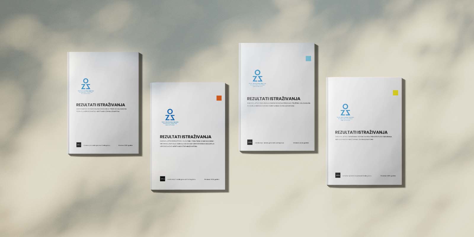
Healthcare user satisfaction research
Objective was to conduct an in-depth user satisfaction analysis for the Health Insurance Institute of Herzegovina-Neretva Canton. The goal was to gather insights on user experiences and satisfaction levels, addressing areas in need of improvement and guiding strategic decisions to enhance healthcare service delivery.
Our team designed and executed a comprehensive survey targeting a representative sample of insured users across the region. We gathered data across various demographics, including age, gender, and geographic location, to ensure balanced insights. This research employed both statistical and descriptive data analysis methods, delivering an objective view of user satisfaction levels with healthcare services and administrative processes.
- High Overall Satisfaction: The data revealed a significant increase in user satisfaction levels compared to previous years, with over 83% of respondents expressing satisfaction with healthcare services.
- Insight into Information Accessibility: A substantial improvement was noted in user satisfaction with information received from the Institute, indicating effective communication efforts.
- Identification of Improvement Areas: Feedback highlighted issues such as slow response times for specific requests and occasional miscommunication, which provided actionable insights for service enhancements.
My role included designing the survey, overseeing data collection, and conducting the analysis. Utilizing statistical and descriptive methods, I distilled the findings into clear insights and recommendations for the client.
This project provided the Health Insurance Institute with a detailed understanding of user needs and satisfaction levels, helping to identify specific areas for improvement. The insights have since supported ongoing enhancements in healthcare service accessibility, efficiency, and user communication strategies.
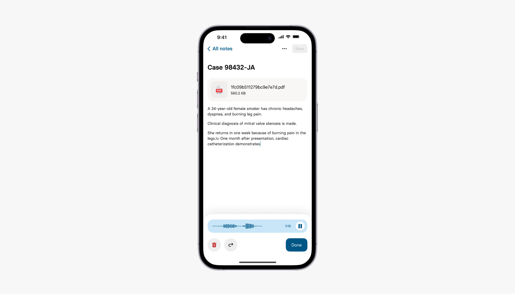
AI-driven medical assistant for healthcare professionals
Mobile app tailored for medical professionals, providing an AI-assisted toolkit for case documentation, diagnostic support, and streamlined access to medical research and literature. The app provides a seamless experience designed to save time, boost diagnostic accuracy, and keep healthcare professionals updated with relevant medical knowledge.
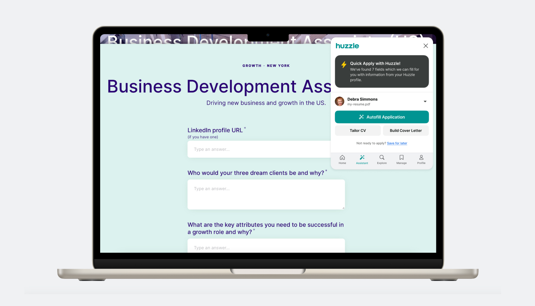
AI-powered job applications autofill Chrome extension
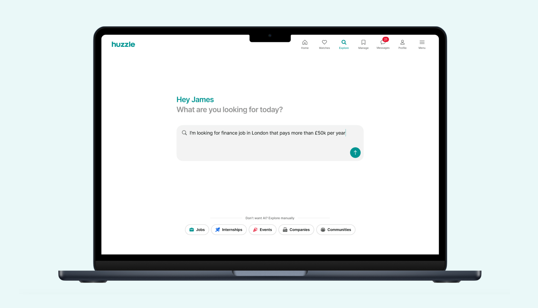
Personalized AI job search for modern job seekers
ChatGPT for Jobs
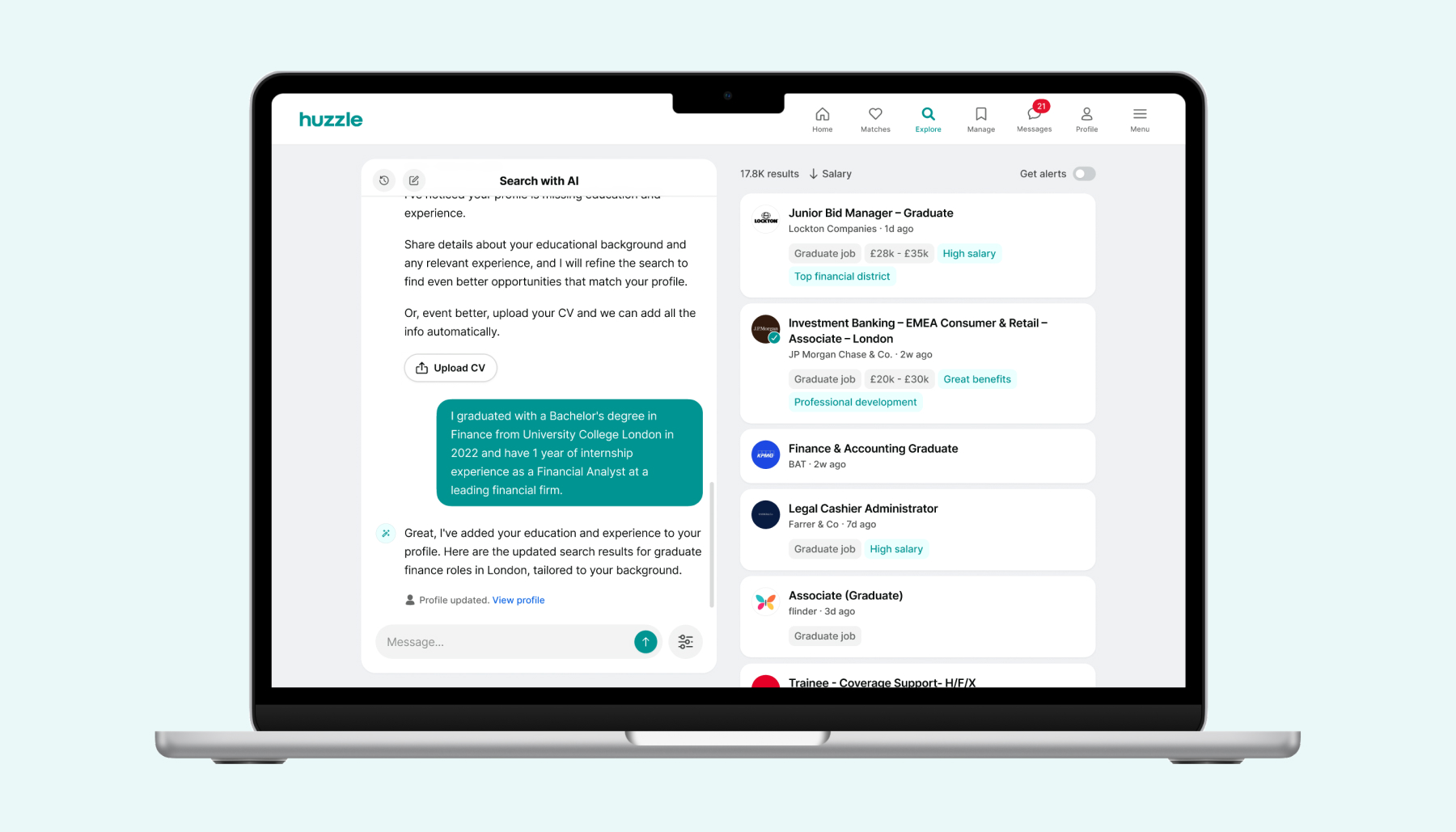
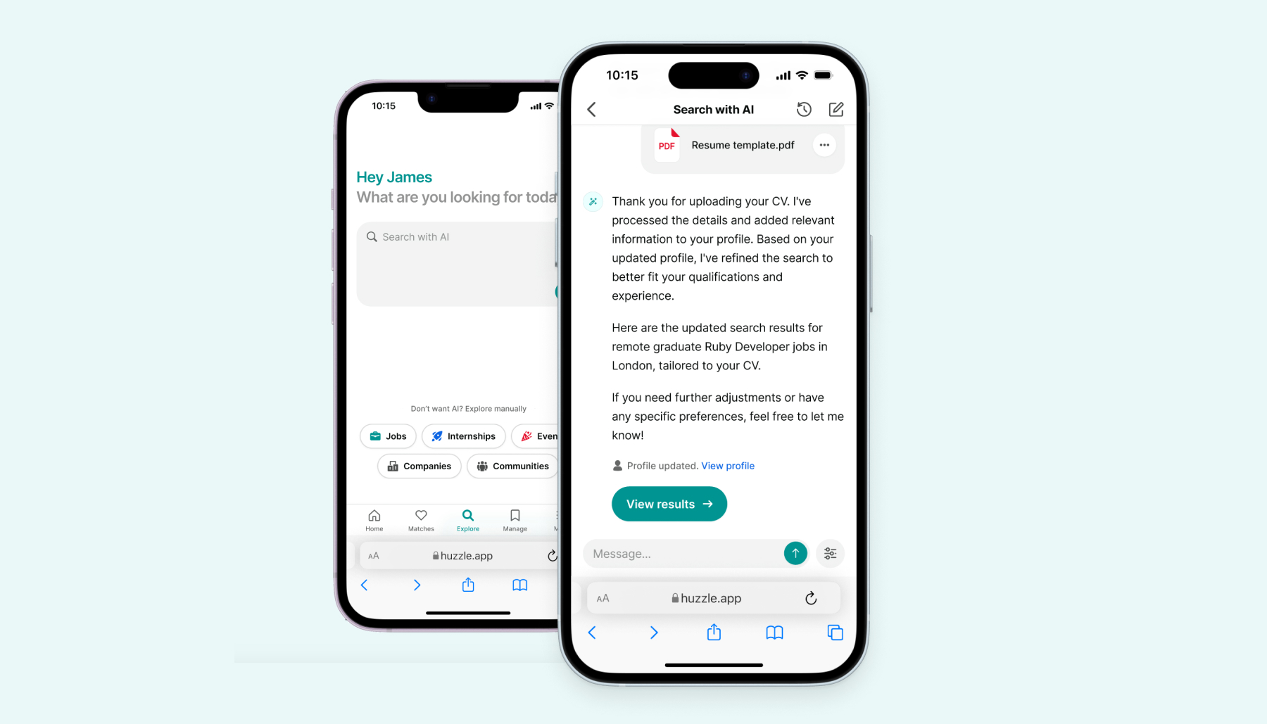
An innovative job search assistant that leverages AI to understand job seekers’ unique requirements, helping them refine searches, build professional profiles, and apply more effectively. The app’s natural language processing, smart filtering, and resume optimization features aim to reduce job search complexity and increase job application relevance.
Society management tool
Home to 1,000+ societies
Huzzle for Societies is a comprehensive platform designed to help student societies manage their events, members, and company partnerships, all in one place. From creating and managing events to tracking subscribers, it is a society management easier, more efficient, and way more fun!
Huzzle Community Tool was designed to address core issues in how student societies manage their activities. Our user research revealed that existing platforms often lack the flexibility societies need, leading to inefficiency, fragmentation, and barriers to effective community building. By identifying key user pain points—such as event organization, membership management, and sponsor communication—we developed a clear approach to tackle these challenges head-on.
Our goal was to create a platform that could serve as a central hub, integrating all aspects of society management while remaining user-friendly and responsive to different types of user needs. This focus informed every stage of development, resulting in a tool that empowers societies to grow and engage their communities more effectively.
- Problem

The development of the Huzzle community tool involved multiple design stages, from initial wireframes to interactive prototypes. We iterated based on user feedback, focusing on creating a cohesive design system that unified the user experience across devices.
Collaboration with development ensured smooth implementation and addressed any technical challenges early on.

Comprehensive design system
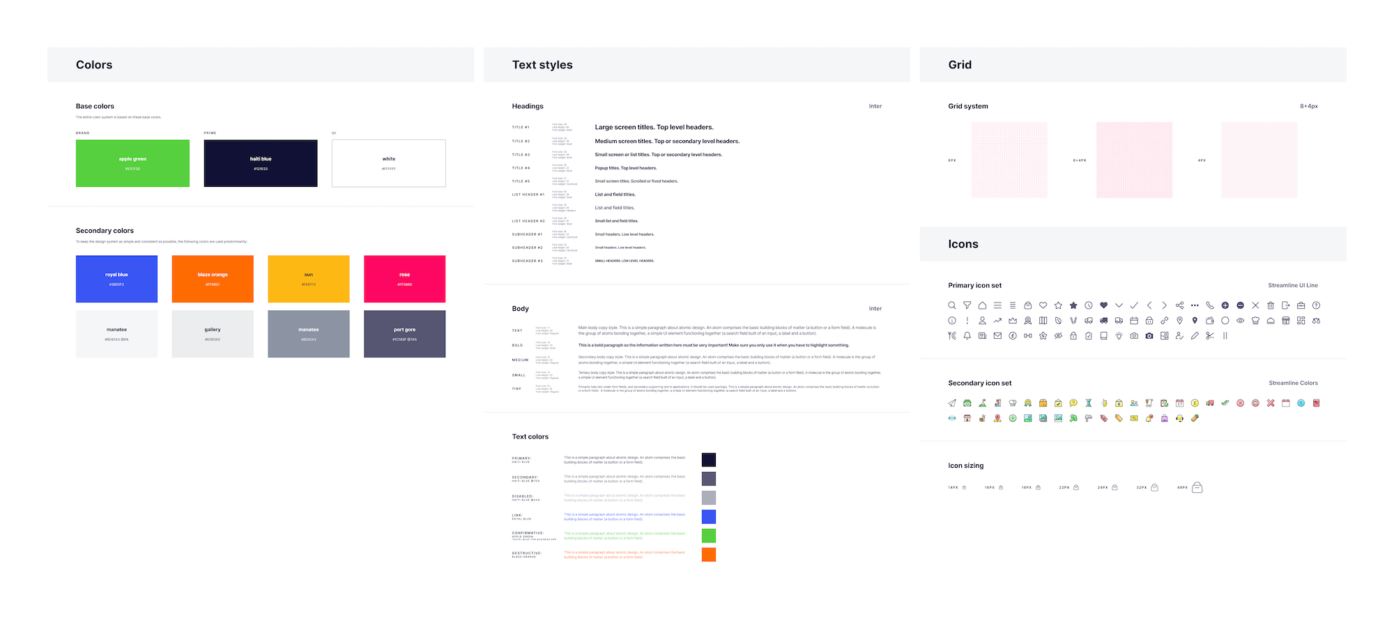
Developed a complete design system to ensure consistency and efficiency throughout the project. This included a comprehensive design component library, icons, a color palette, and fonts. The system also encompassed a thorough style guide and standardized layouts.

In-depth dev handoff
The platform enables users to host events, send targeted newsletters, and analyze community engagement effectively. It supports seamless collaboration with societies and facilitates connections with sponsors, all within a unified system. This all-in-one solution enhances the efficiency of managing and growing communities, providing a central hub for various interactions and tasks.

Constant iterations led to significant improvements, such as reducing event posting to as little as 3 clicks, despite managing over 50 data points.

The evolution from the initial MVP to the current version demonstrates significant enhancements in functionality, design, and user experience. This transformation marks the shift from a basic prototype to a comprehensive, fully-developed solution.


All events, socials, links and every detail about student society in one place - creating a better experience for community members and increasing conversion numbers in bulk.


Some of UK's most professional Student Societies are already using Huzzle.

Early careers network connecting students, communities and companies
#1 graduate copilot in UK
Starting out as a CRM for pre-professional student societies, Huzzle has evolved into the university career companion used by over 120k talents.
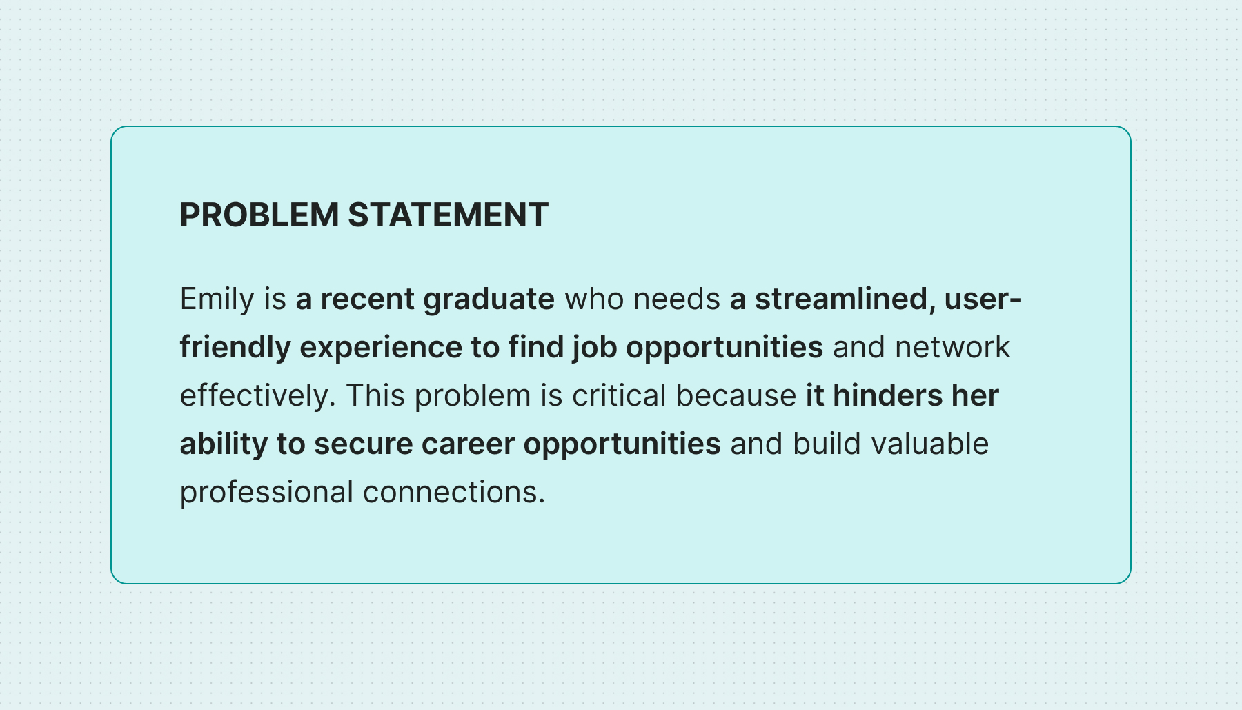
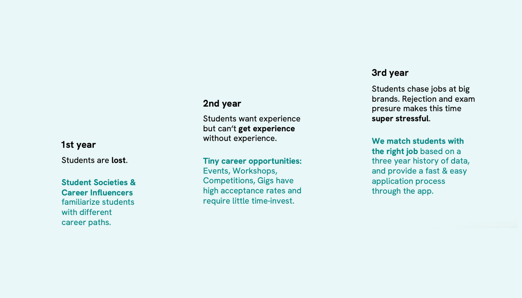
Our research into the early career journey for students uncovered critical insights into their diverse challenges. From the confusion of first-year students exploring career paths, to the struggle of gaining experience in the second year, and the pressure of job hunting in the third year, each stage presents unique hurdles.
This understanding guided our UX strategy, leading us to define clear problem statements, map user journeys, and create detailed user personas. We also developed user stories to address these specific needs and identified key challenges to refine our approach. By integrating these elements, we ensured our solutions effectively support students at every stage of their early career journey.
- Problem statement
- Users
- Empathy map
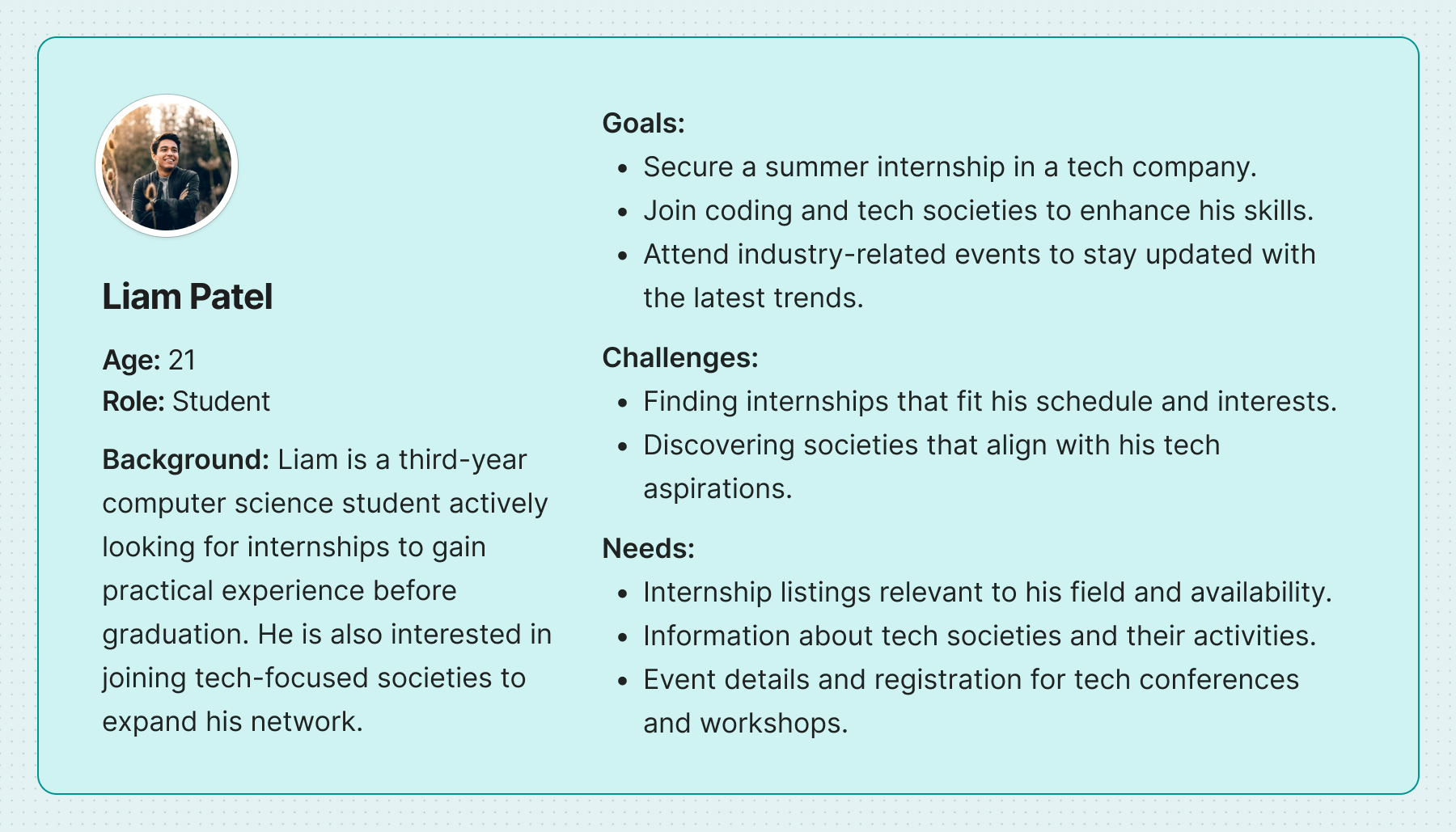
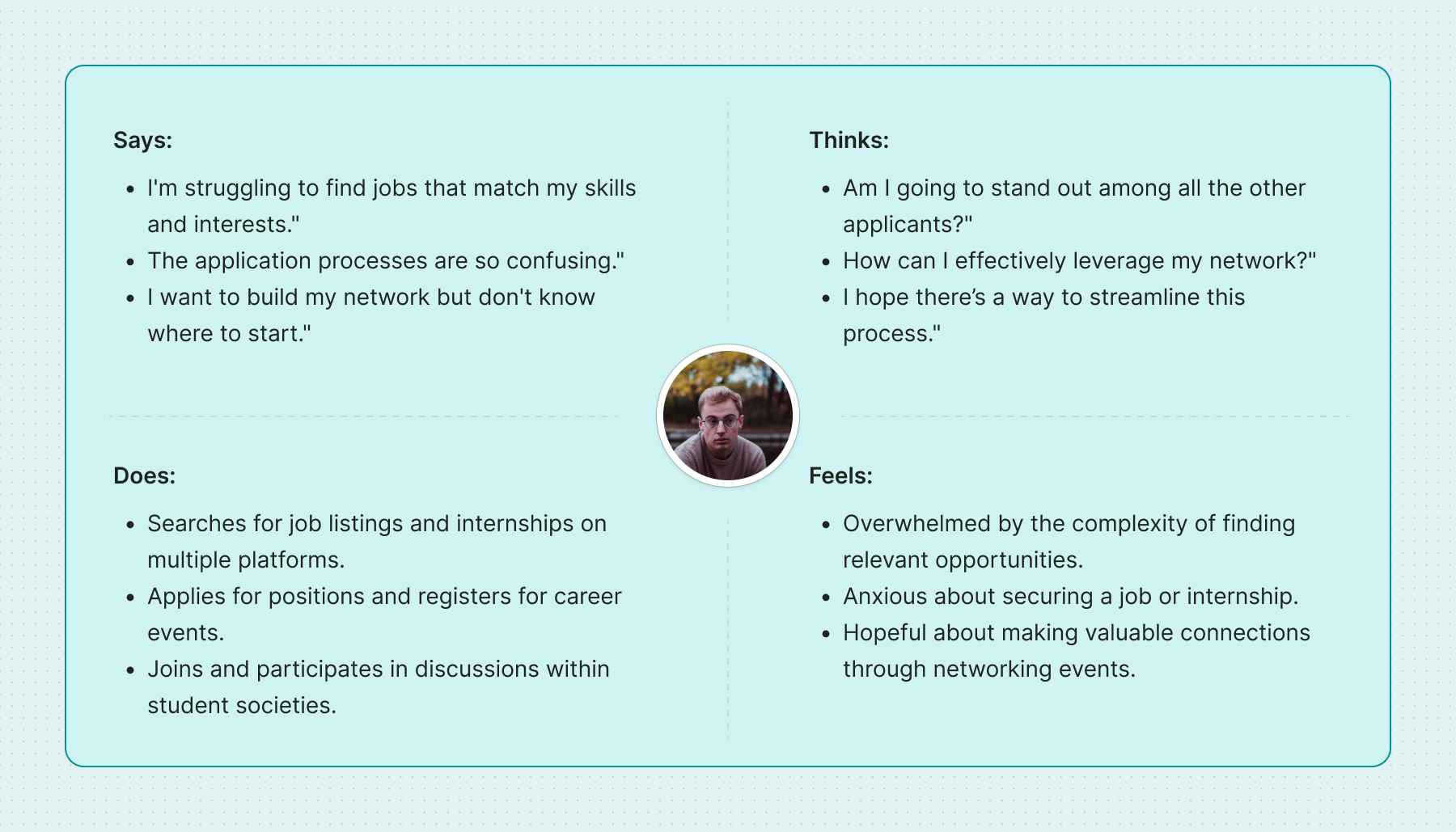
Over 12 months, we interviewed more than 1,000 students to uncover the challenges they face in their early careers. This research highlighted significant pain points: first-year students often feel directionless, second-year students struggle with the catch-22 of needing experience to gain experience, and third-year students face intense pressure from job hunting and exams.
These insights guided the development of our platform, focusing on providing targeted career resources and opportunities that address these specific issues, streamline application processes, and reduce stress throughout their career journey.
Our design process covered every stage from initial research to final implementation. By integrating user insights, iterative design, and continuous feedback, we ensured a cohesive and effective user experience throughout the project.
Comprehensive design system
Developed a complete design system to ensure consistency and efficiency throughout the project. This included a comprehensive design component library, icons, a color palette, and fonts. The system also encompassed a thorough style guide and standardized layouts.
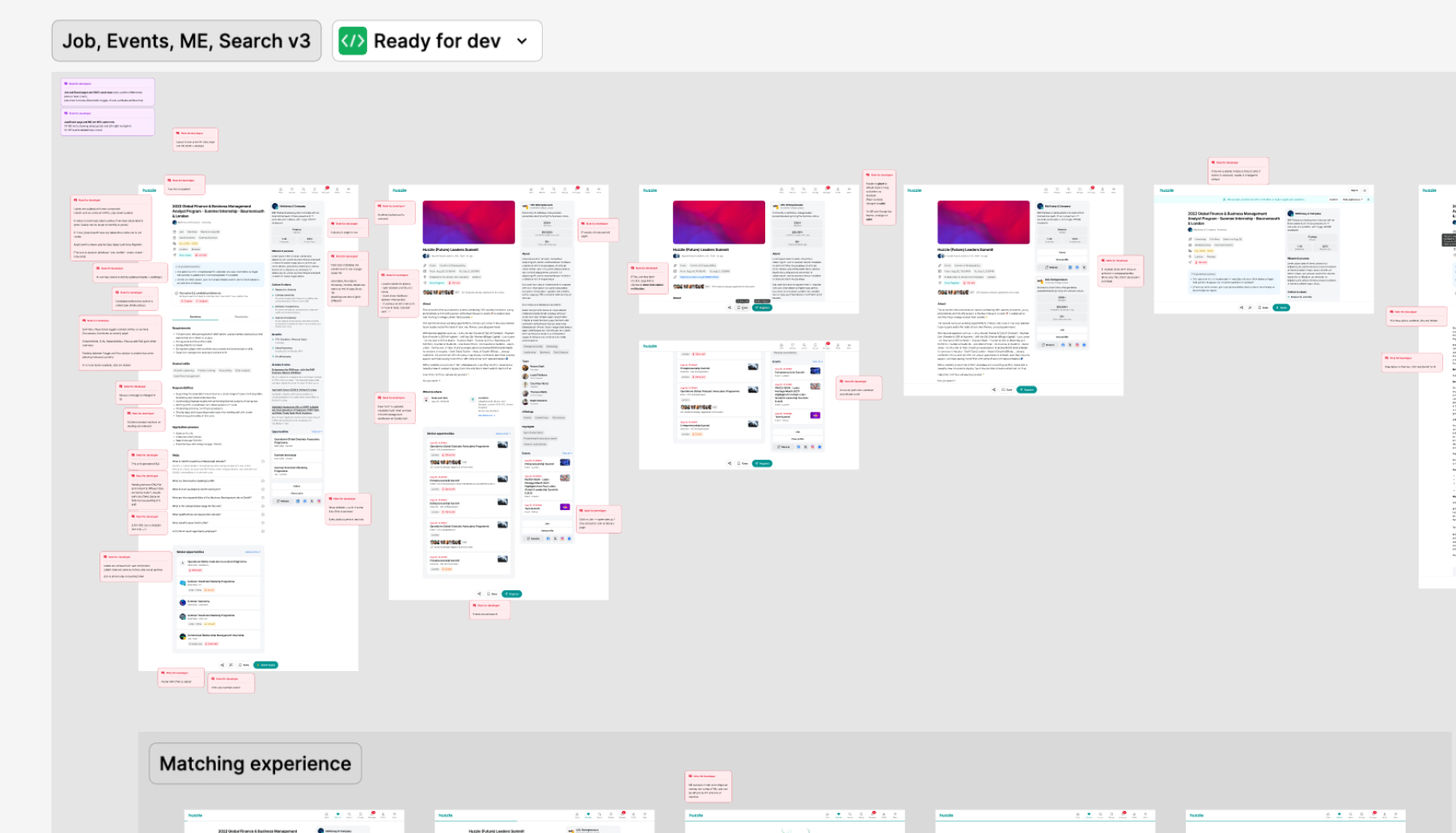
In-depth dev handoff
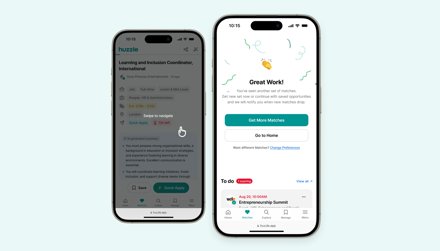
Microinteractions and animations
Incorporated extensive microinteractions and animations to enrich the user experience. These elements were carefully designed to provide visual feedback, guide users through tasks, and enhance overall engagement. Integration of these animations adds depth and responsiveness, making interactions more intuitive and enjoyable.
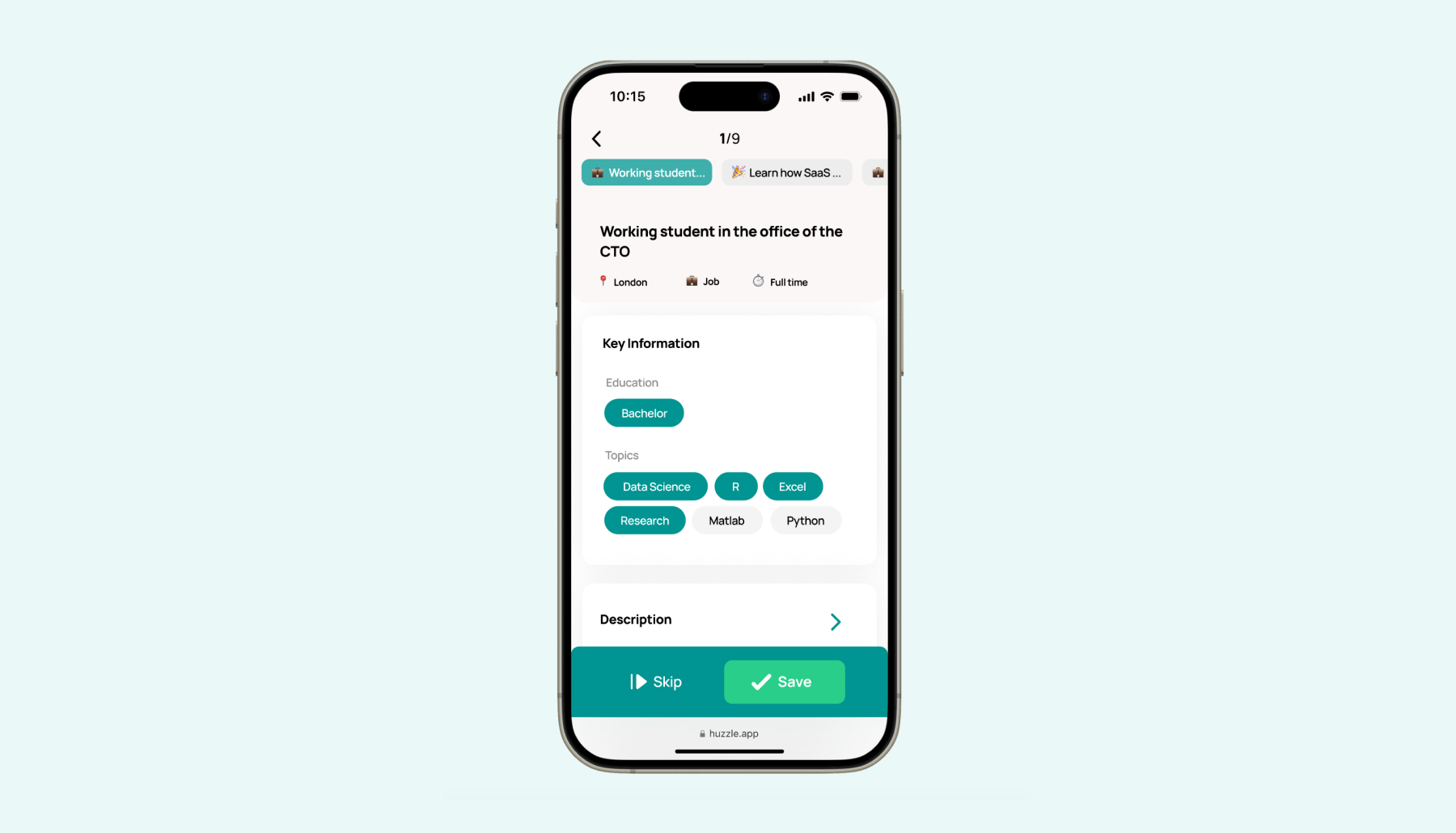
We transformed job discovery into a positive, engaging experience by adopting a dating-matching approach. This redesign reduces the stress of job hunting, making the process more enjoyable and user-friendly. Our goal was to create a seamless and interactive experience that encourages users to explore opportunities with ease and enthusiasm.
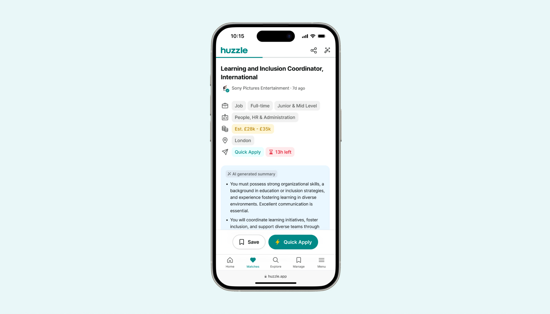
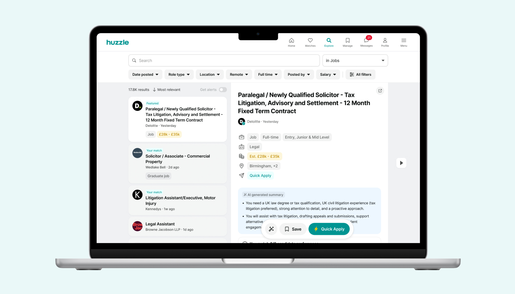
Engineered a powerful search system with advanced features and multiple filters, allowing users to easily explore and pinpoint relevant job opportunities within a vast and complex dataset.
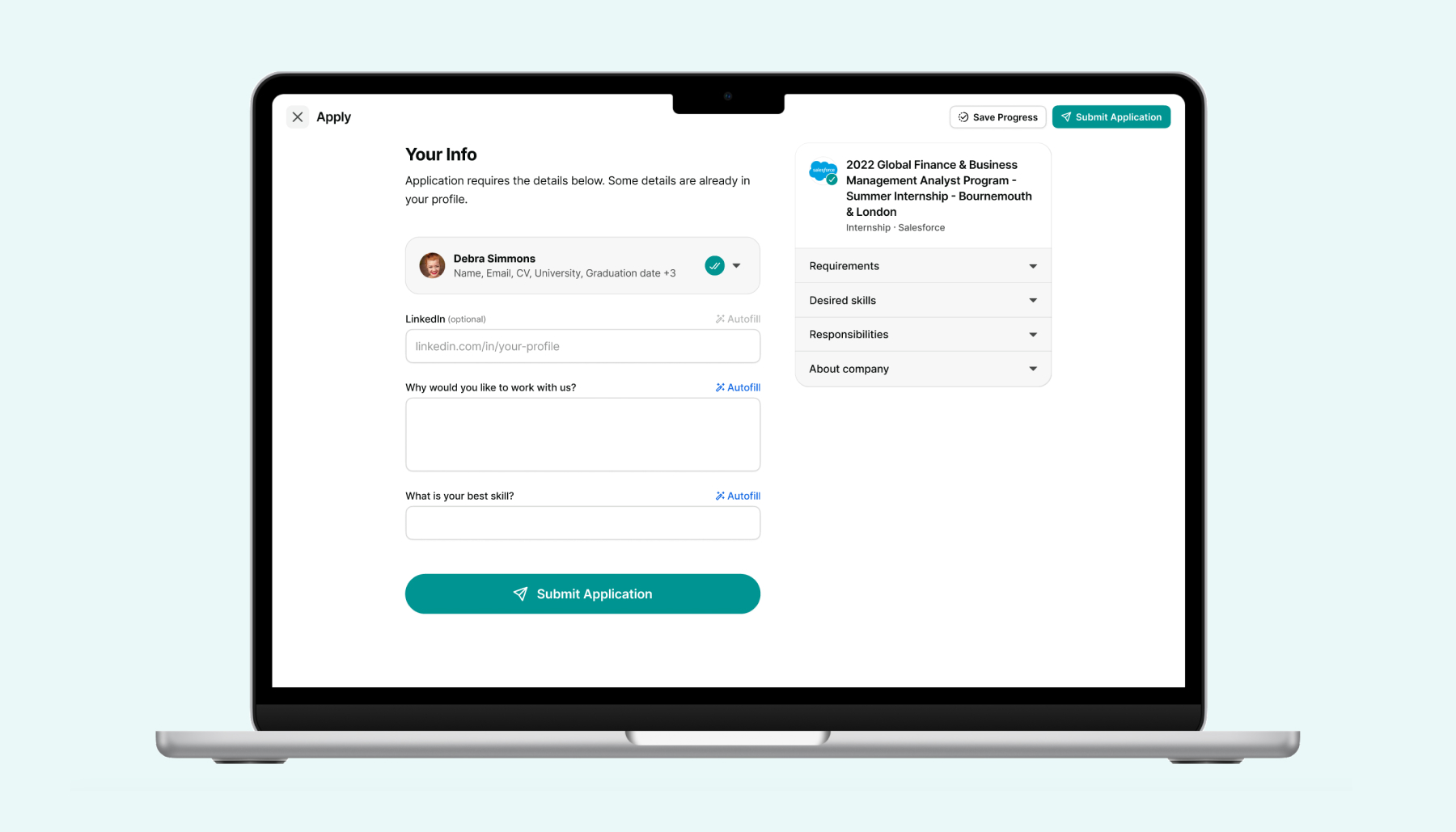
Created user-friendly forms with advanced features like paid ticketing, custom questions, waitlists, and approvals. This simplicity drives record-breaking event registrations for multiple societies and boosts job application completion rates.
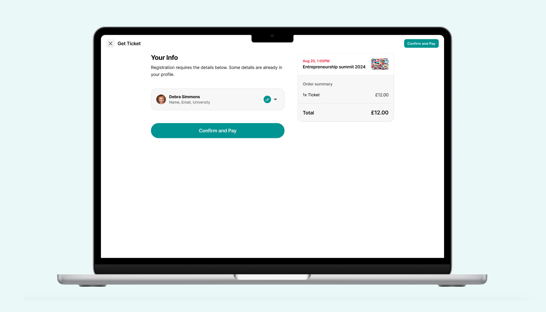
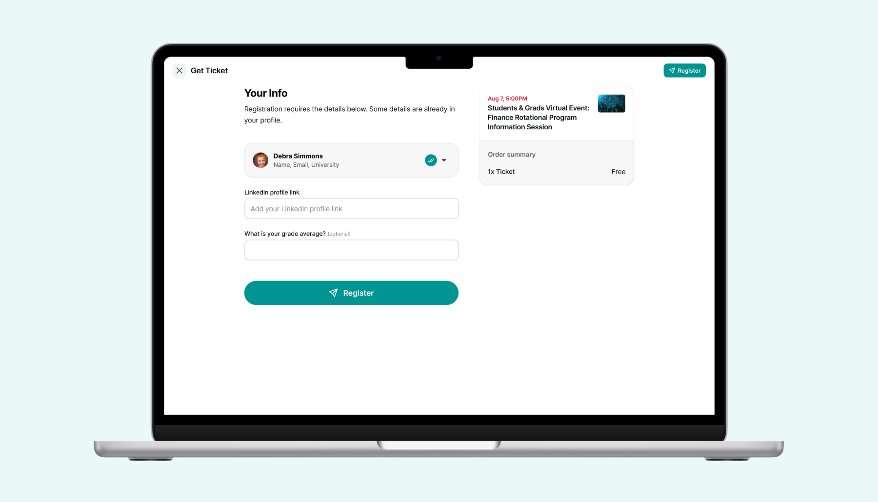
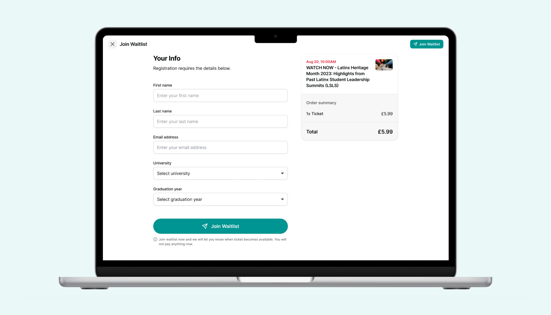
The evolution from the initial MVP to the current version demonstrates significant enhancements in functionality, design, and user experience. This transformation marks the shift from a basic prototype to a comprehensive, fully-developed product.
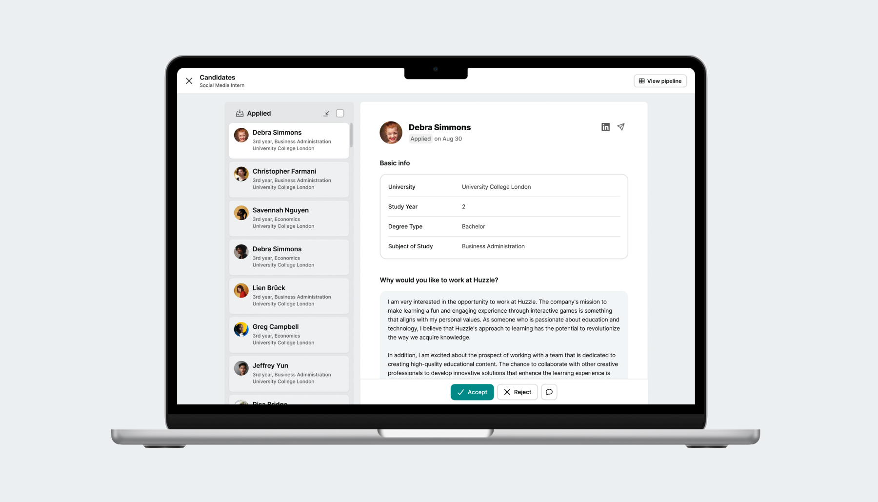
Recruiter & talent sourcing tool
100,000+ talents with 1,000 job applications daily
A comprehensive desktop web app designed to streamline recruitment through job and event management, candidate screening, and personalized messaging, within a network of UK student societies.
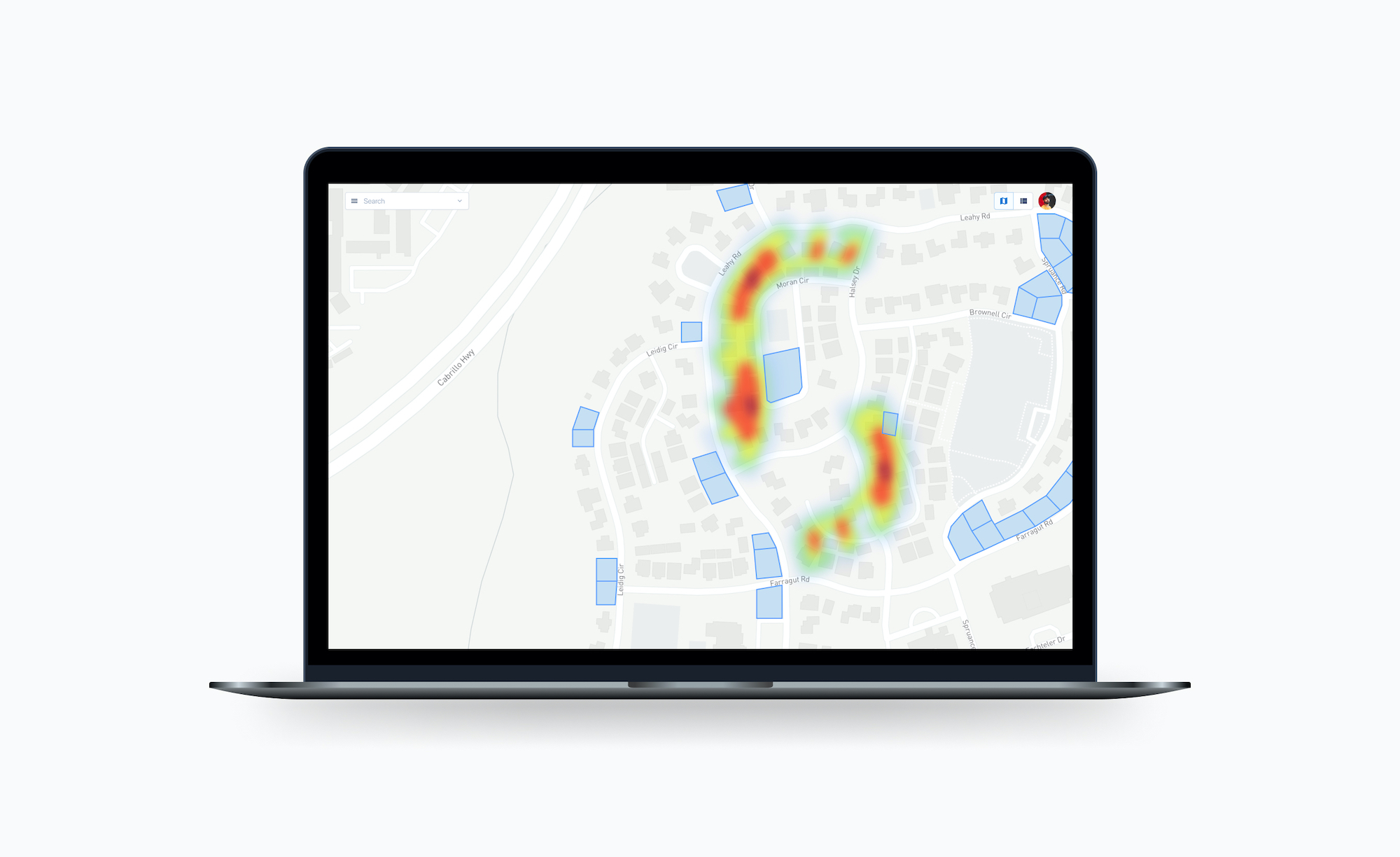
Search and evaluation dashboard for a next-gen real estate platform
A single tool to help specialists evaluate real estate projects, with a focus on the construction of modular units geared toward short term rentals.
Interviews gathered about 50 people (calls, chats and physical interviews) who were potential (external) target users to know their views and experience of using existing similar applications and to know their pain-points and improvement suggestions, and definite (internal) users who had a clear vision what benefits they want to get out of the product.
The visual design process started with the creation of simple wireframes. Followed by high fidelity designs and hi-fi prototyping.
Graduate students and postdocs publishing and discovery apps
A platform for postdocs, graduate students, PI's, and couch academics to feed their expertise back into the authorship system and amplify only the research of high integrity and value.
Made simple to select for high quality research by consolidating the academic reading habits and intuition of researchers, strengthening high-quality research and improving the signal-to-noise ratio.
- Users
- User story
- Problems


Task-based user flows

Digital wireframes

Gradual improvements

Intensive prototyping
The whole app was meant to provide a seamless experience, and a decision to go with a minimalistic approach was pretty straightforward.


Both native apps and web responsive designs were planned and done from the start.

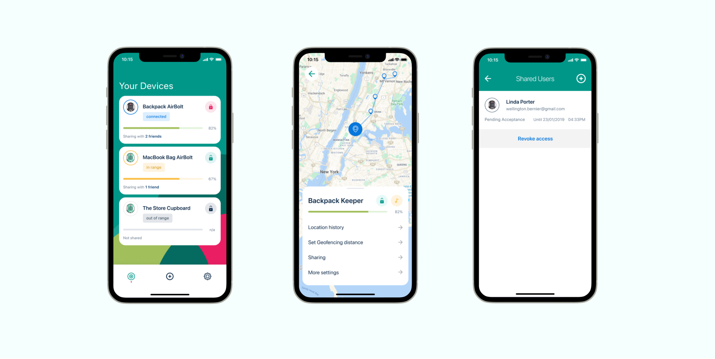
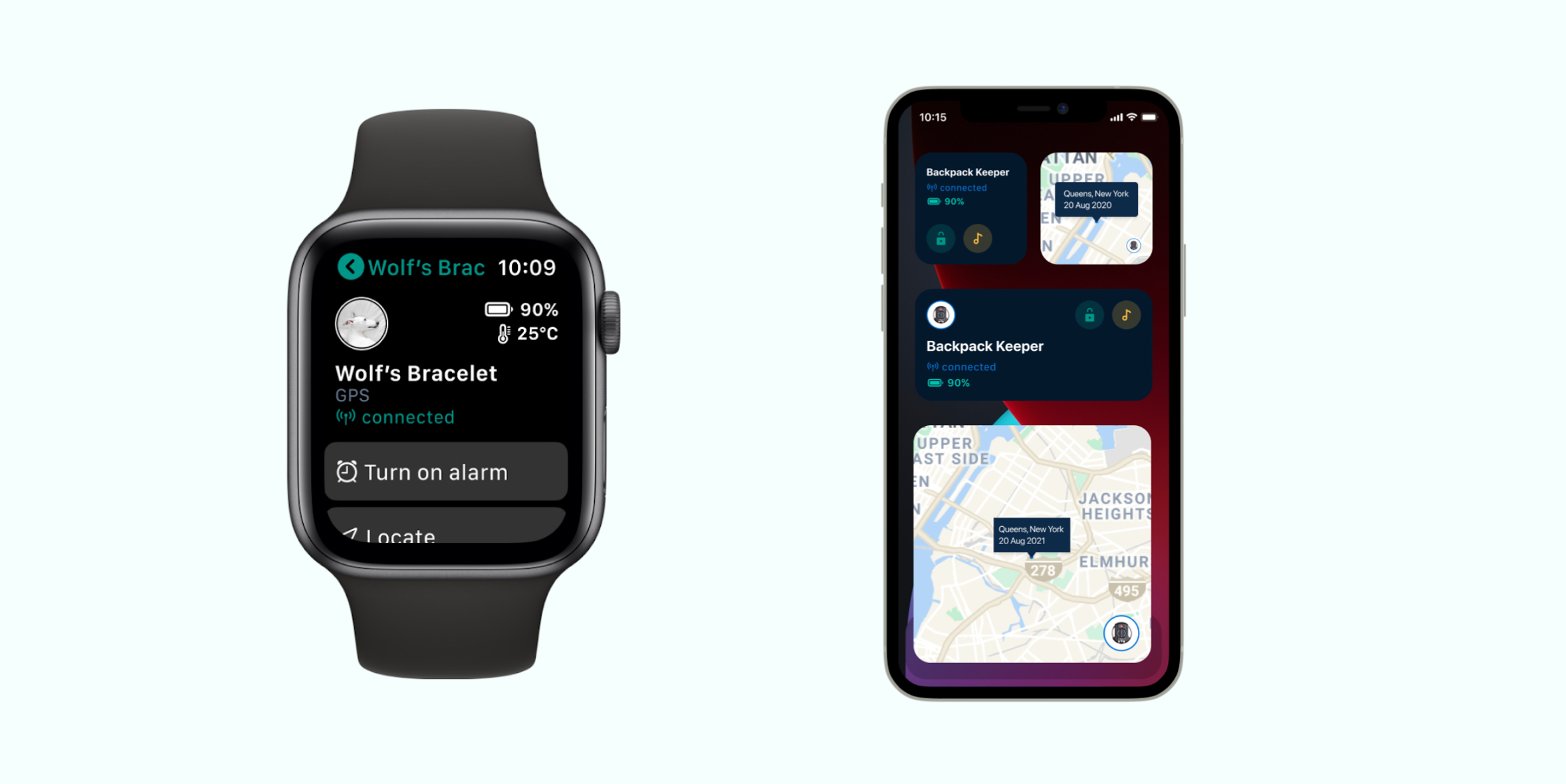
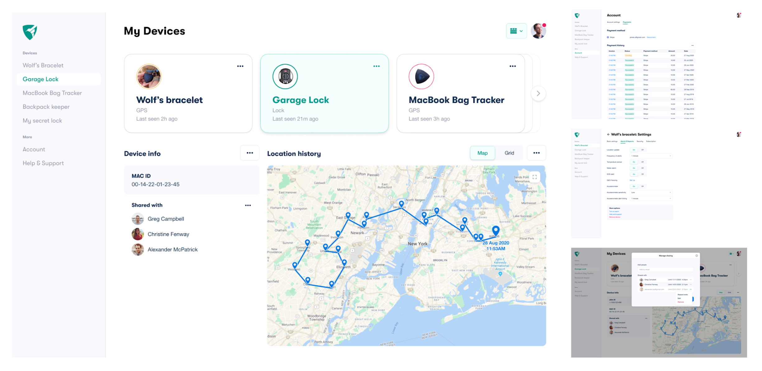
Feature rich GPS tracker & smart locker
#1 most funded GPS campaign in Kickstarter history
A revolutionary hardware and software ecosystem for secure access & asset tracking. Designed from the ground up to be the most technologically advanced GPS tracker on the market this is just one of company’s bound to be successful products.
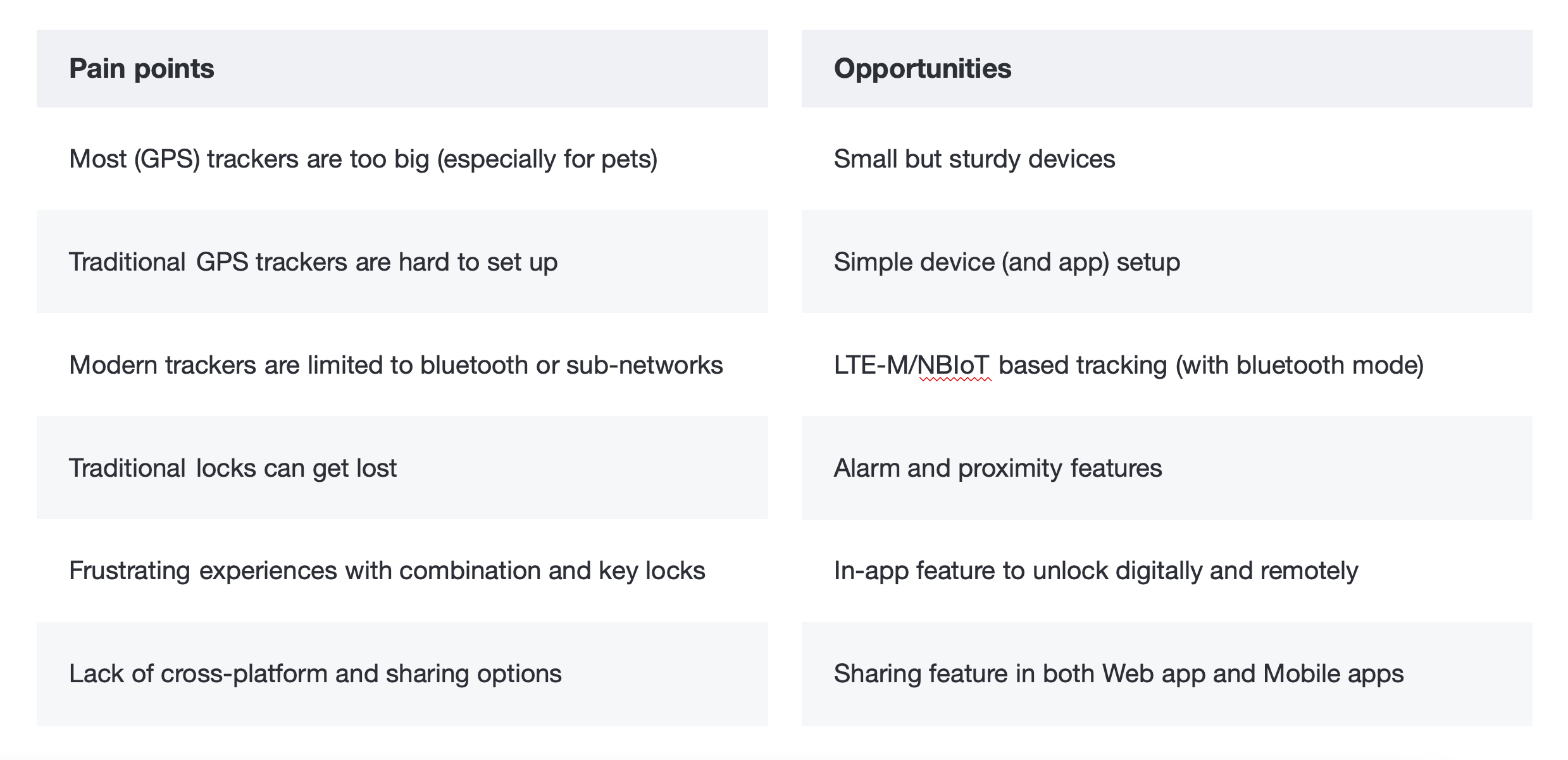
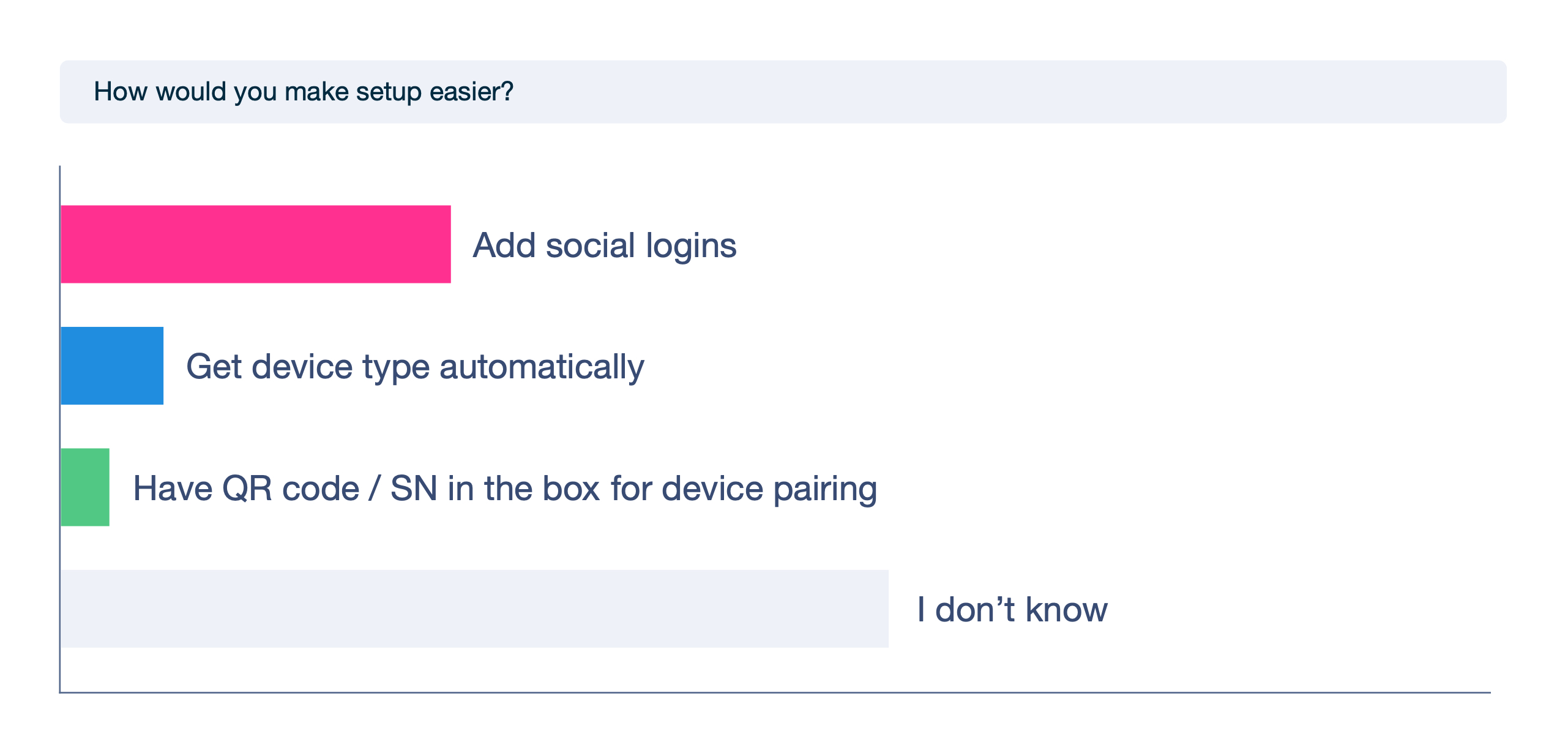
Research revealed that existing solutions often add stress through both hardware and software. To counter this, we focused on developing products that address these issues by simplifying and streamlining user experience in as many ways as possible. By focusing on solutions that streamline processes and enhance ease of use, we aimed to create a user experience that checks all the boxes for efficiency and simplicity.
- Challenges
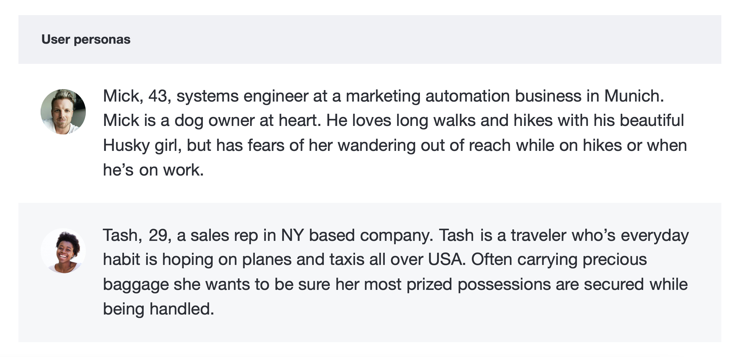
- Users
- Pain points
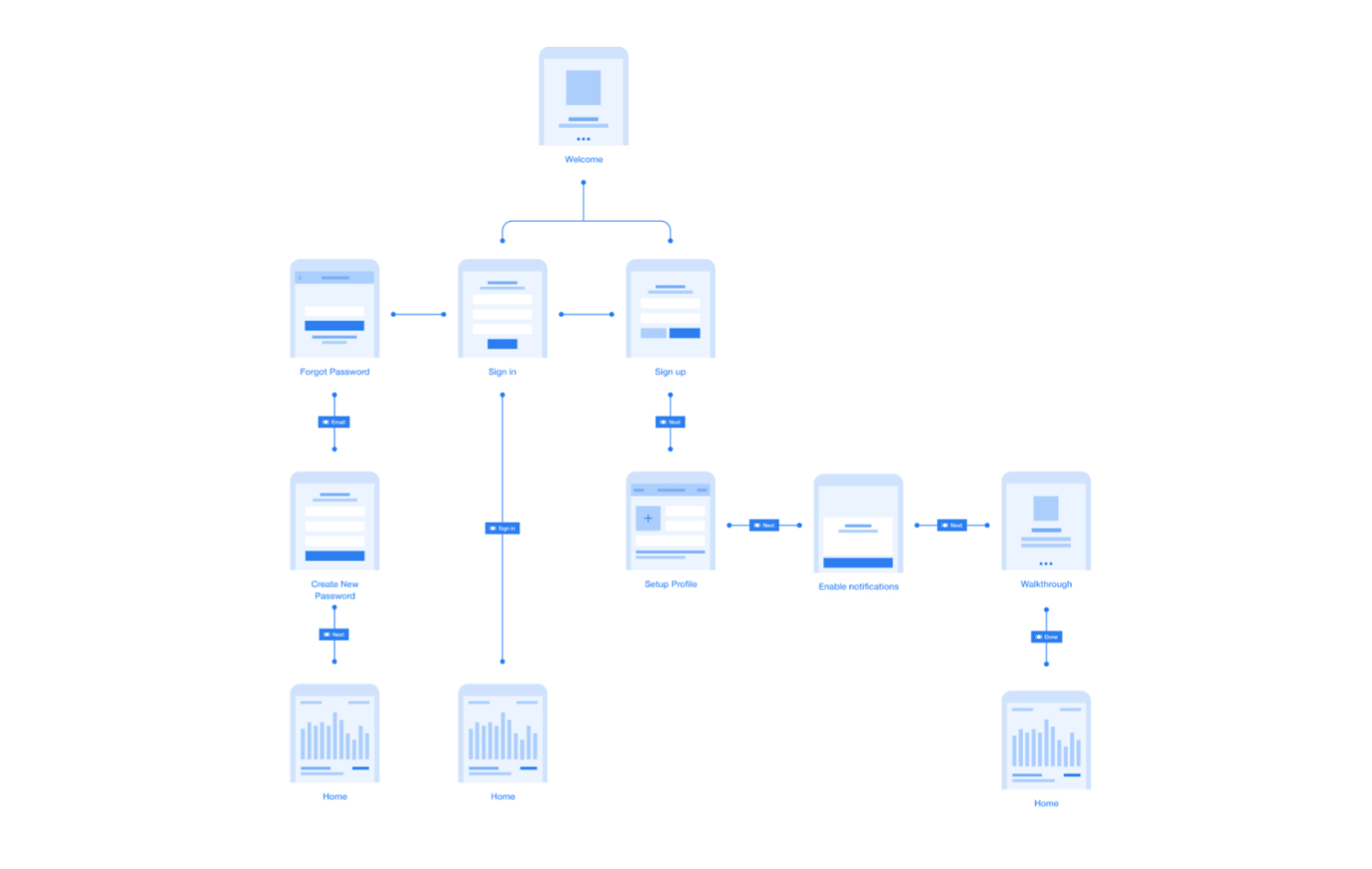
User flows were defined early on from individual sections to entire app in bulk
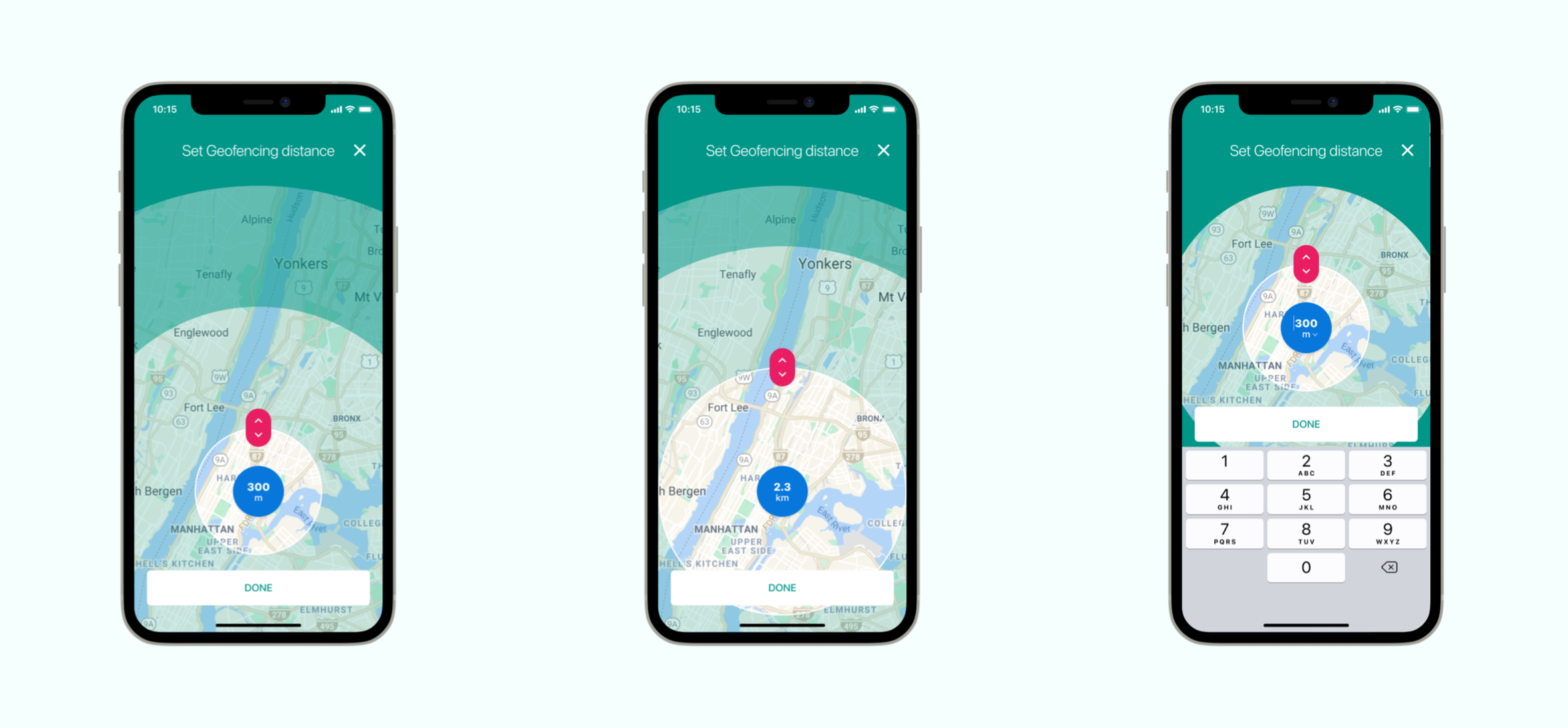
Detailed interactions - from step-by-step UIs to After Effects based animations
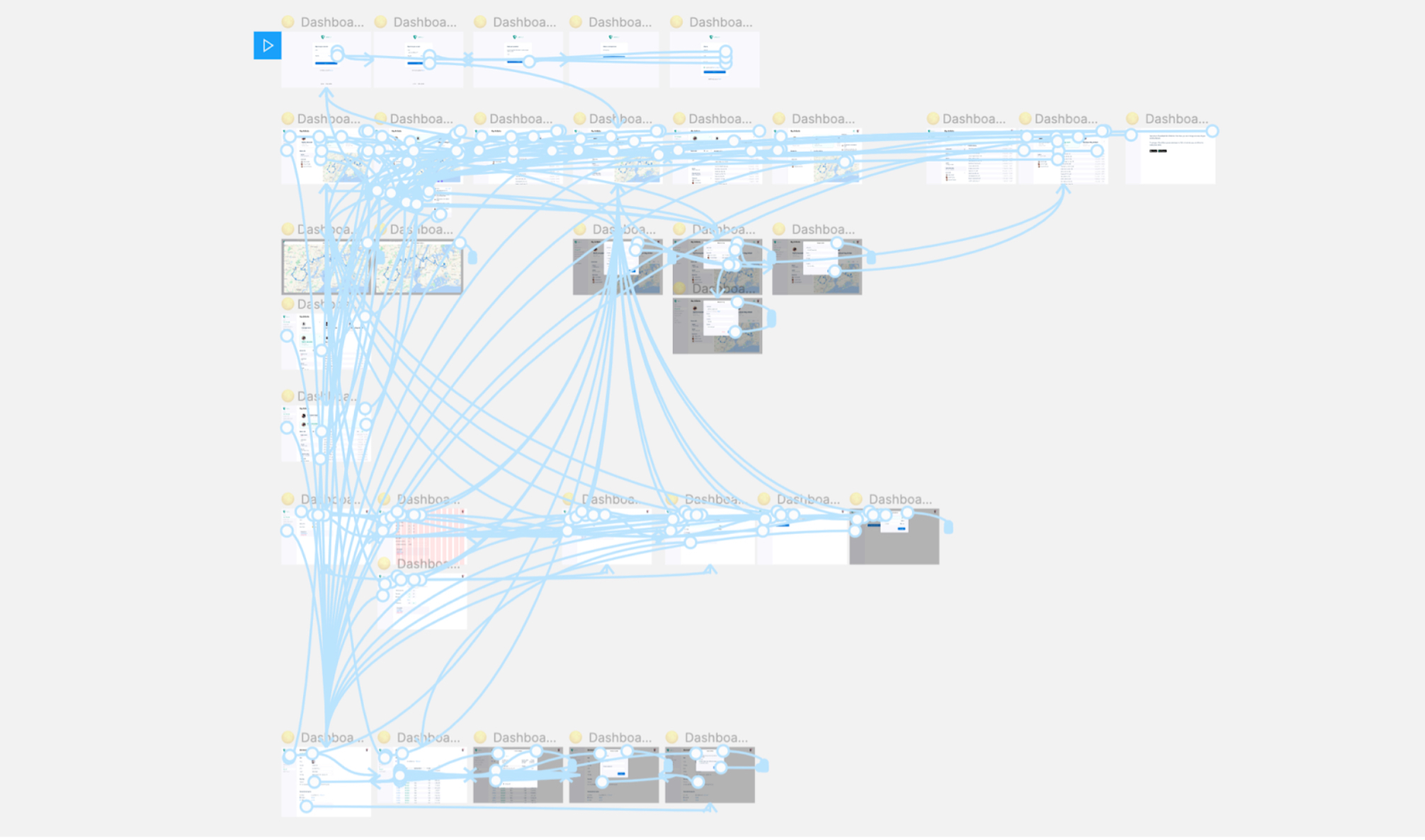
Basic and detailed prototyping for better understanding of flow and feel
Leading content discovery engine for scholarly publishers
1M USD/mo revenue MD App
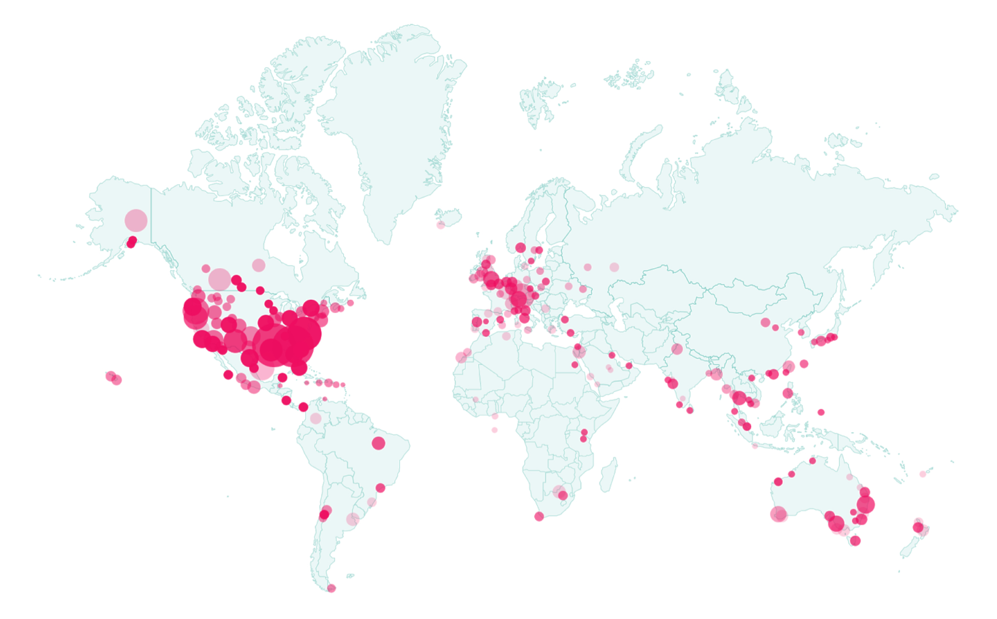
Powering personalised recommendations on over 8,500 scholarly websites by 400+ publishers, with over 130M+ readers per month and $1M monthly revenue employing 160 people internationally.
Researchers, Publishers, Authors, Marketers, Admins. End users pool is large, diverse but tied to the same field of work (MD Science).
- Problem
- Challenges
- Users


Continuing research allowing risks minimisation and constant product improvements.

Detailed analysis of the top competitor products and their user’s impressions helped better shape our product.

Once we had a clearer understanding of our users and competitors, we initiated the visual design process with basic low-fidelity wireframes. These were tested briefly before advancing to the next stages. Insights from our specific user base were immediately applied to our high-fidelity designs. As the project progressed, we delved into more complex features, created detailed prototypes, and developed a robust design system.
After several rounds of testing, the product launched successfully, generating significant revenue and a wealth of new feedback. This constructive feedback was integral in driving further refinements and enhancements, ensuring continuous improvement and evolution of the product.

Next to pen & paper, we did huge amount of digital wireframes (before proceeding to any high fidelity designs) to help imagine product better in early stages.

Complexity. For each sub-product, detailed designs were delivered, enabling product and dev teams quick and easy insights into any use-case scenario.

An all-inclusive custom design library containing over 5.000 components with support to Figma’s Autolayout and Variants features.

Improvements. Along with the trends, we grew, and still do.
*Dashboard design in 2015 vs 2018. Redesign resulting in considerable improvements in both UX and UI featuring: revamped menu system, all new search and filter system, significantly better visibility both horizontally and vertically.

Variations. All features got various UX ideas, which were evaluated through user testing, and optimal ones pushed to dev.

High level prototyping.
We developed a comprehensive style guide detailing every aspect of our design system, including typography, color schemes, iconography, and UI components. This guide was created by systematically documenting each design element and its usage, ensuring that every part of the platform adhered to a consistent visual and functional standard. By defining these guidelines, we were able to maintain a cohesive design across all screens and interactions. The style guide not only provided clear instructions for the design team but also facilitated a unified user experience throughout the project, ensuring that every element fit seamlessly into the overall design.

We designed a widget that caters to a variety of publishers by offering extensive customization options. Its simplicity not only ensures ease of use but also drives higher engagement, as evidenced by over 5 million monthly clicks. The widget’s flexible design allows for smooth integration across different platforms, while maintaining a high standard of accessibility. Its scalable architecture ensures consistent performance and a seamless user experience, contributing to increased conversions and user satisfaction.

Addressed a key challenge by dividing recommendations into two distinct sections: sponsored links on the right and non-sponsored links on the left. This separation enhances clarity and relevance, ensuring users easily distinguish between promotional and organic recommendations.

Developed dashboards that maximize functionality by integrating advanced spreadsheet features. This approach allows users to efficiently manage, analyze, and visualize data, providing a comprehensive and interactive experience that supports detailed insights.


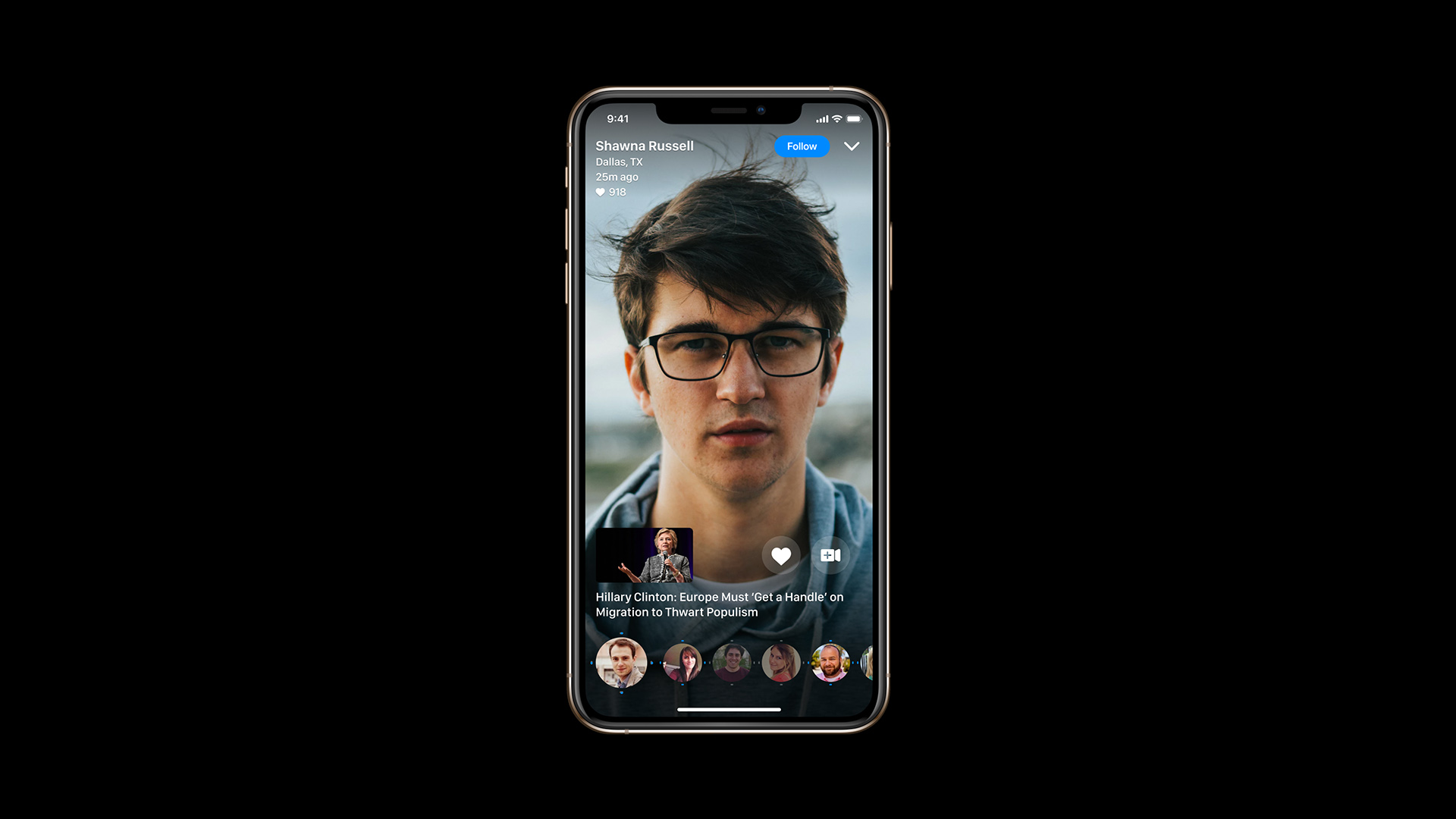
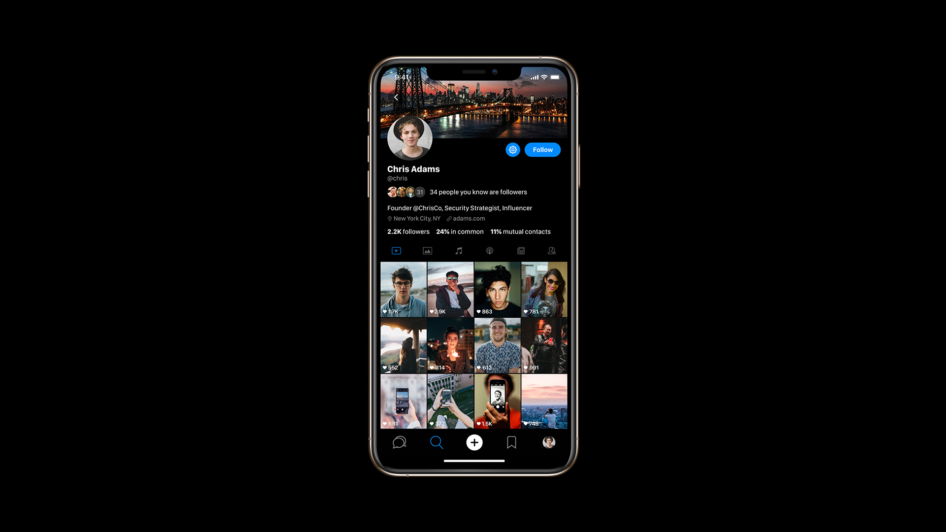
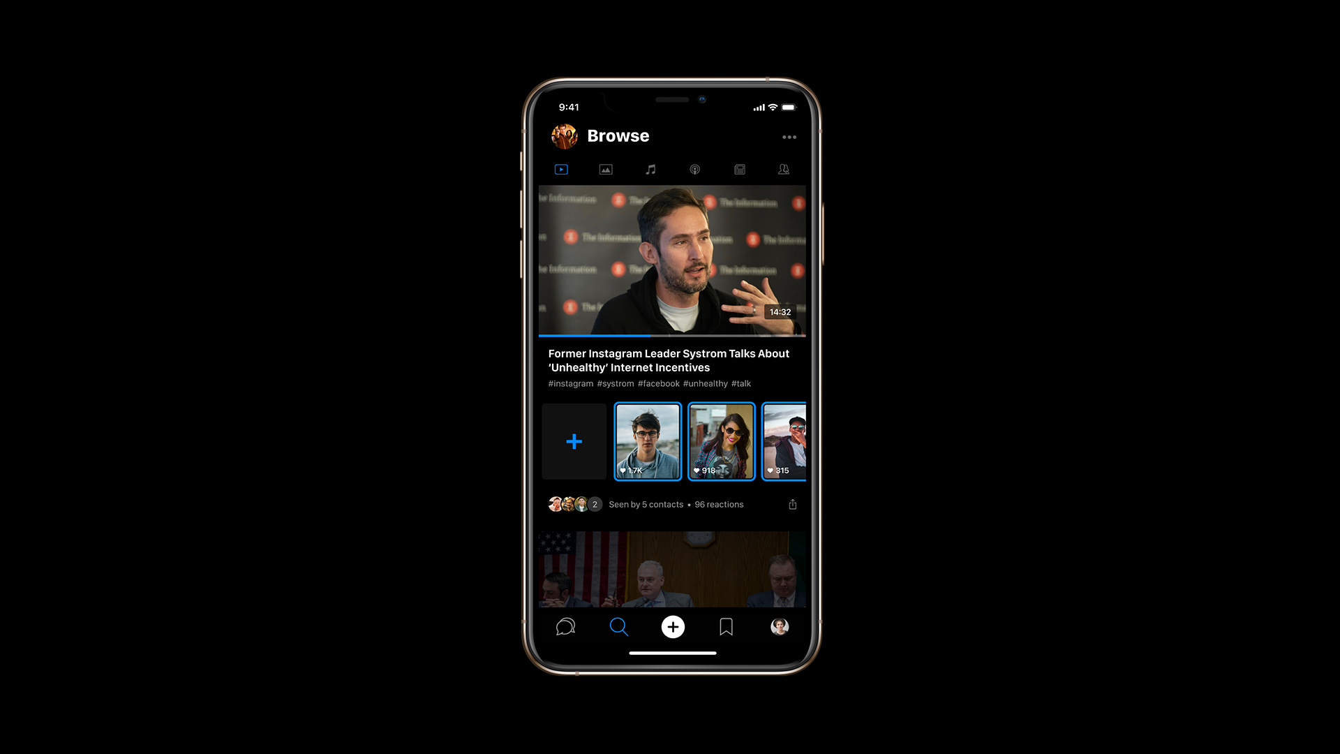
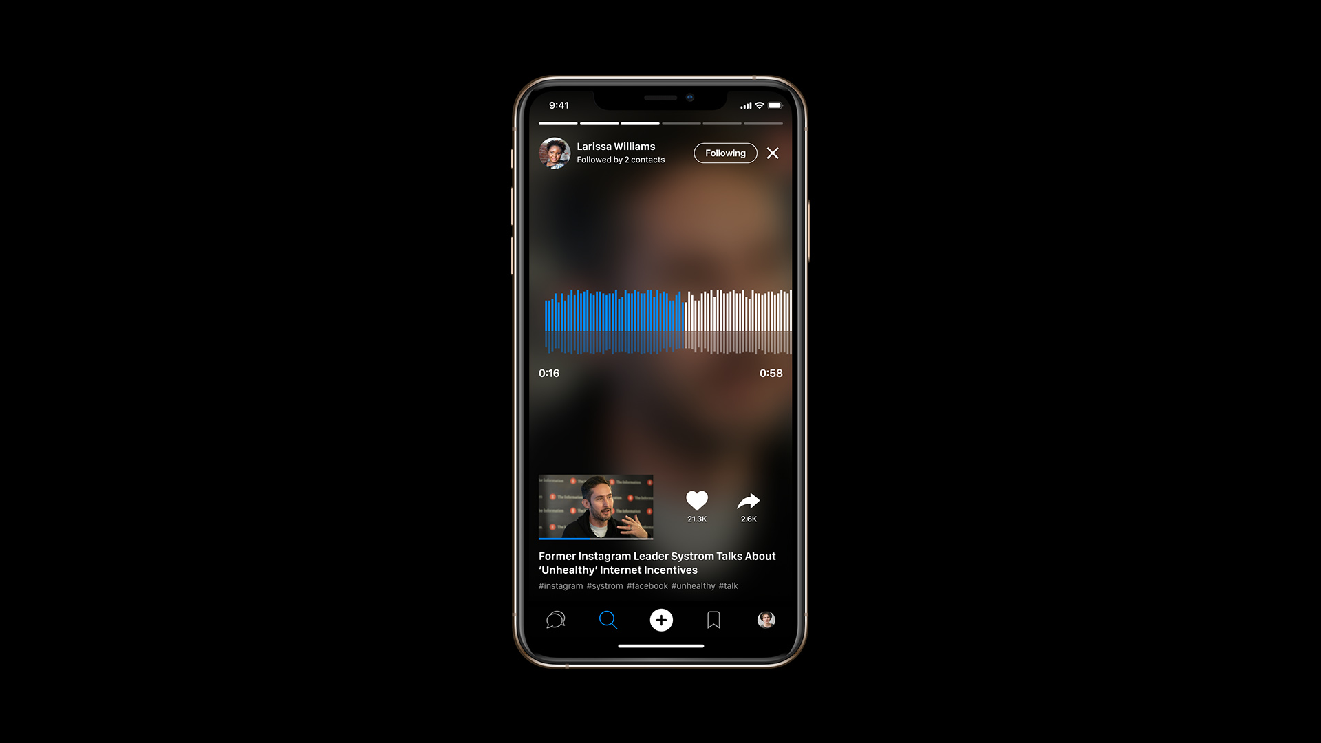
Video reactions social app
Digital campus and drop-in chat for students and student groups
A tech company based in California who's goal is to enhance college experience by making it easier for students to engage with their peers purposefully.
- Users
- Problem
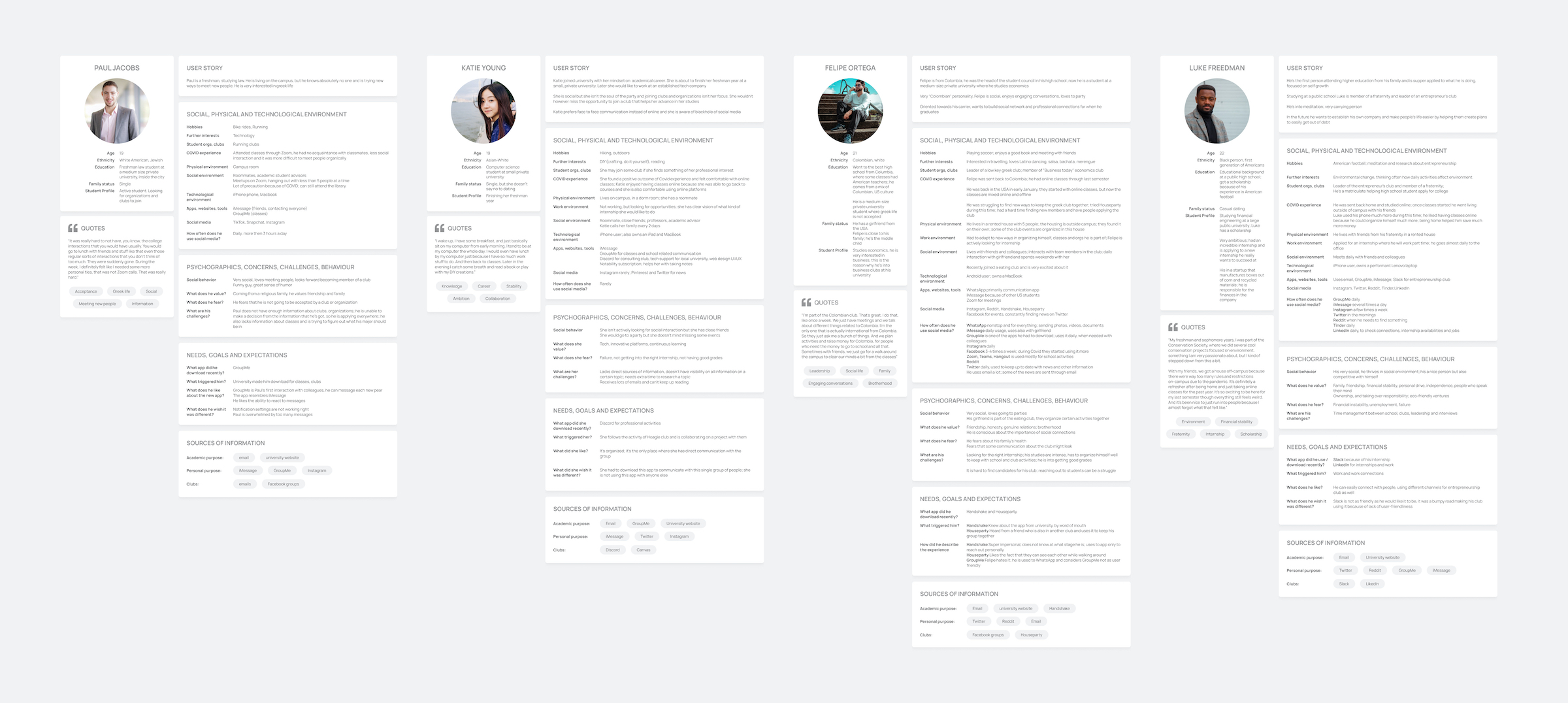
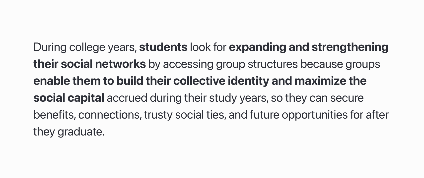
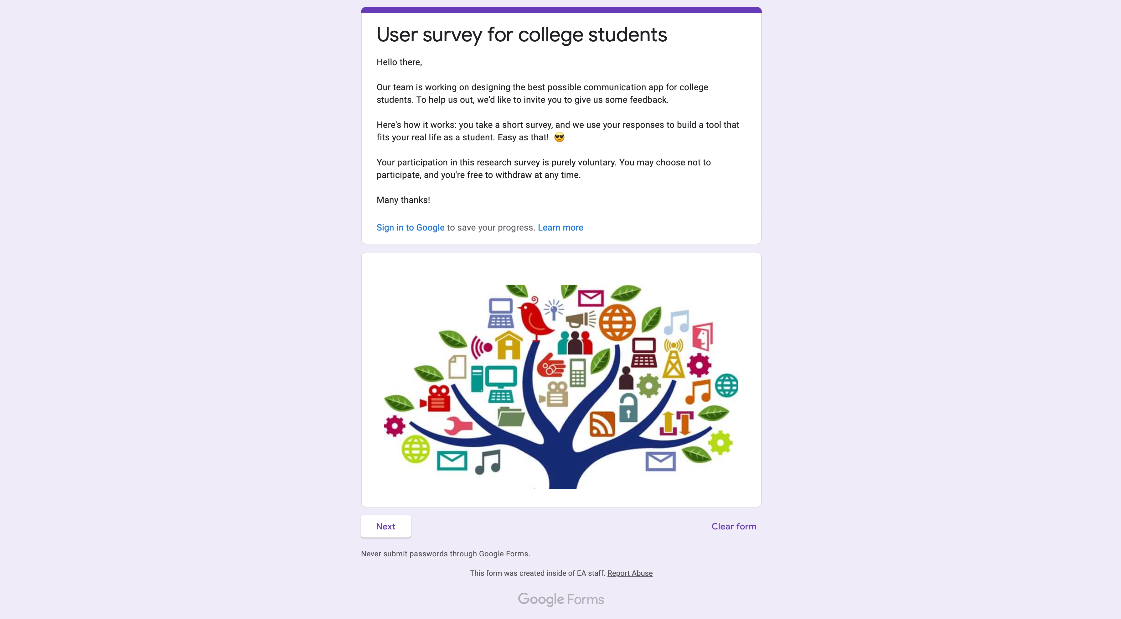
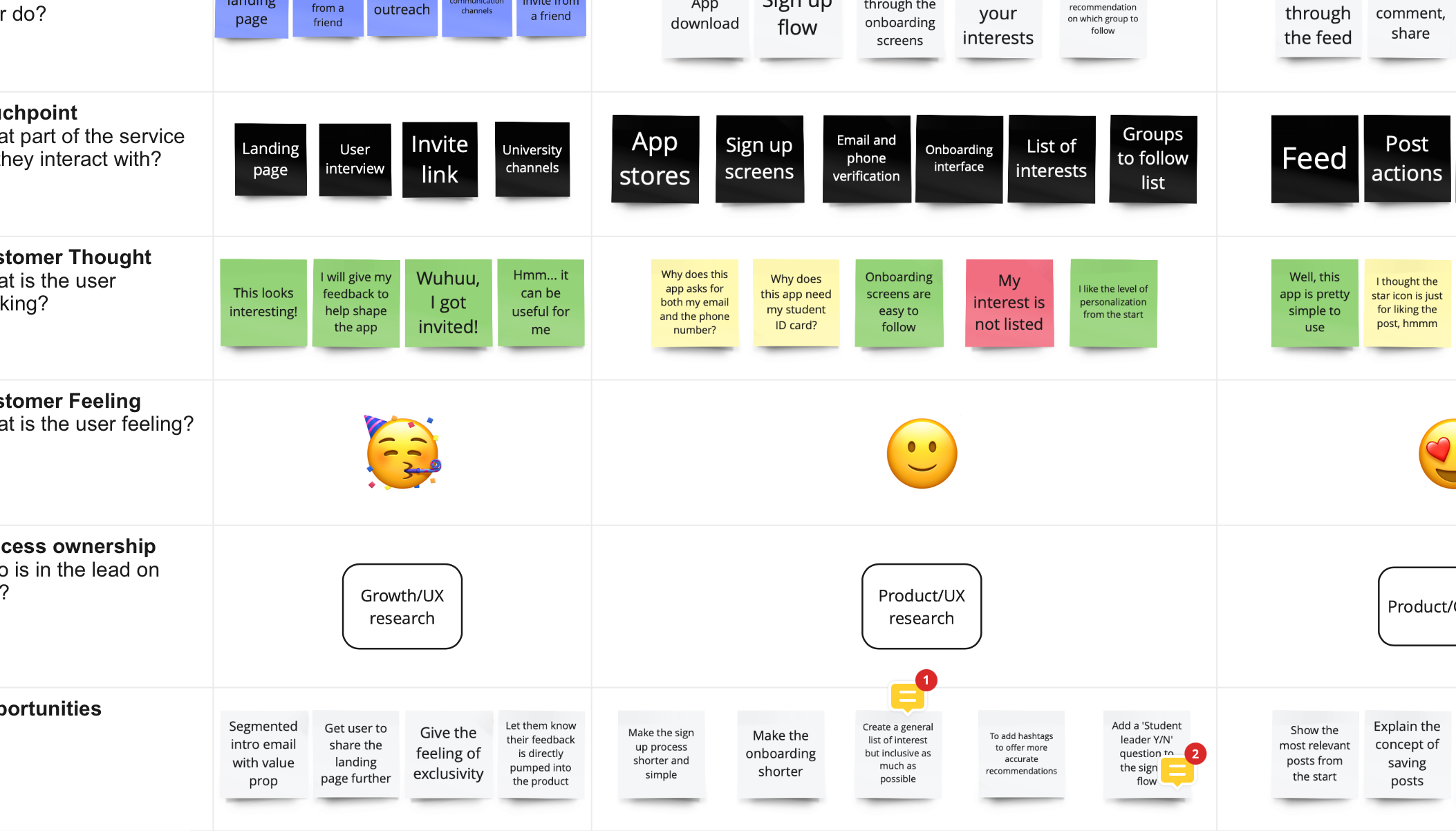
Research findings, collecting more than 1300 observations, over time, uncovered main pain points and areas for improvements allowing better iteration of wireframes and designs during the design process, improving user experience as a whole, and creation of optimal design solutions.
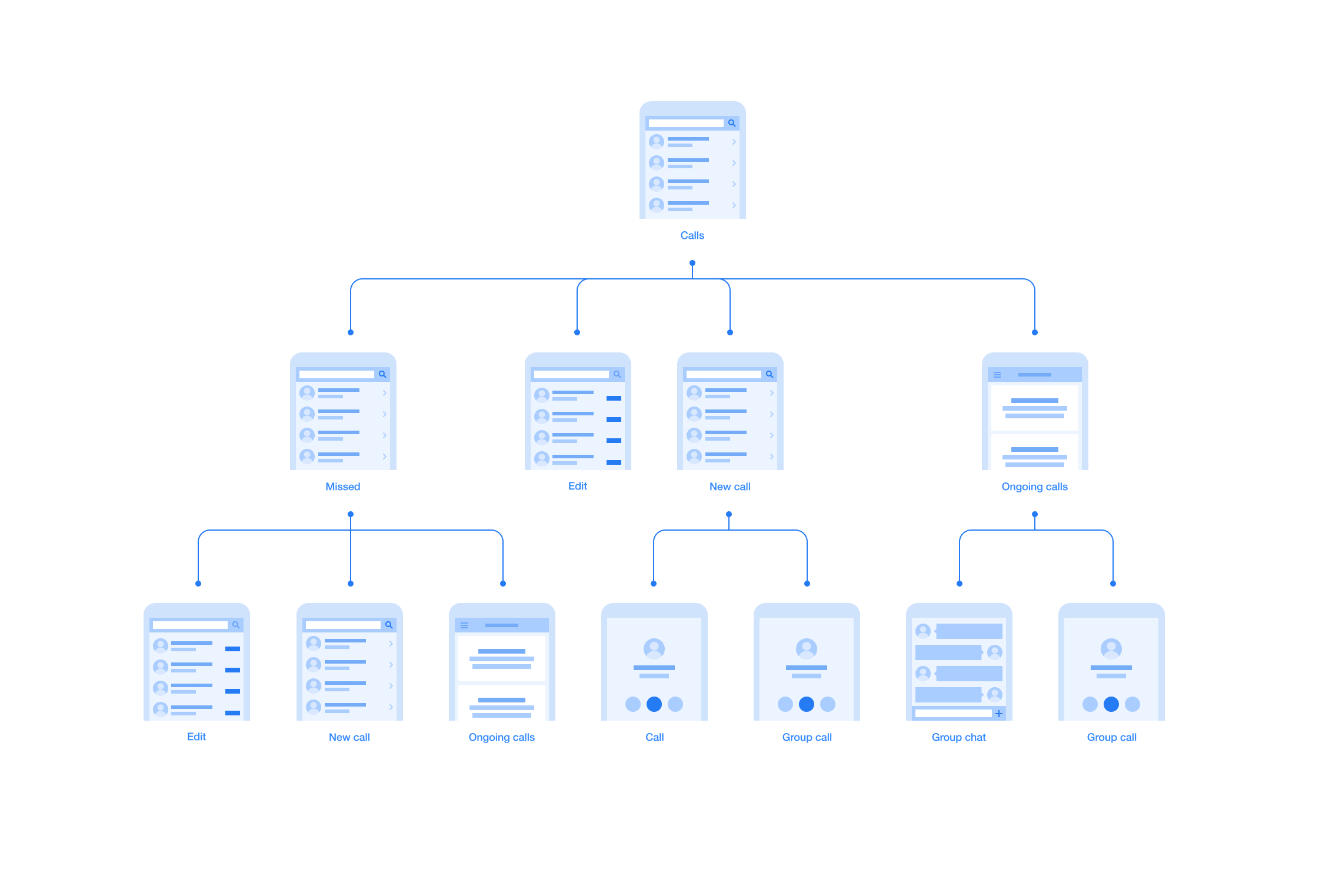
Flows for each section, each scenario
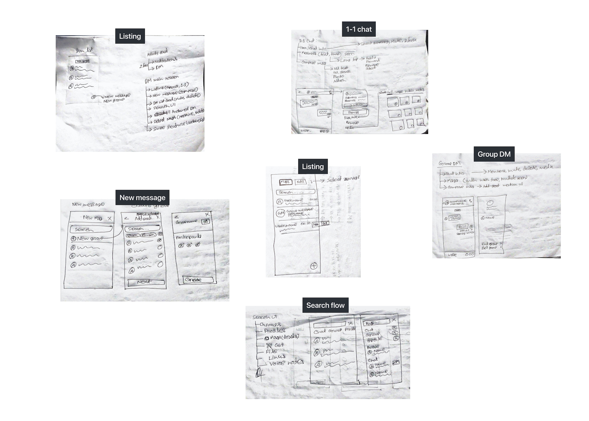
Hand sketches and digital wireframes
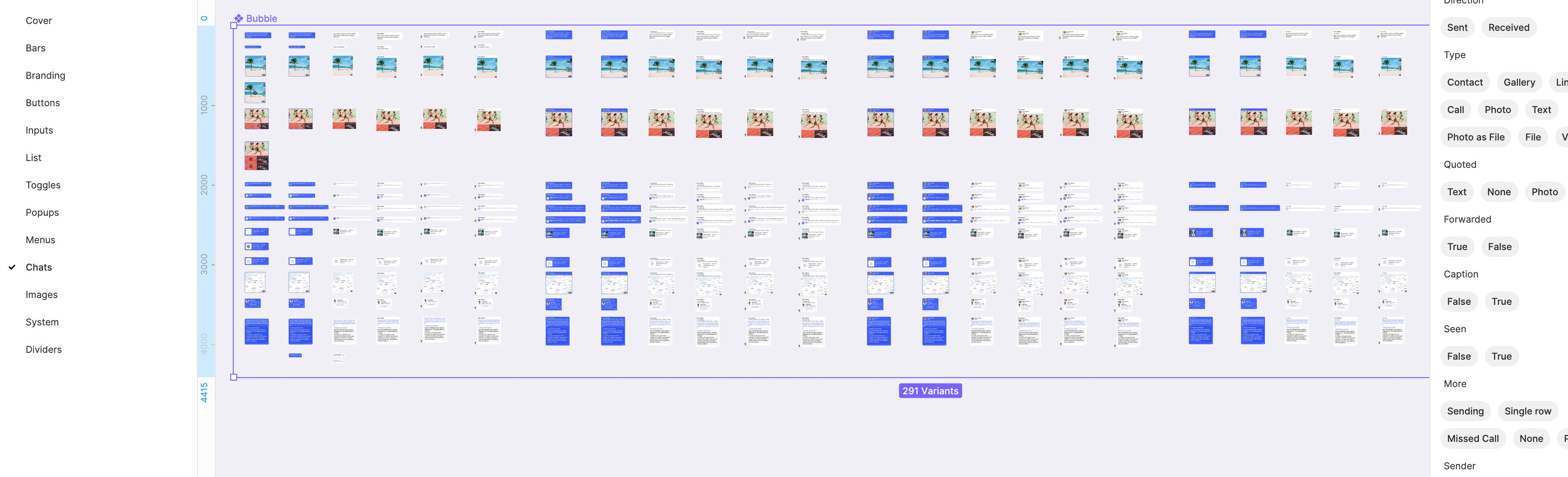
Complete design system for each platform
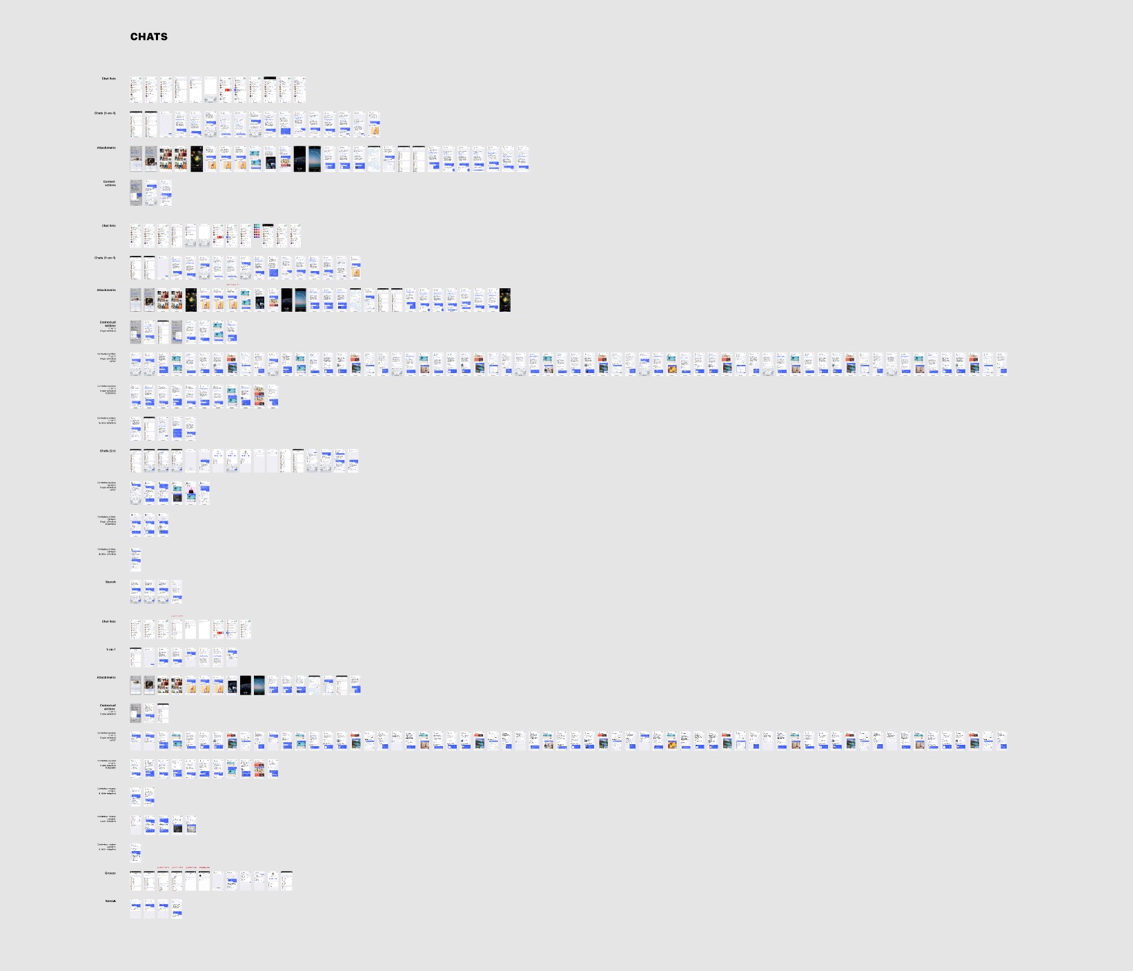
Detailed designs for every use case and every screen size
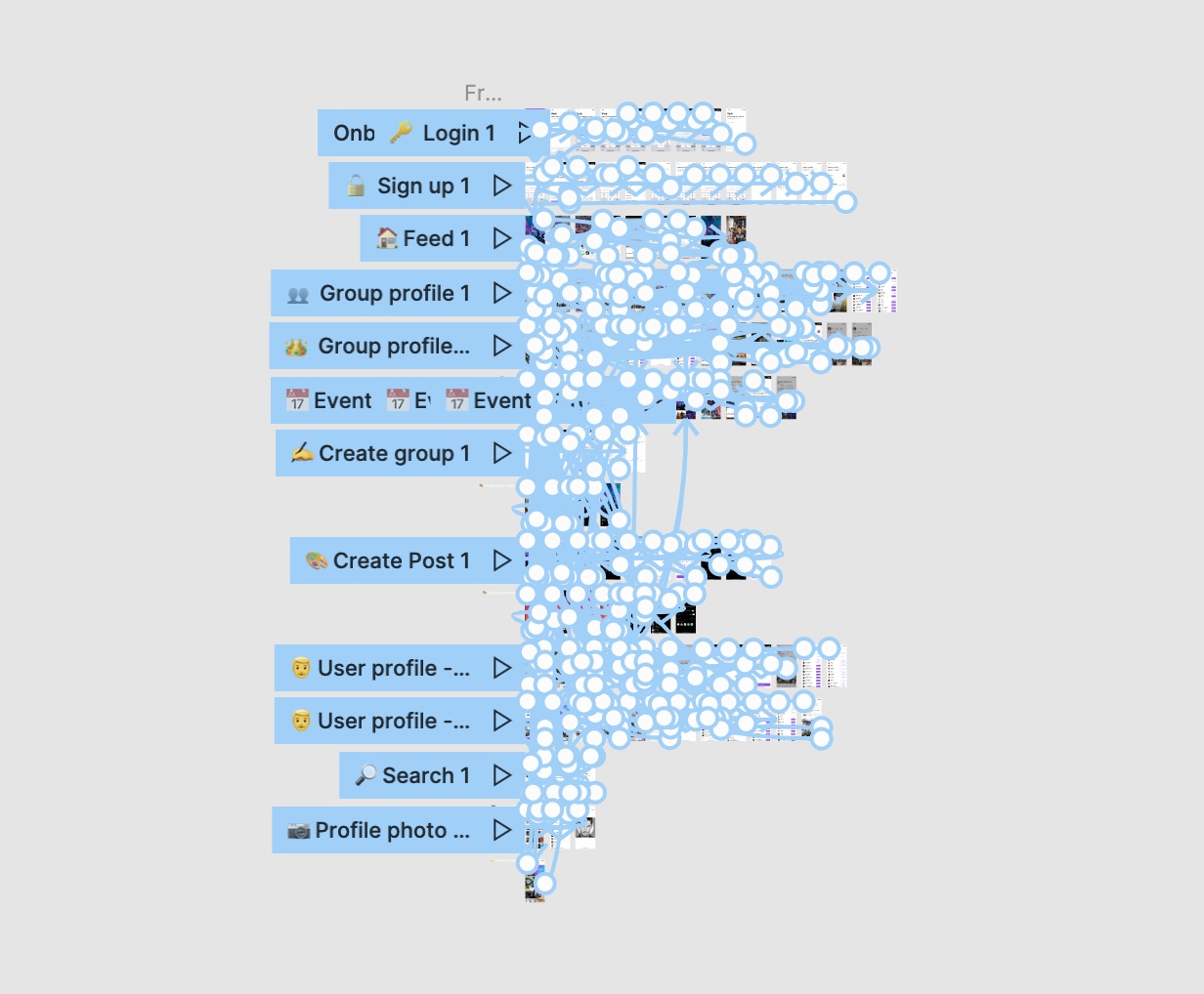
Prototyping on all levels
Each final implementation went through several iterations of user-testing to meet their specific needs. Data from usability tests and other research got used extensively for constant improvements in designs to provide an optimal user experience.
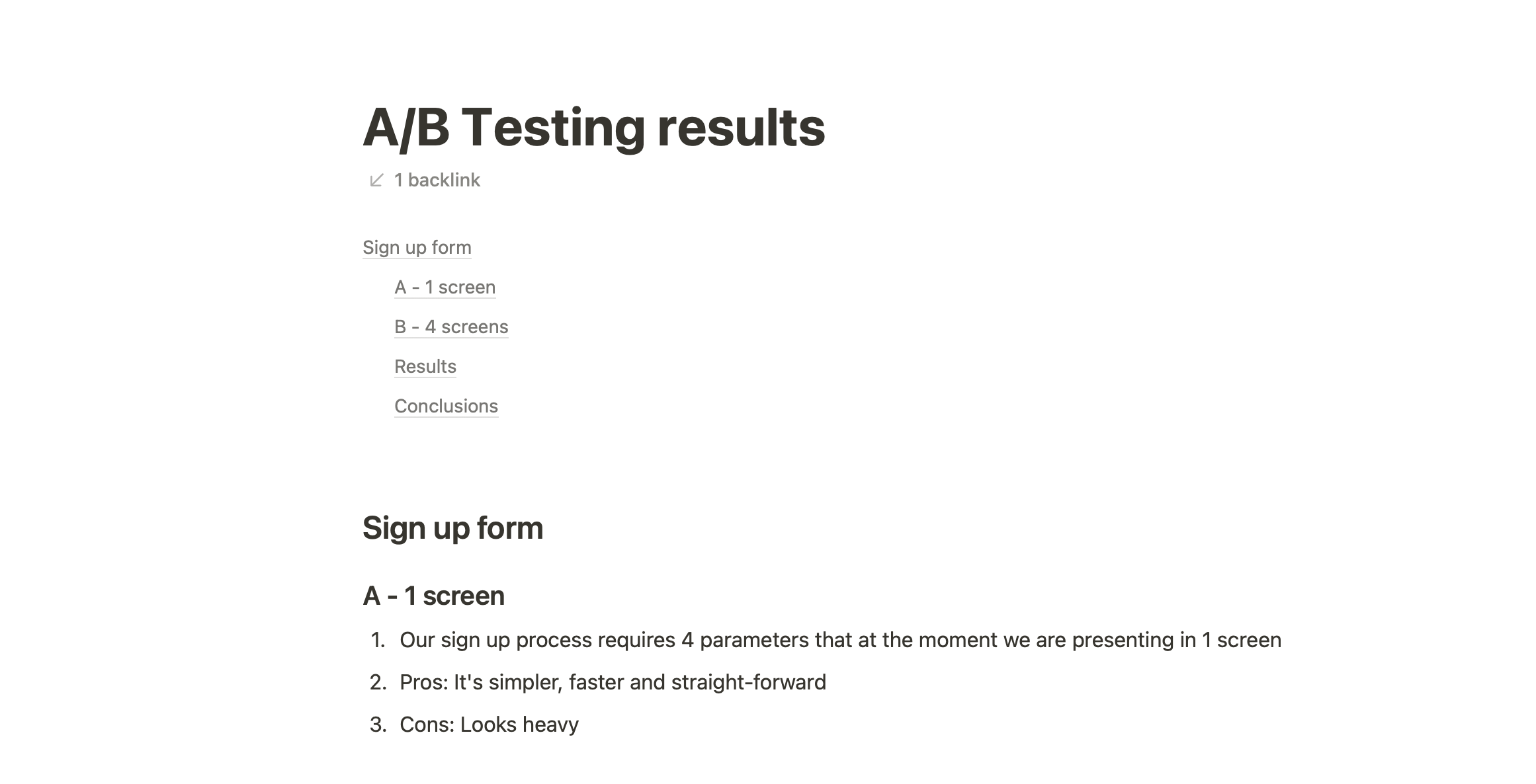
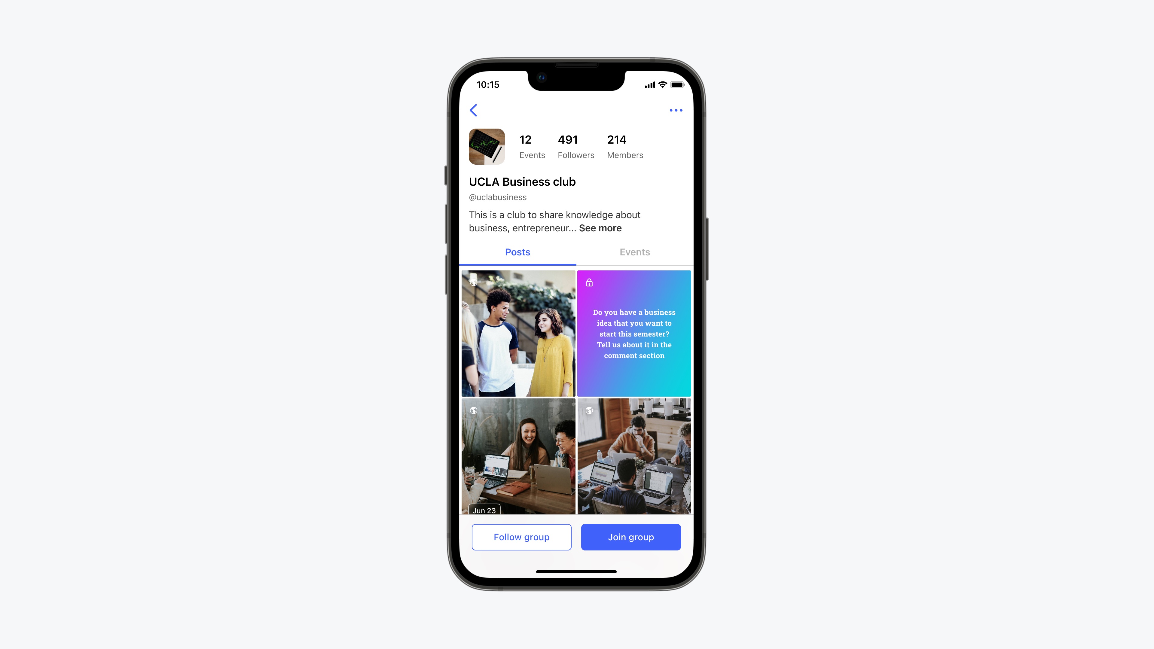
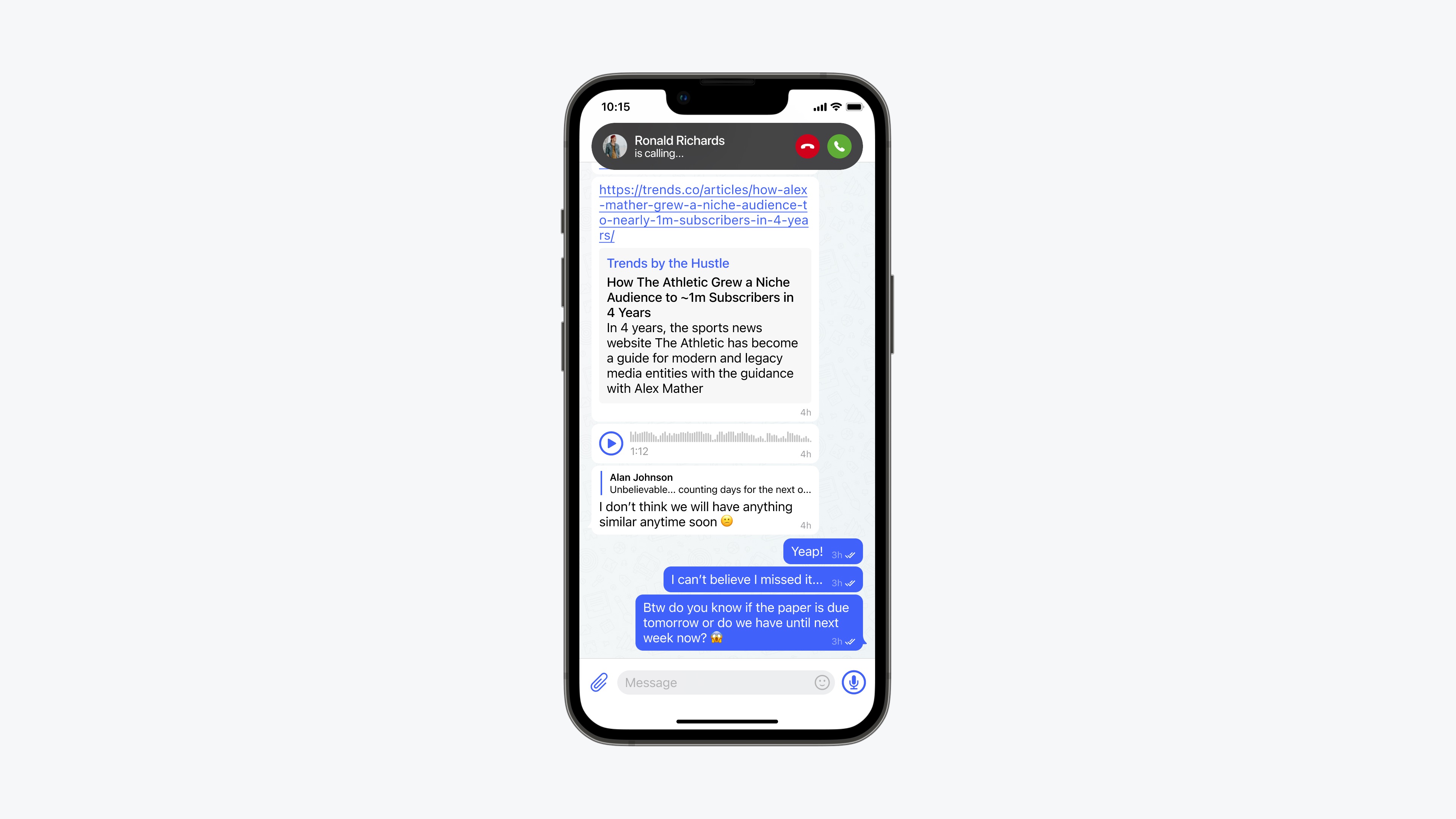
Our designs included all mayor platforms (iOS, iPad, Android, Web, Desktop) and all relevant screen sizes.

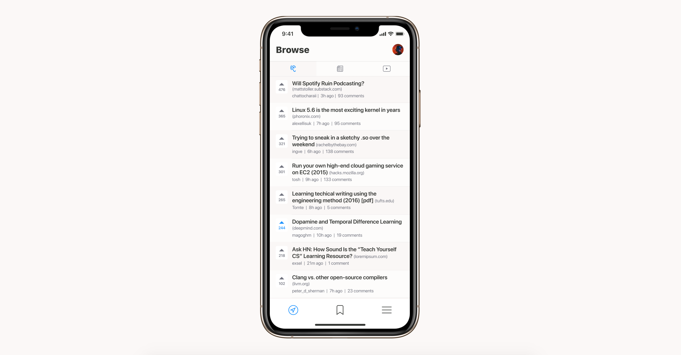
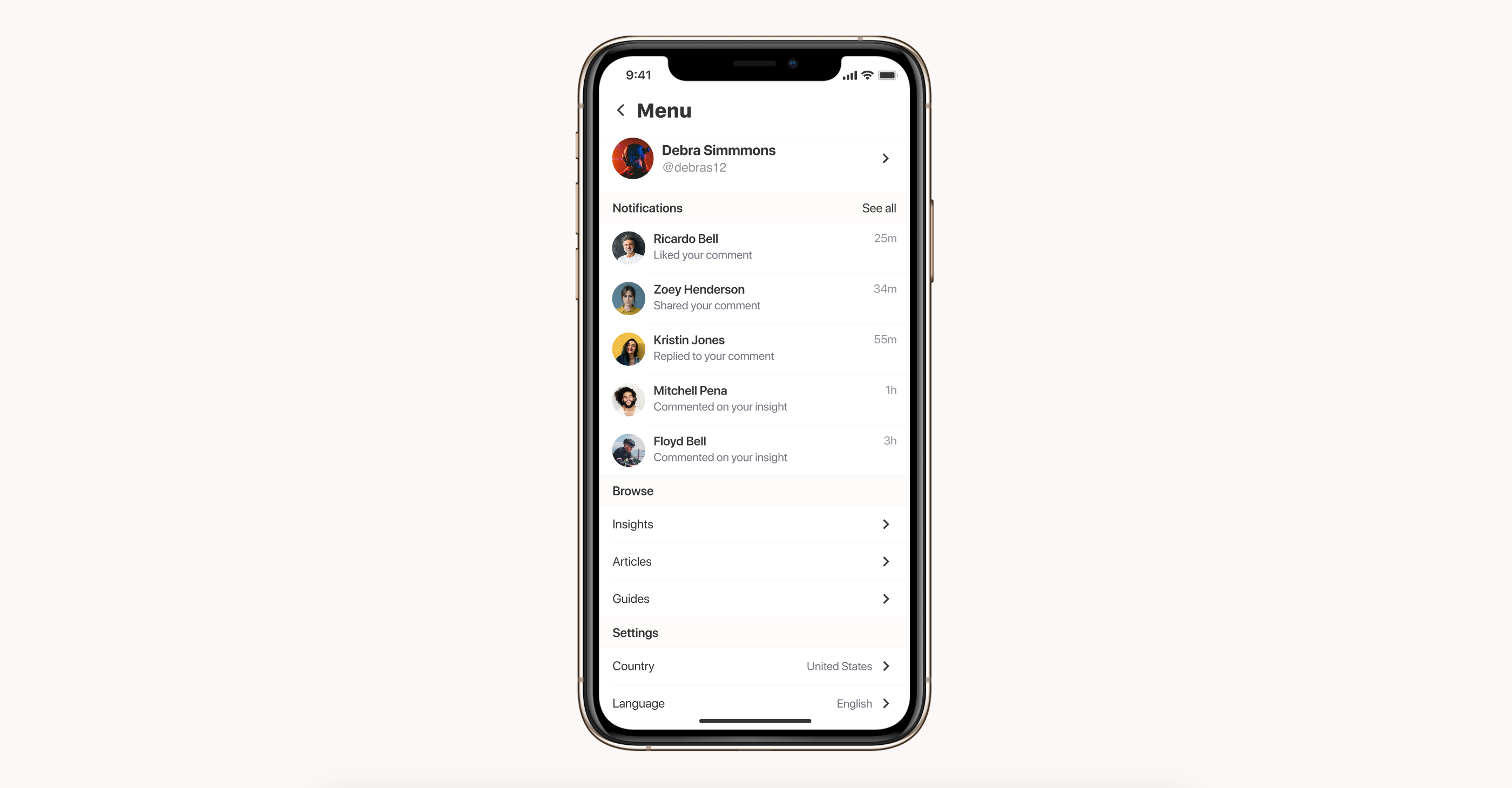
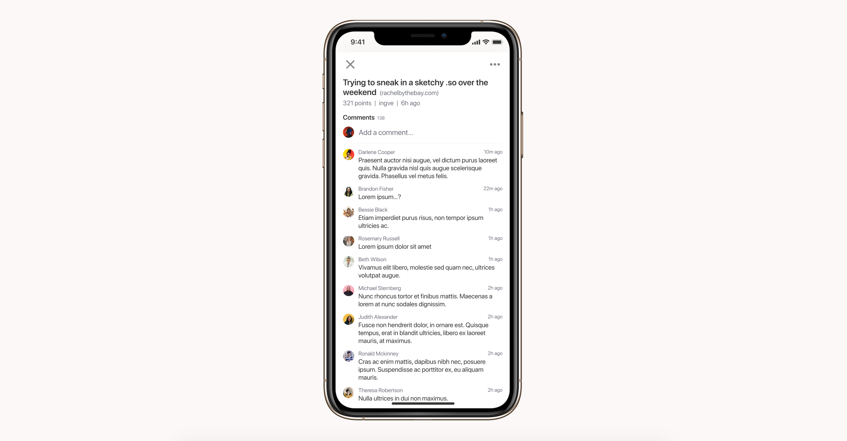
Hackernews clone app
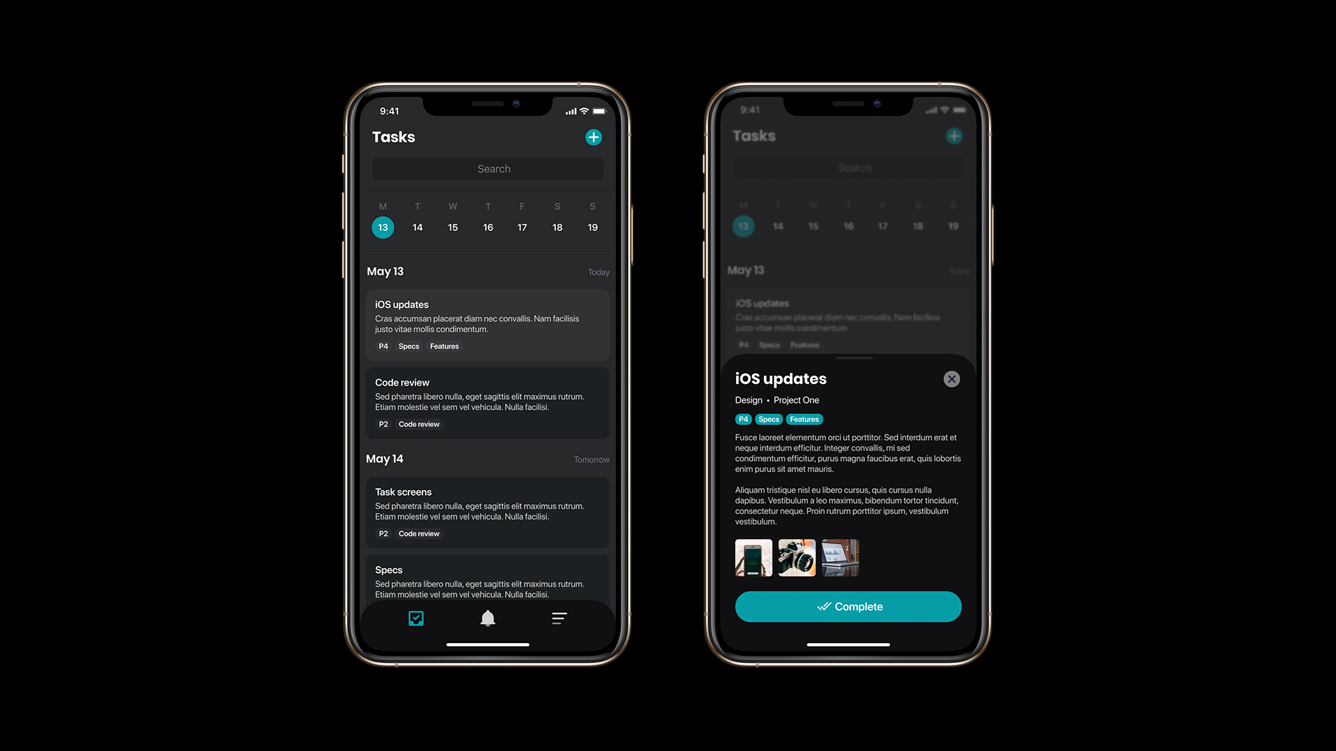
Tasks management mini app
Local master chefs’ homecooked meals discovery app
A food delivery platform celebrating all the amazing food that’s being cooked in a home environment, a place where food lovers can discover homecooked meals for delivery by local master chefs, and culinary artists can share their delicious creations with hungry customers.
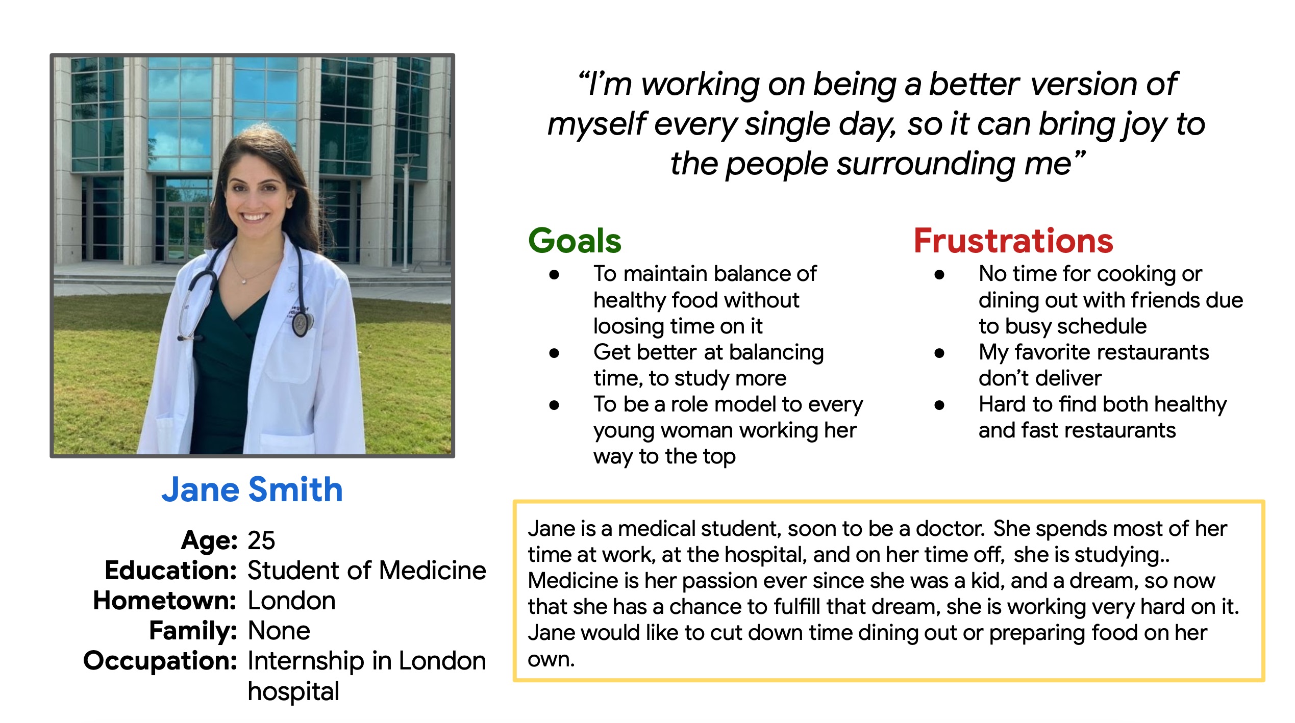
- Users
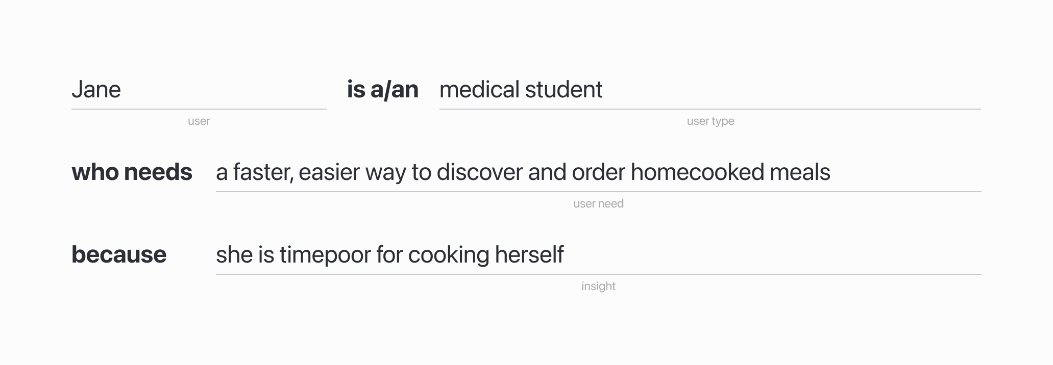
- Problem
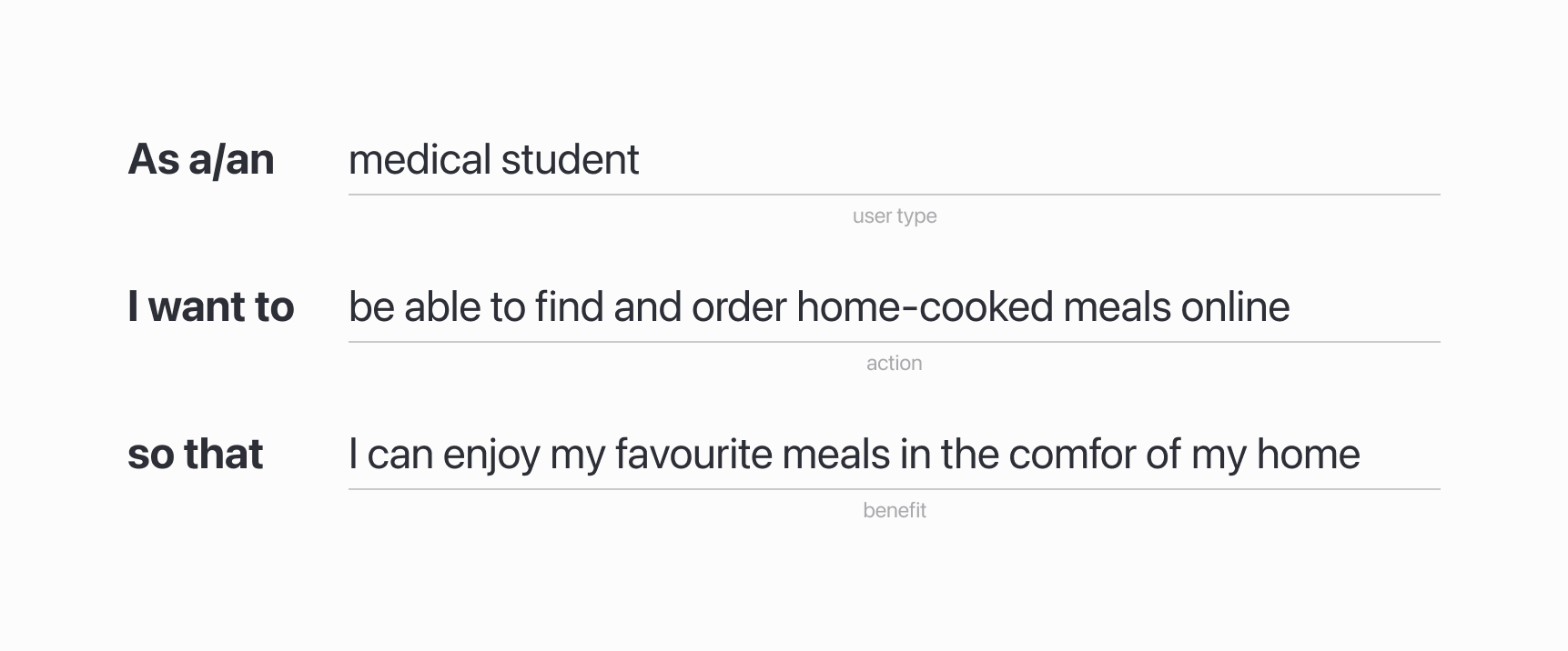
- User story
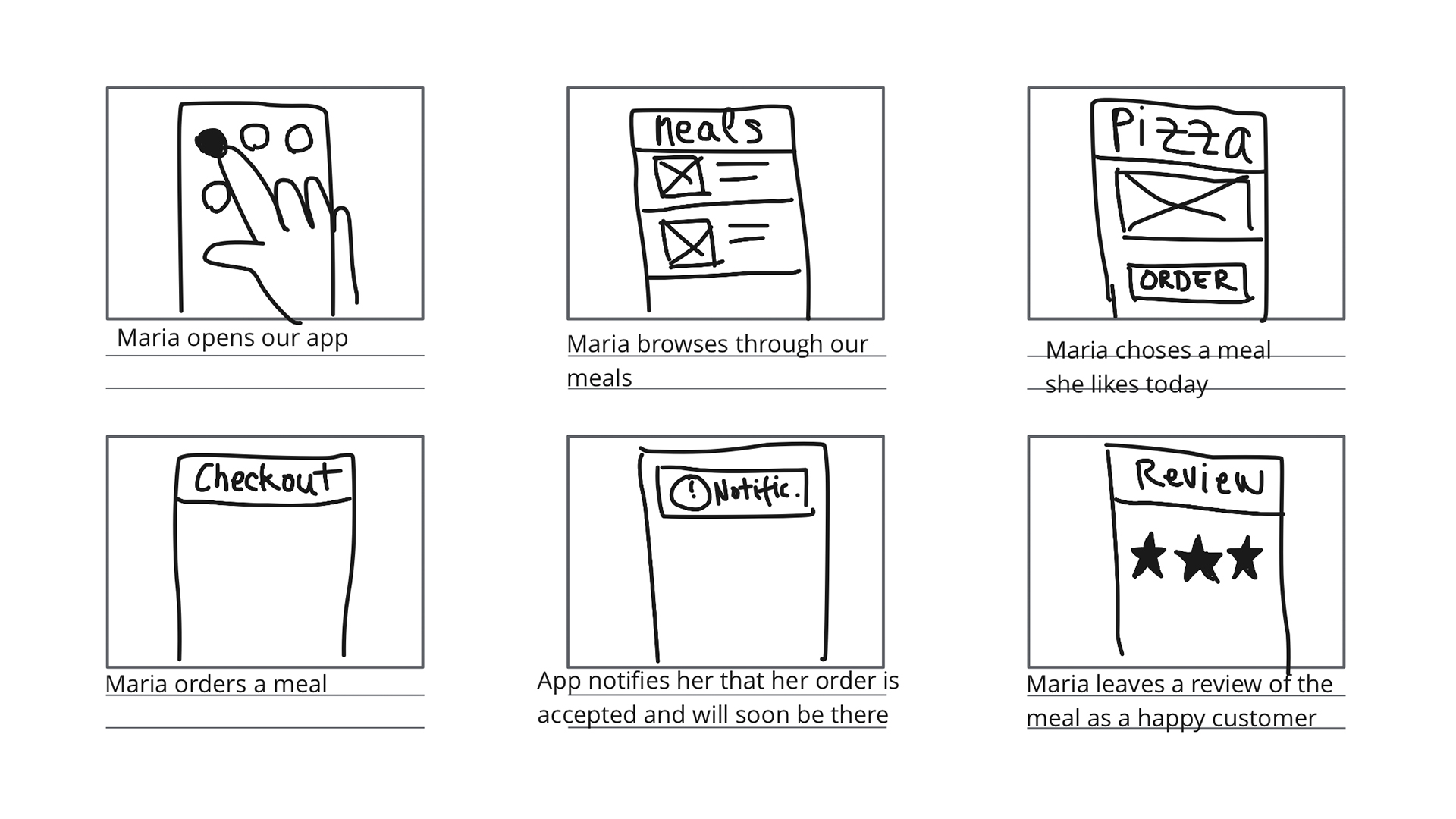
- Storyboards
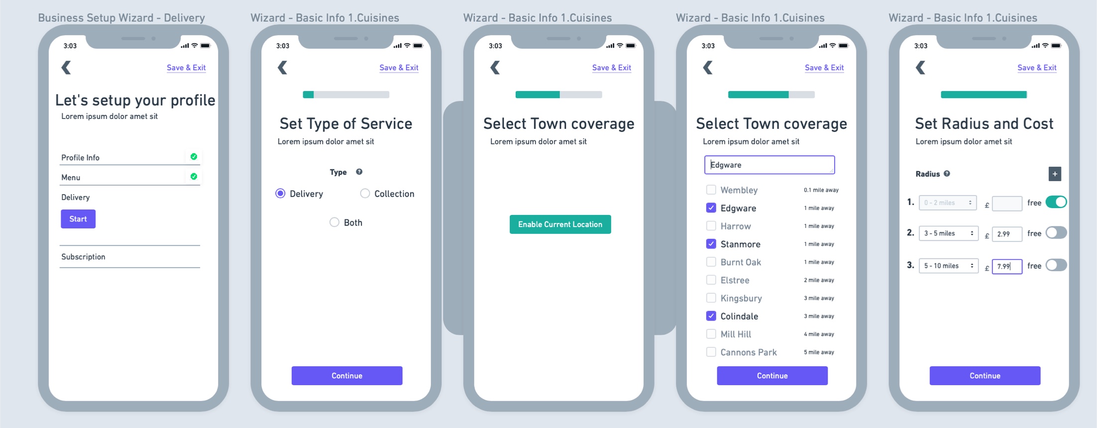
Quick digital wireframes before designs. Given all the functionalities, the wireframes were massive!
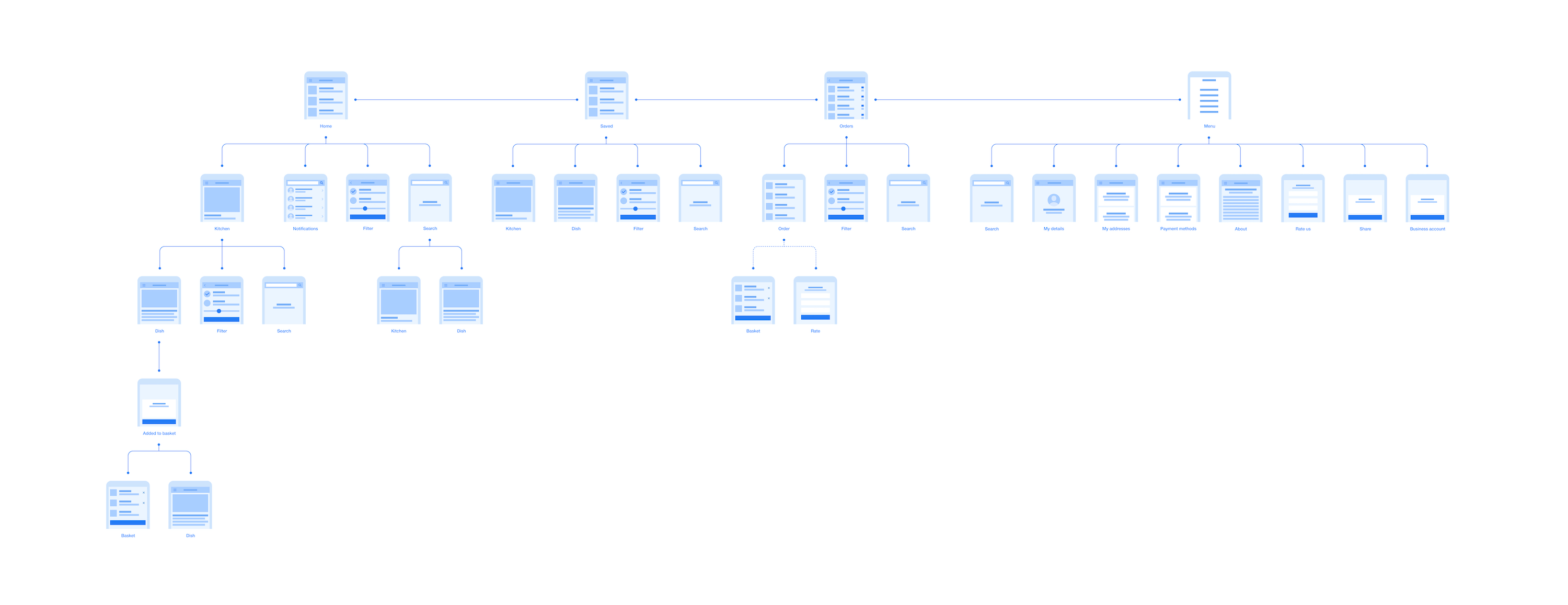
General and detailed flows
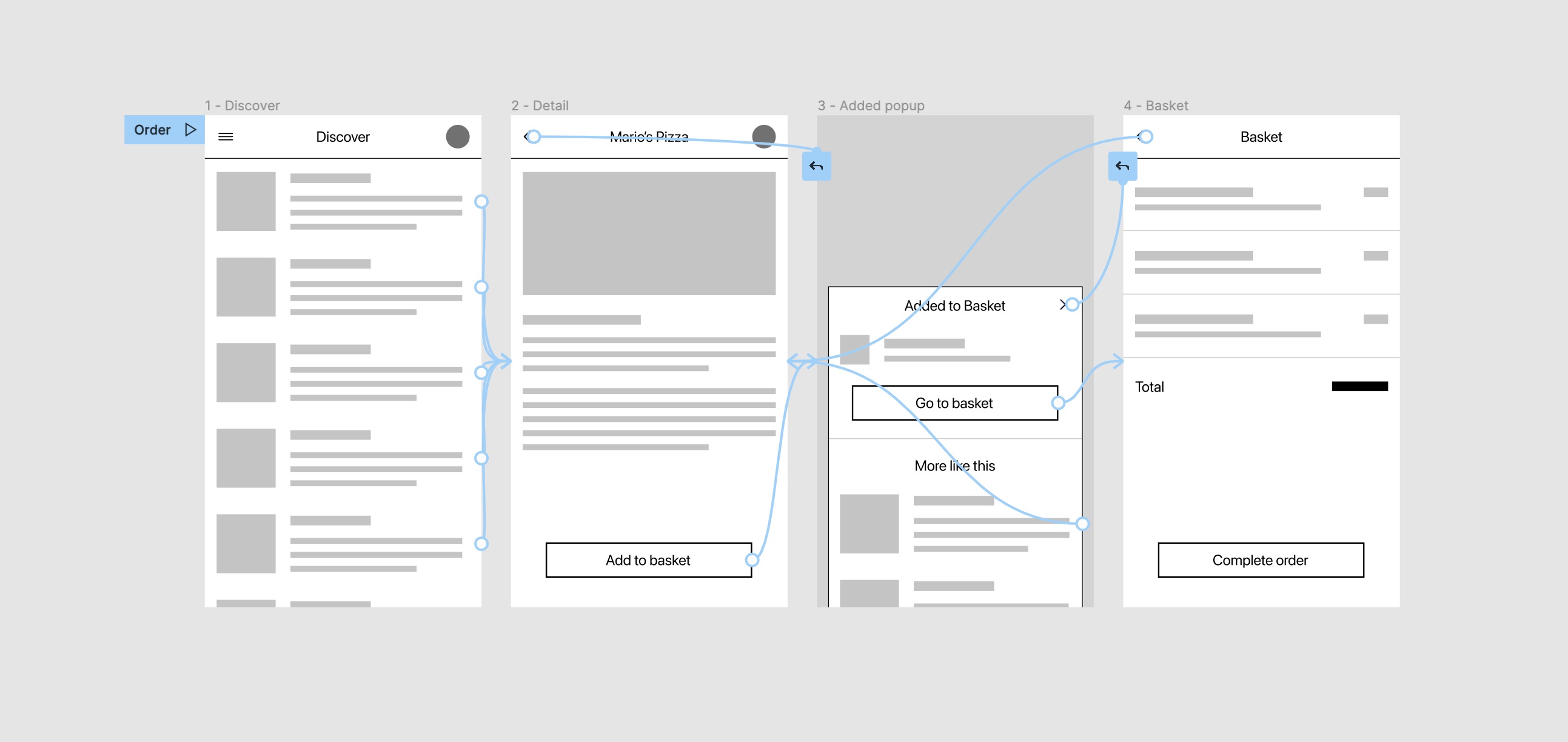
Low fidelity prototypes
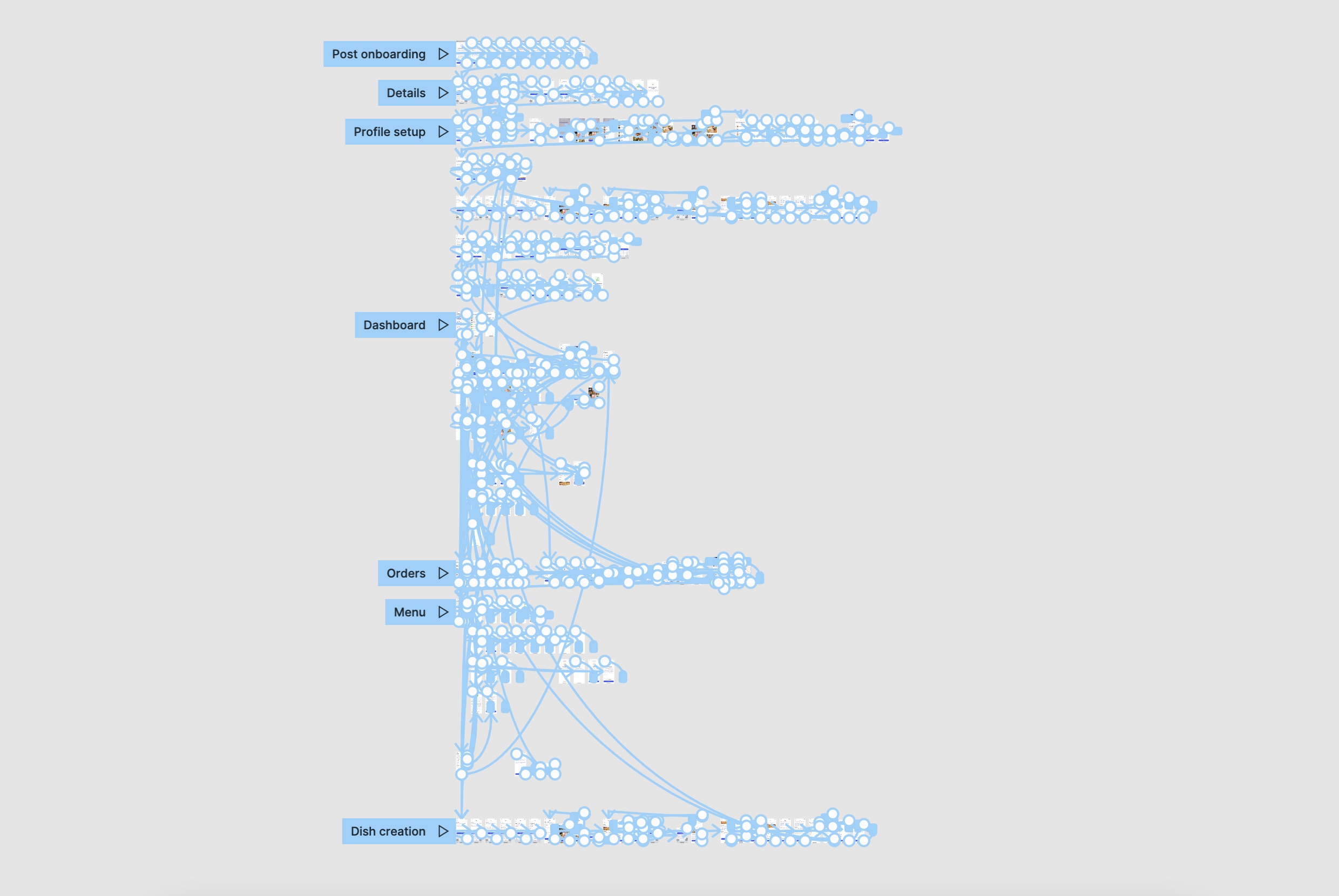
In-depth prototyping with crucial flow and interactions insights

Detailed designs with every edge-case scenario covered
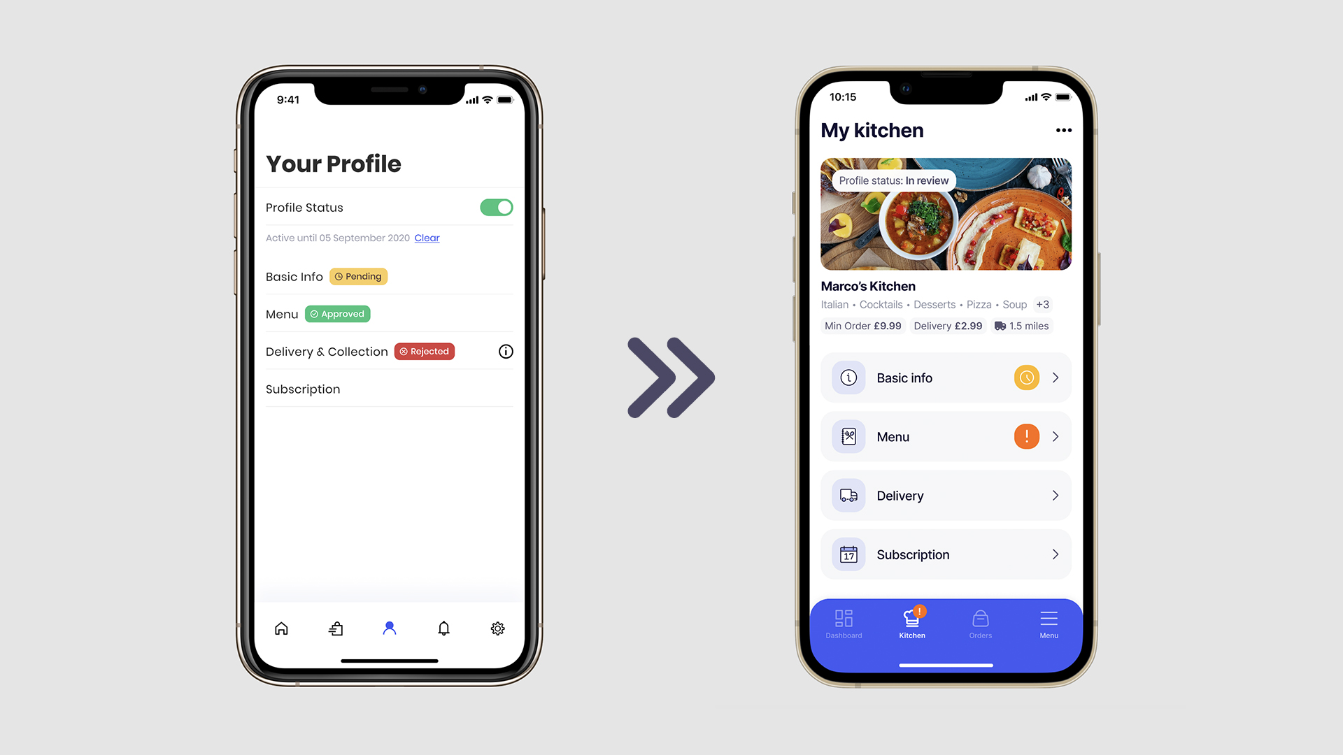
Versioned improvements
With all elements included, from typography, colors to UI components.
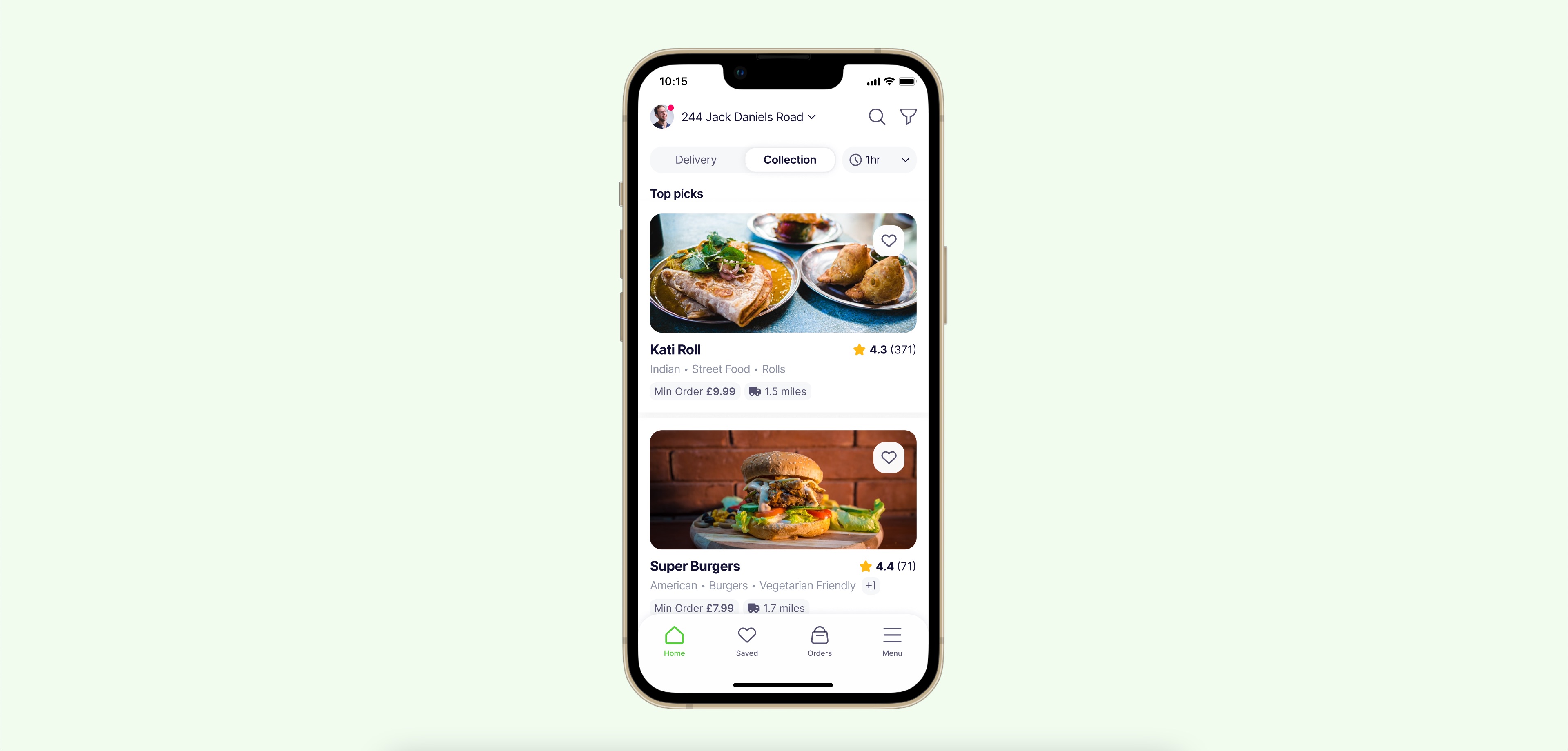
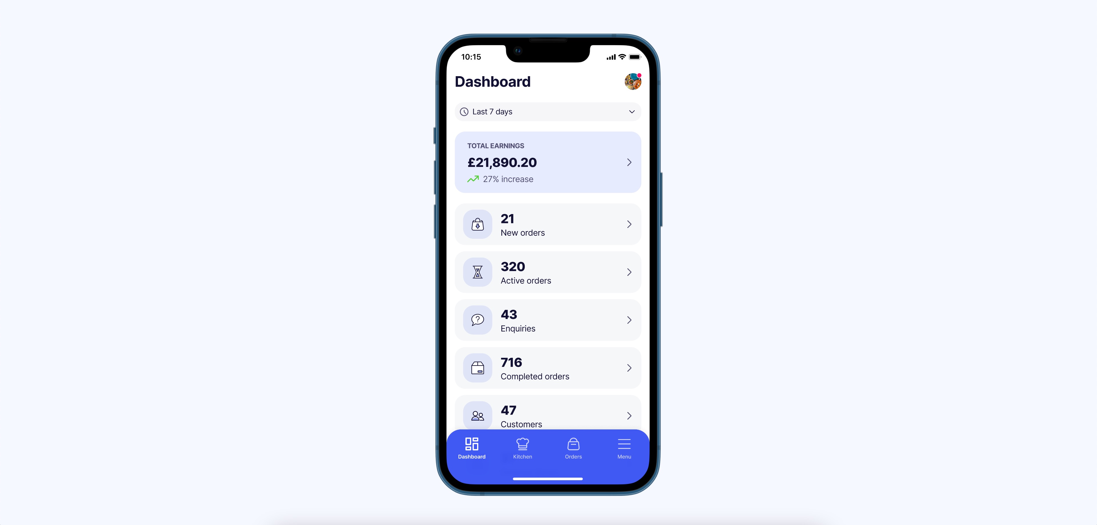
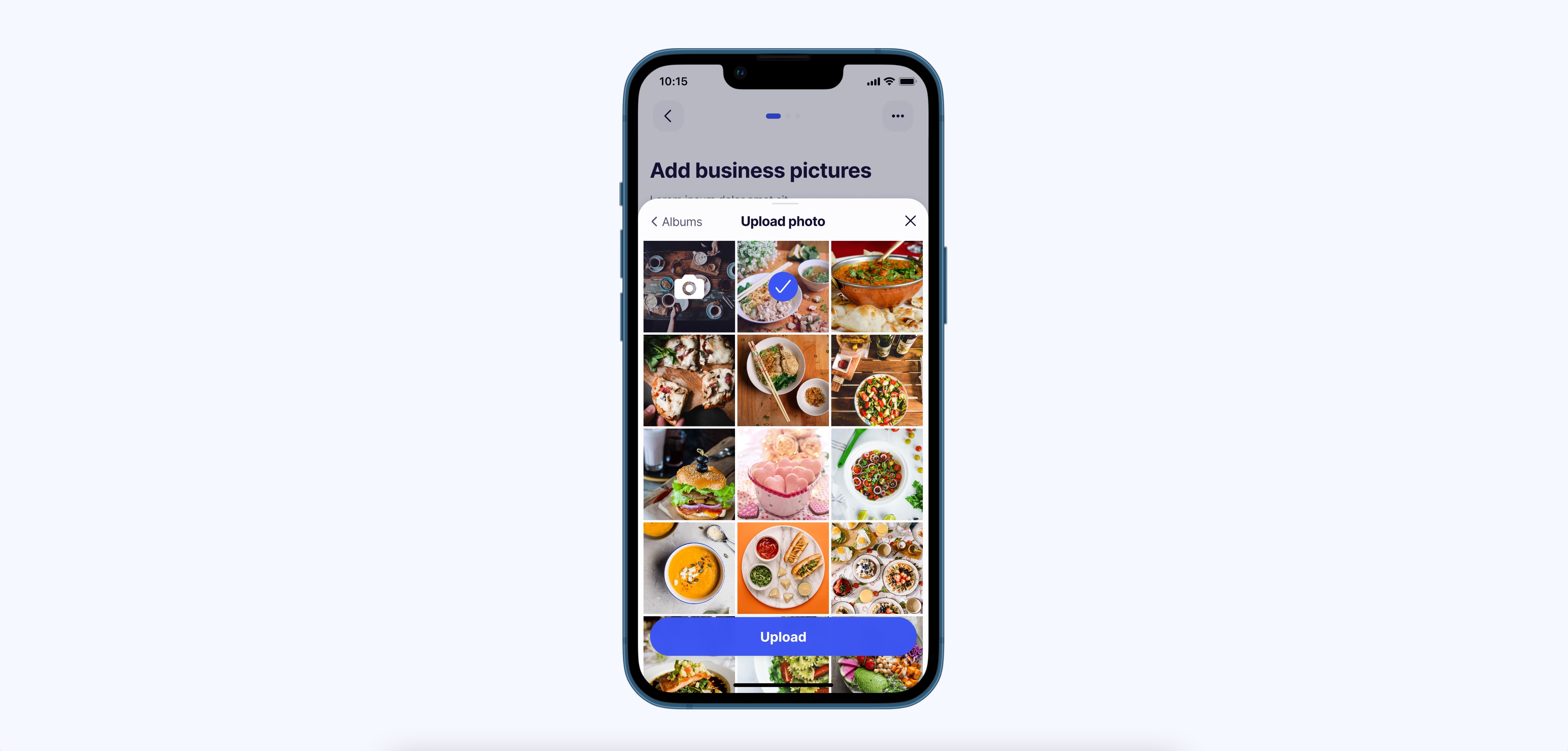
The part of the app for broad audience, a one-stop shop for users to find and order meals they love.
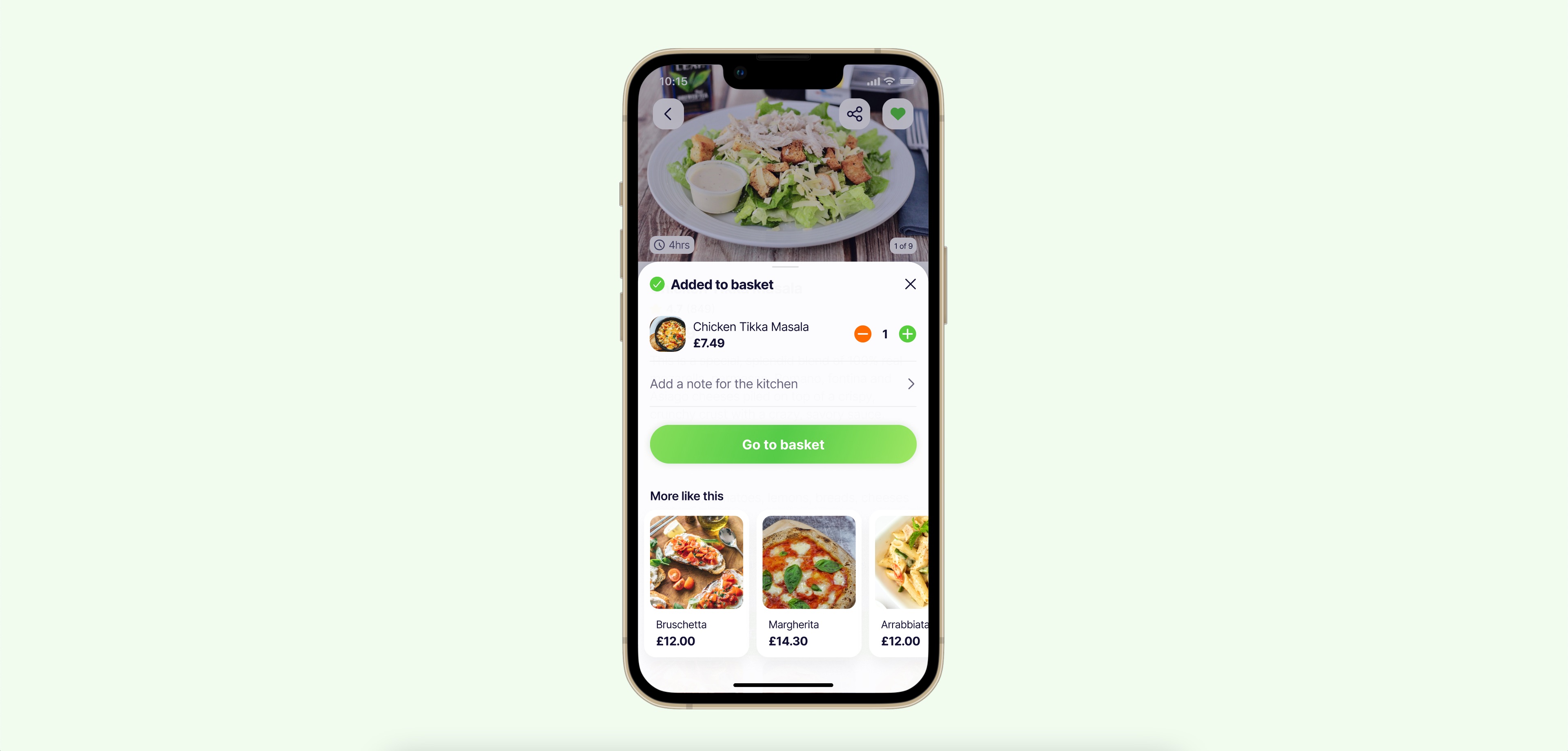
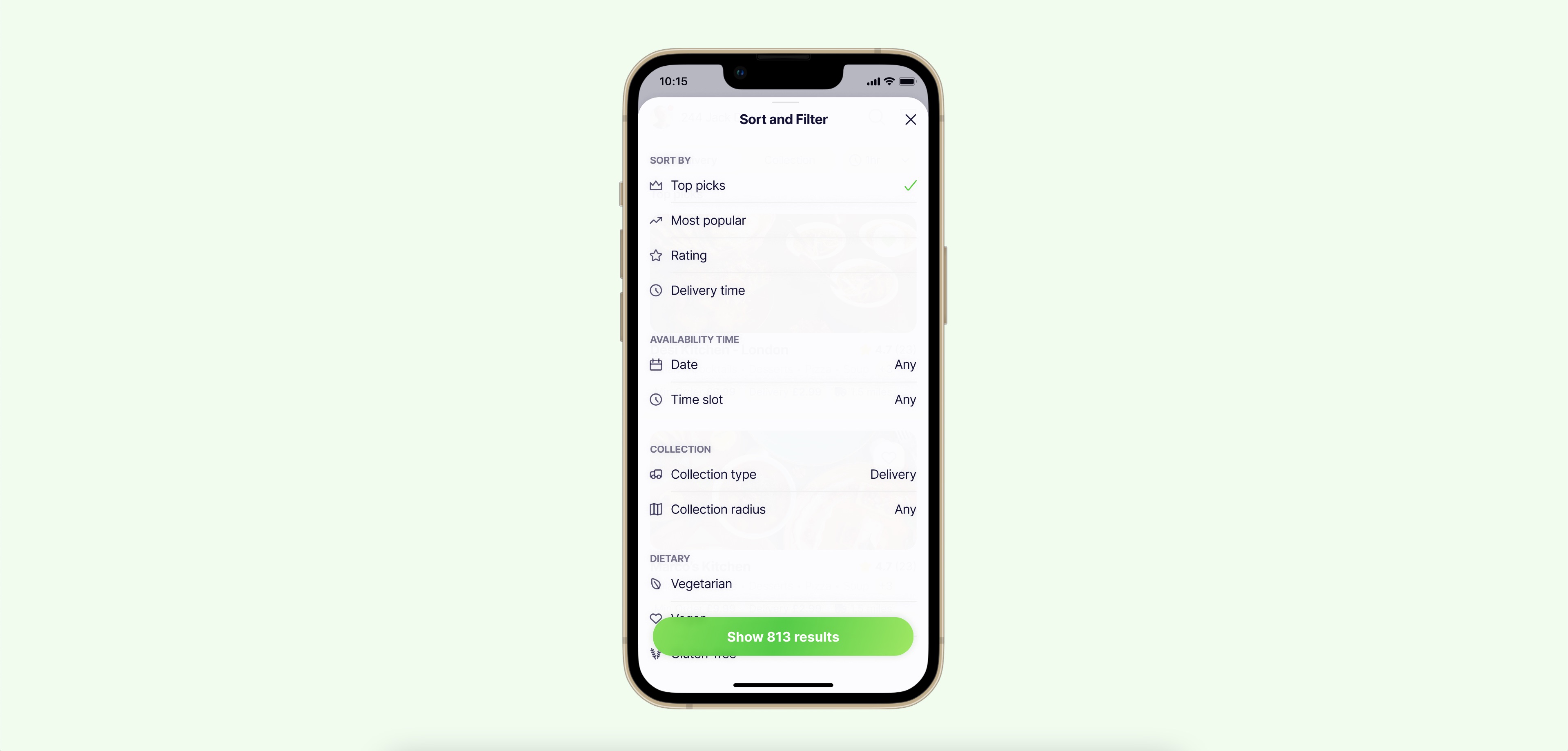
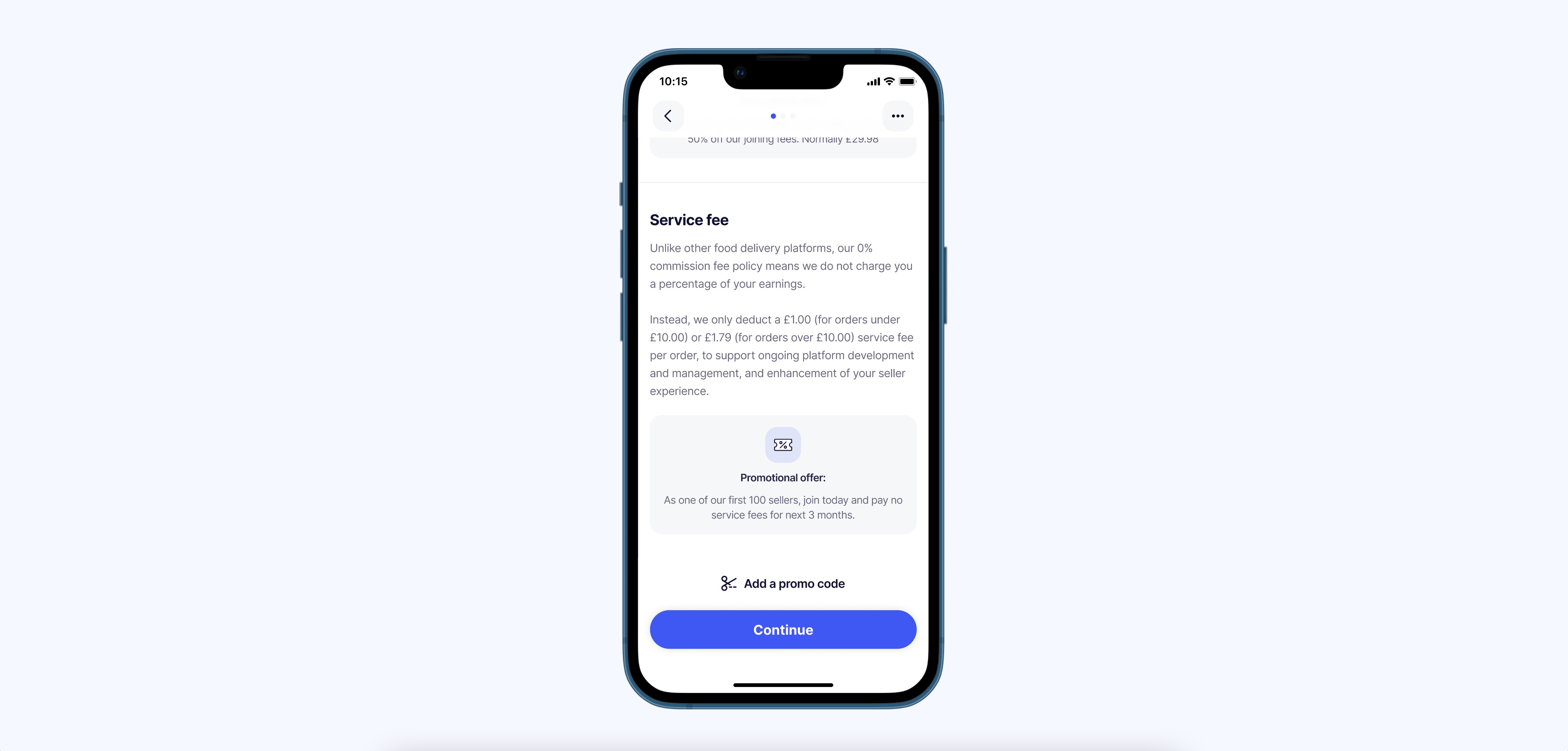
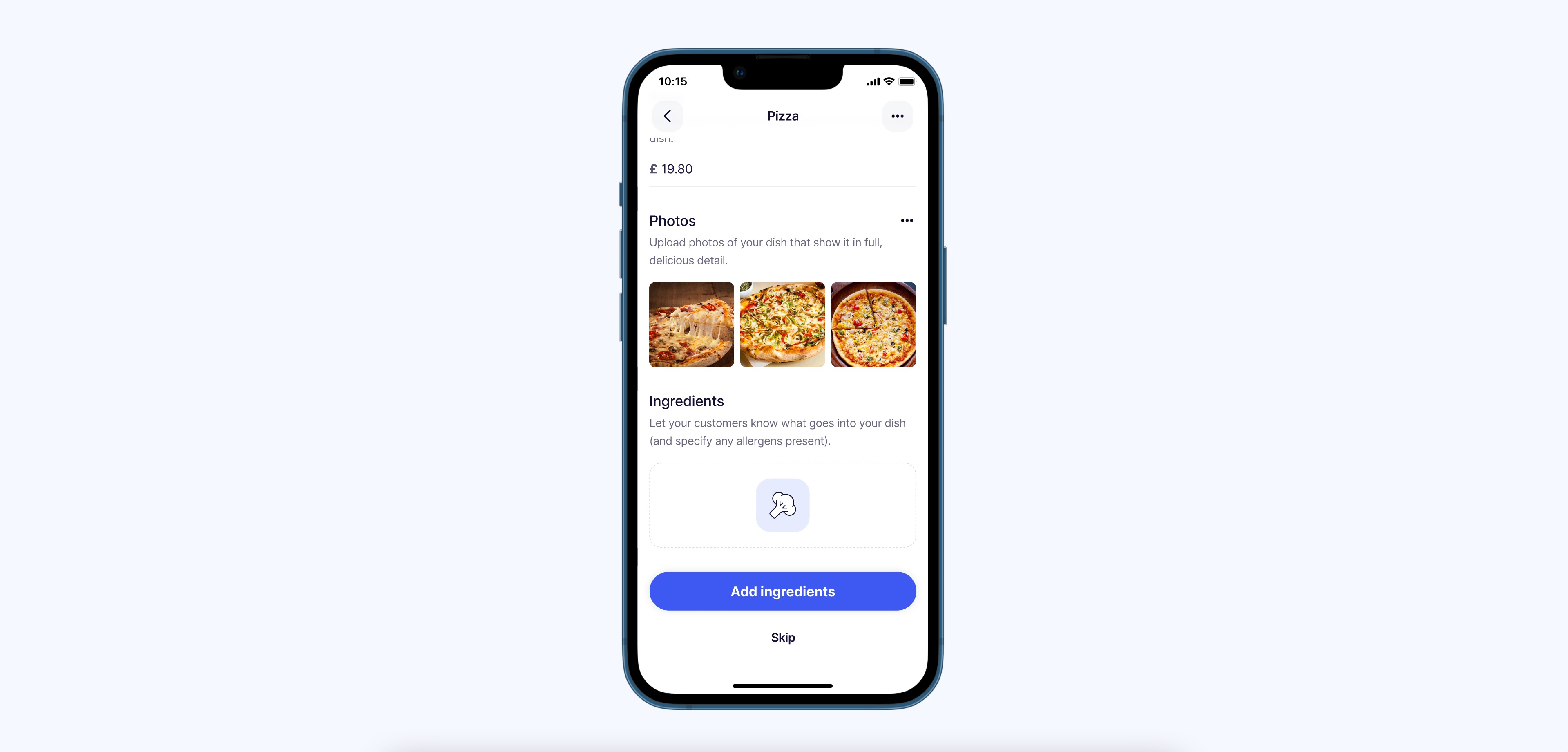
Firmly tied to the discovery app, business side is a place where chefs can share their home-cooked delights with the local community and enjoy a new income stream.
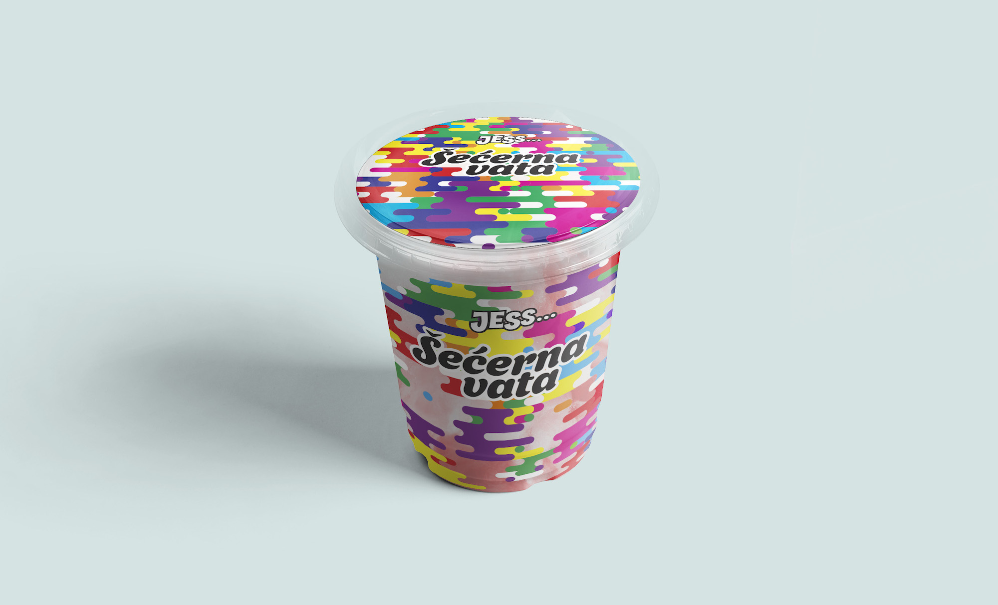
Cotton candy packaging design
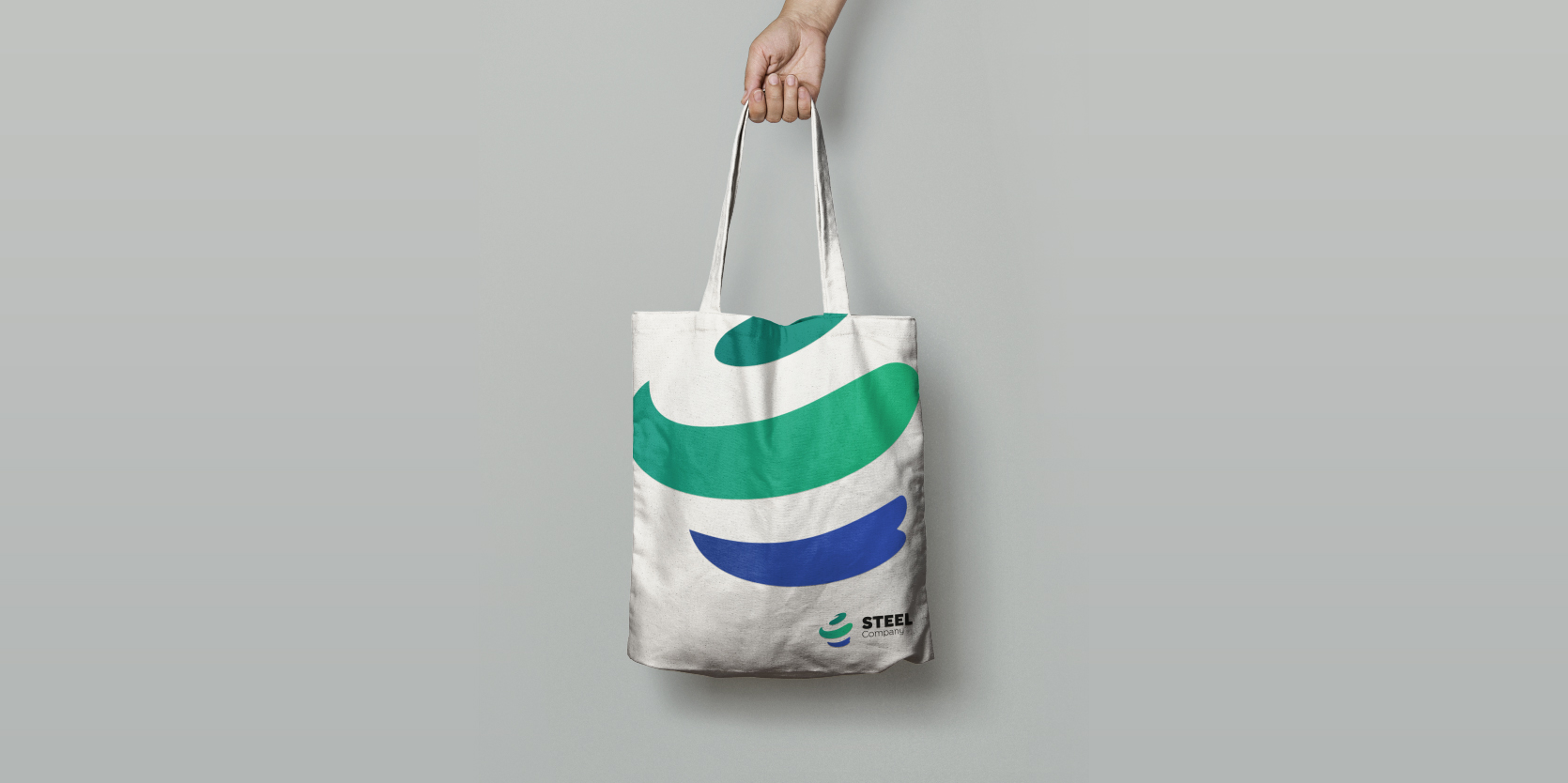
Steel company logo

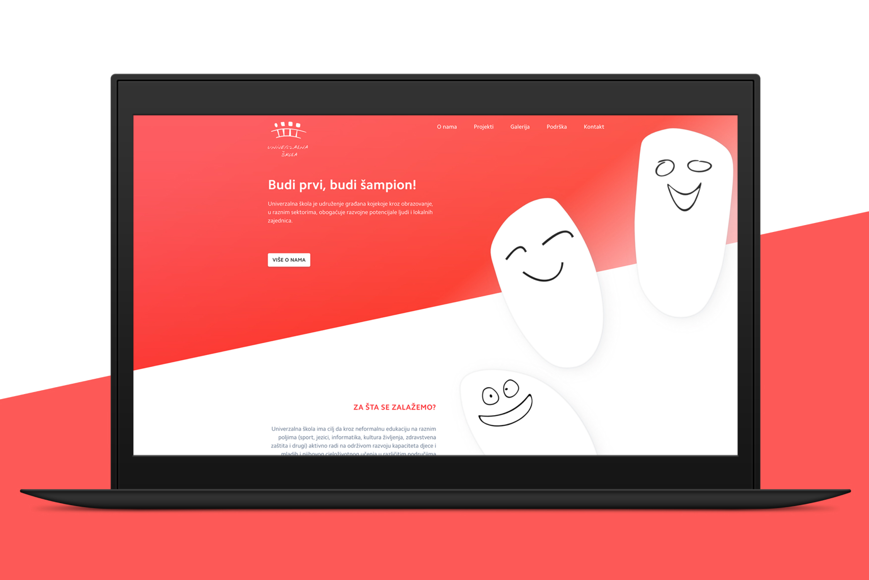
NGO identity and website
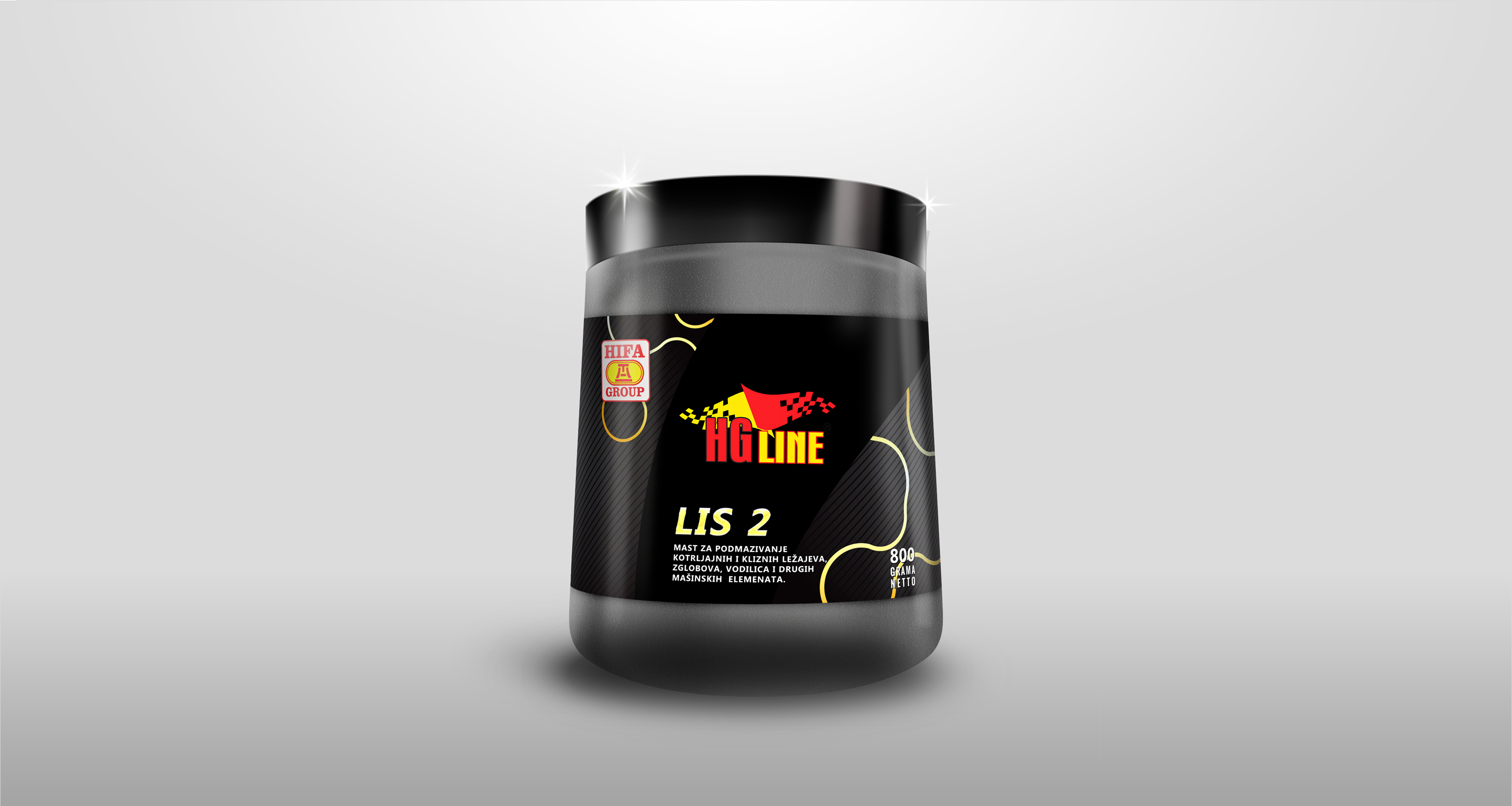
Lubricating grease packaging design
Hydraulic oils for the highest requirements. Carefully selected base oils and a combination of additives ensure excellent hydrolytic and thermal stability, wear and corrosion protection, and excellent low temperature properties. Oils are not susceptible to foaming.
Aleja logo design

Abitec logo upgrade
The redesign of the ABITEC logo included a modernization of the existing logo with additional modifications of colors and graphic elements in order to maintain recognizability and association with the old version of the logo.


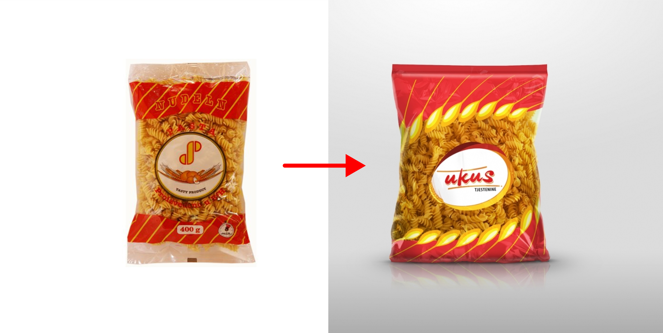
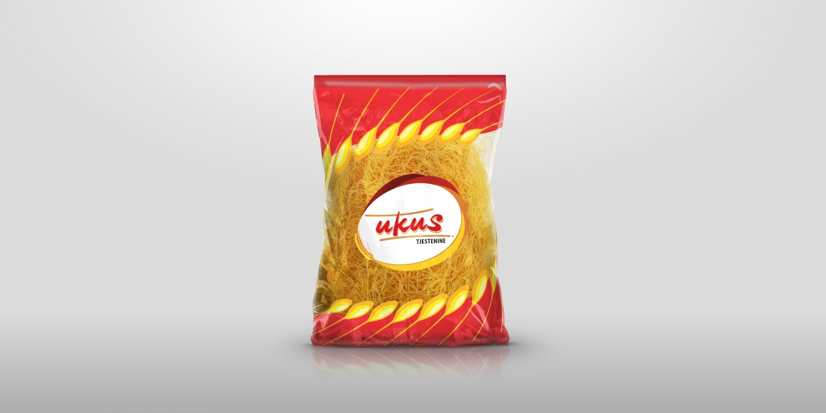
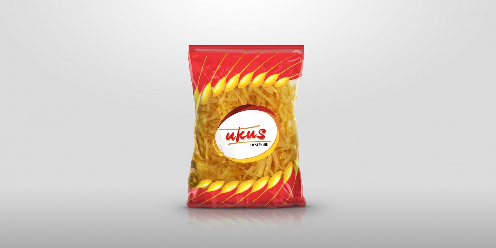
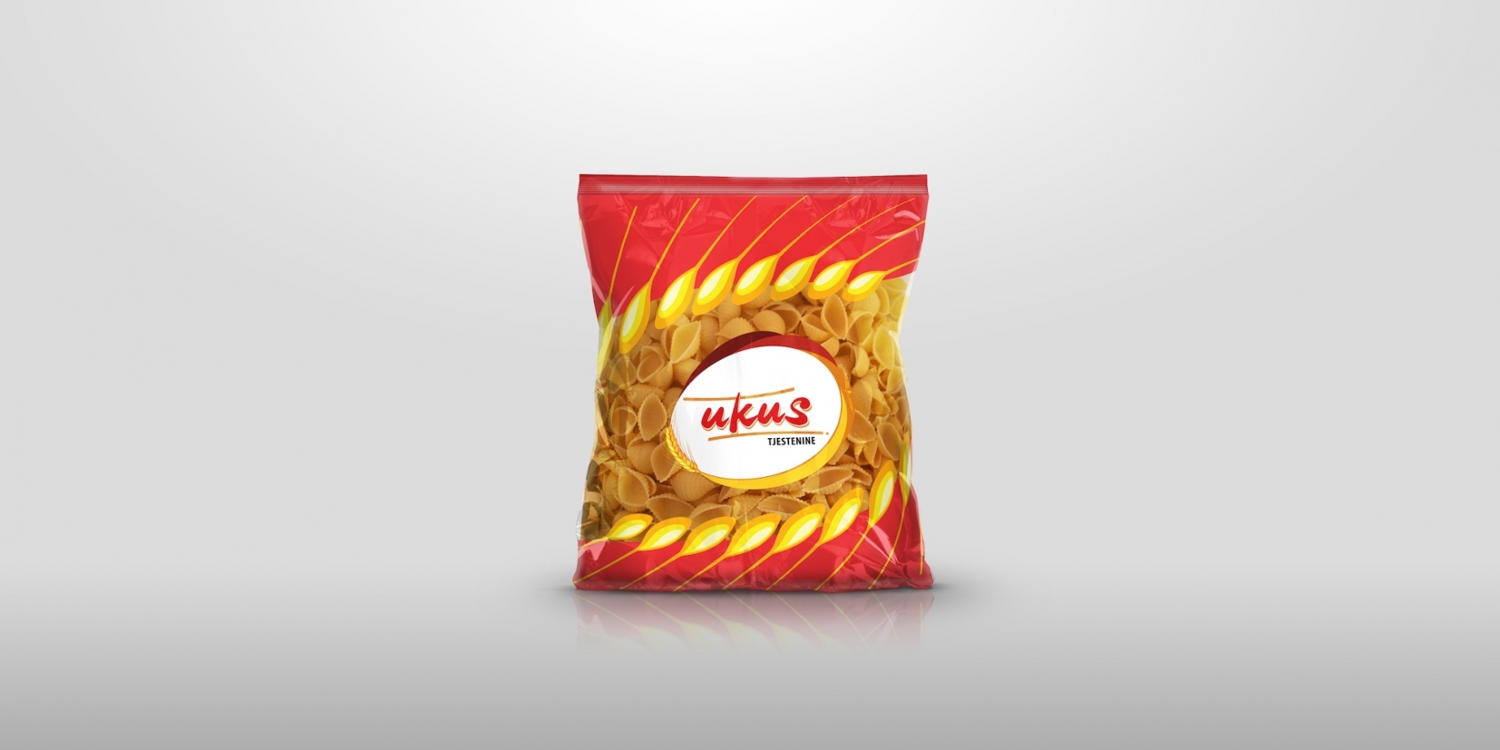
Pasta packaging design
Considering that a product was already an established one on its respective the market, it was essential to keep it recognisable at first glance.
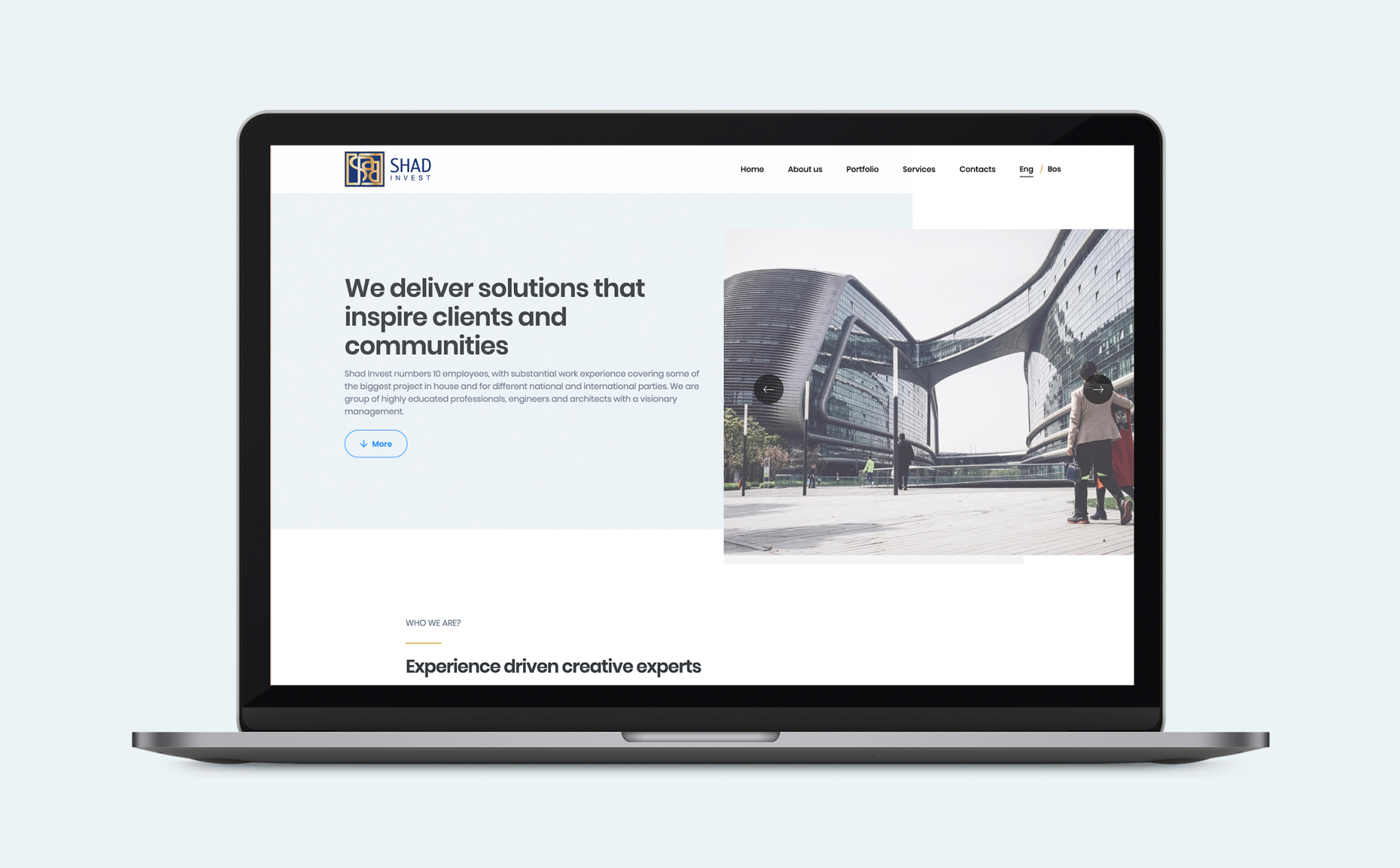
Architecture corporate website
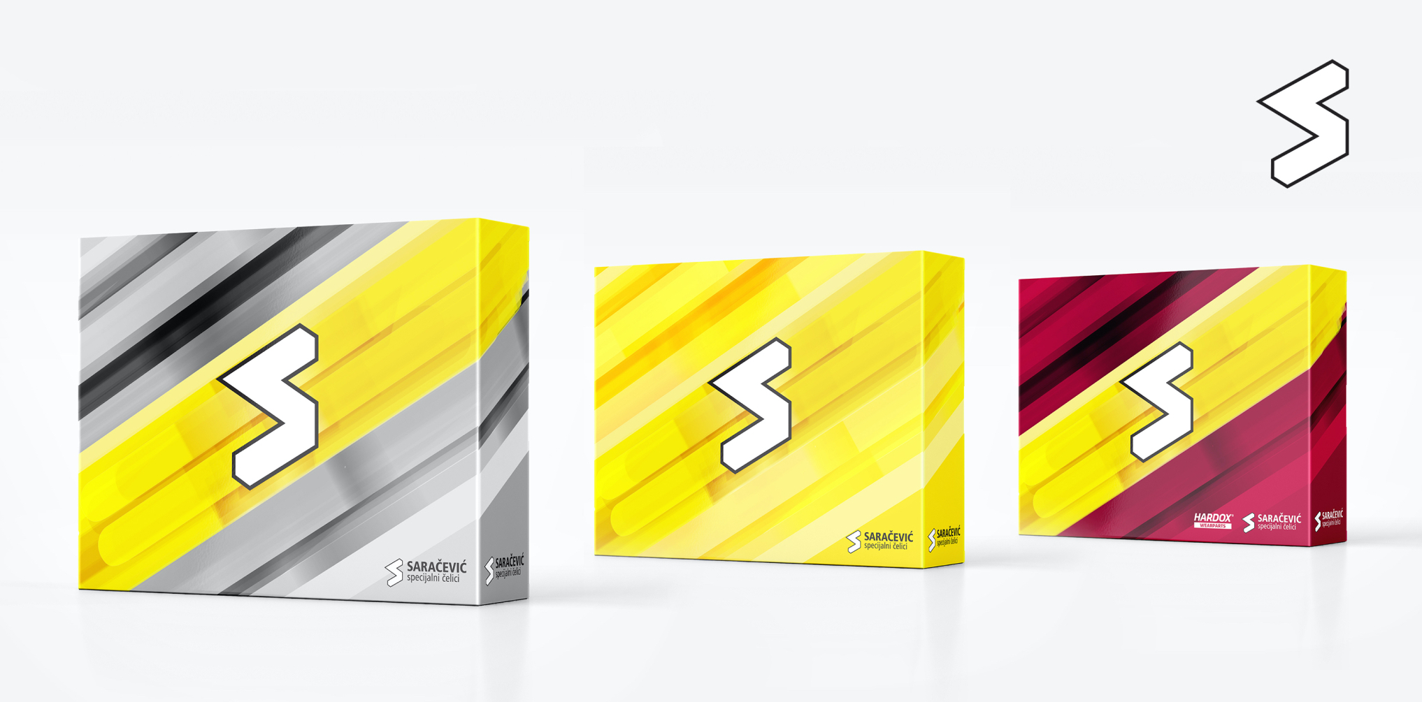
Steel production company visual identity
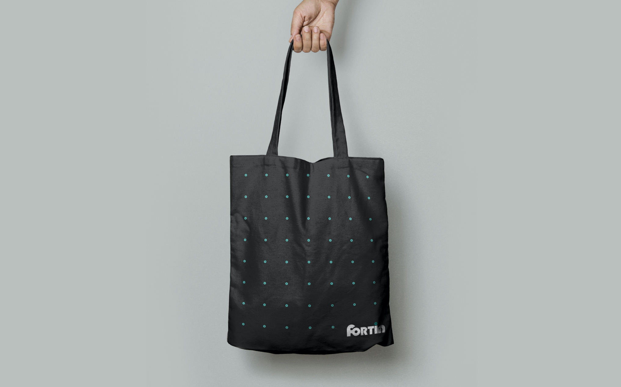
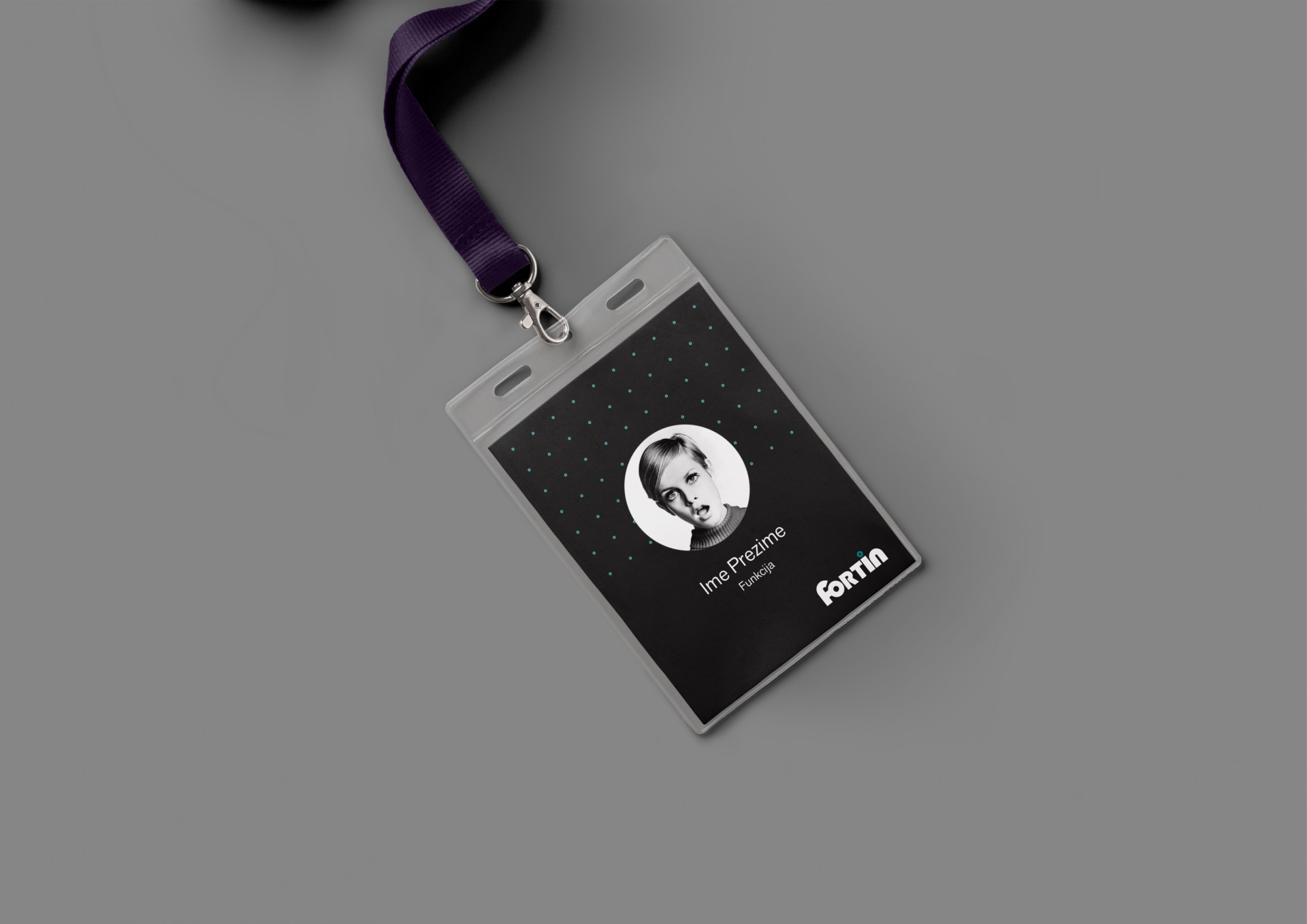
Recycling company visual identity
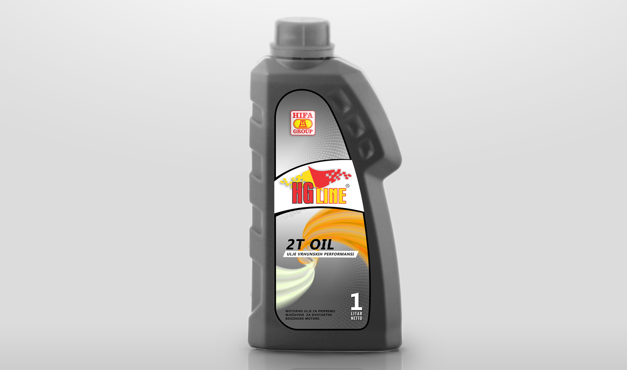
Motor oil packaging design
Hydraulic oils for the highest requirements. Carefully selected base oils and a combination of additives ensure excellent hydrolytic and thermal stability, wear and corrosion protection, and excellent low temperature properties.
Von Wildsein
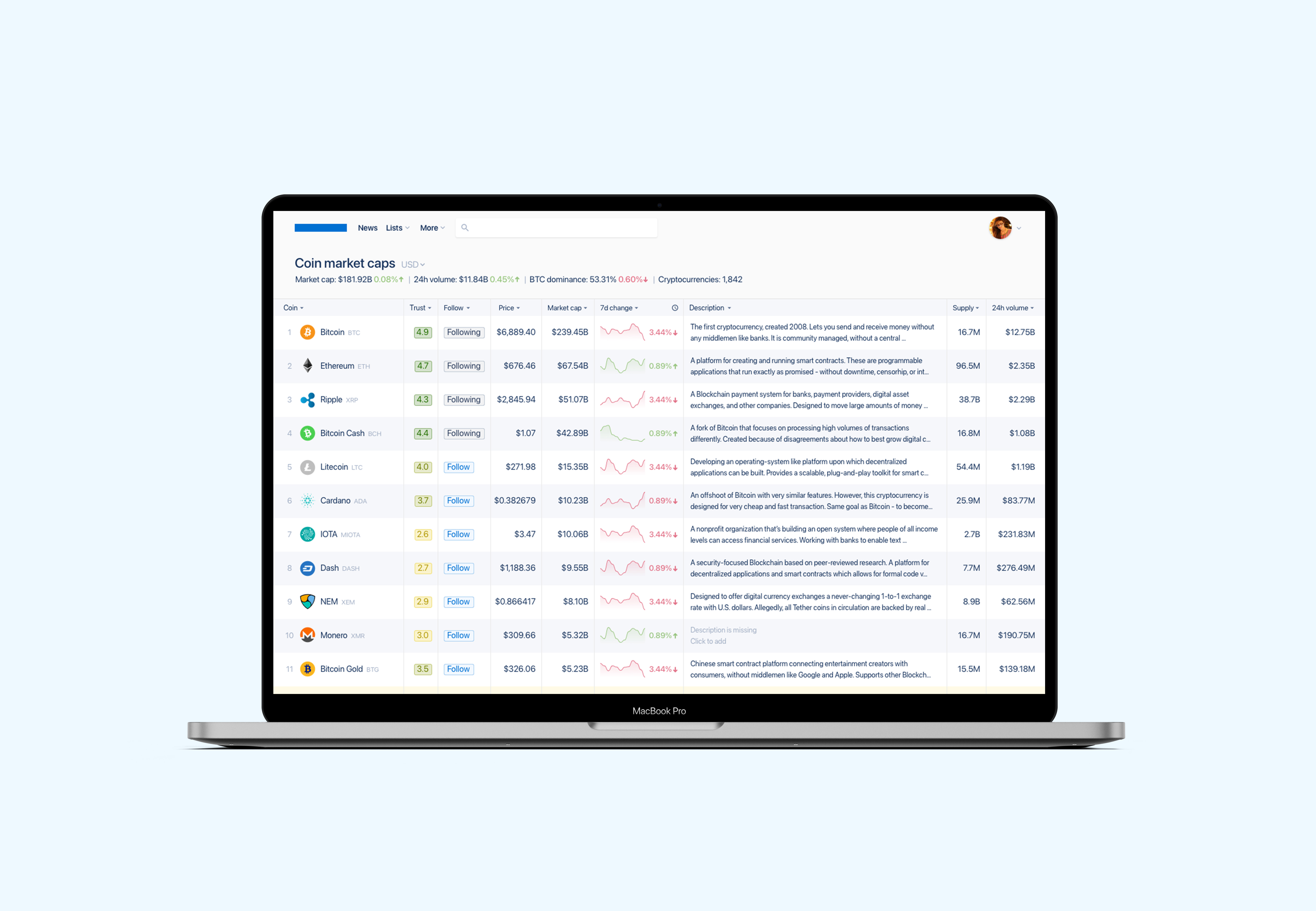
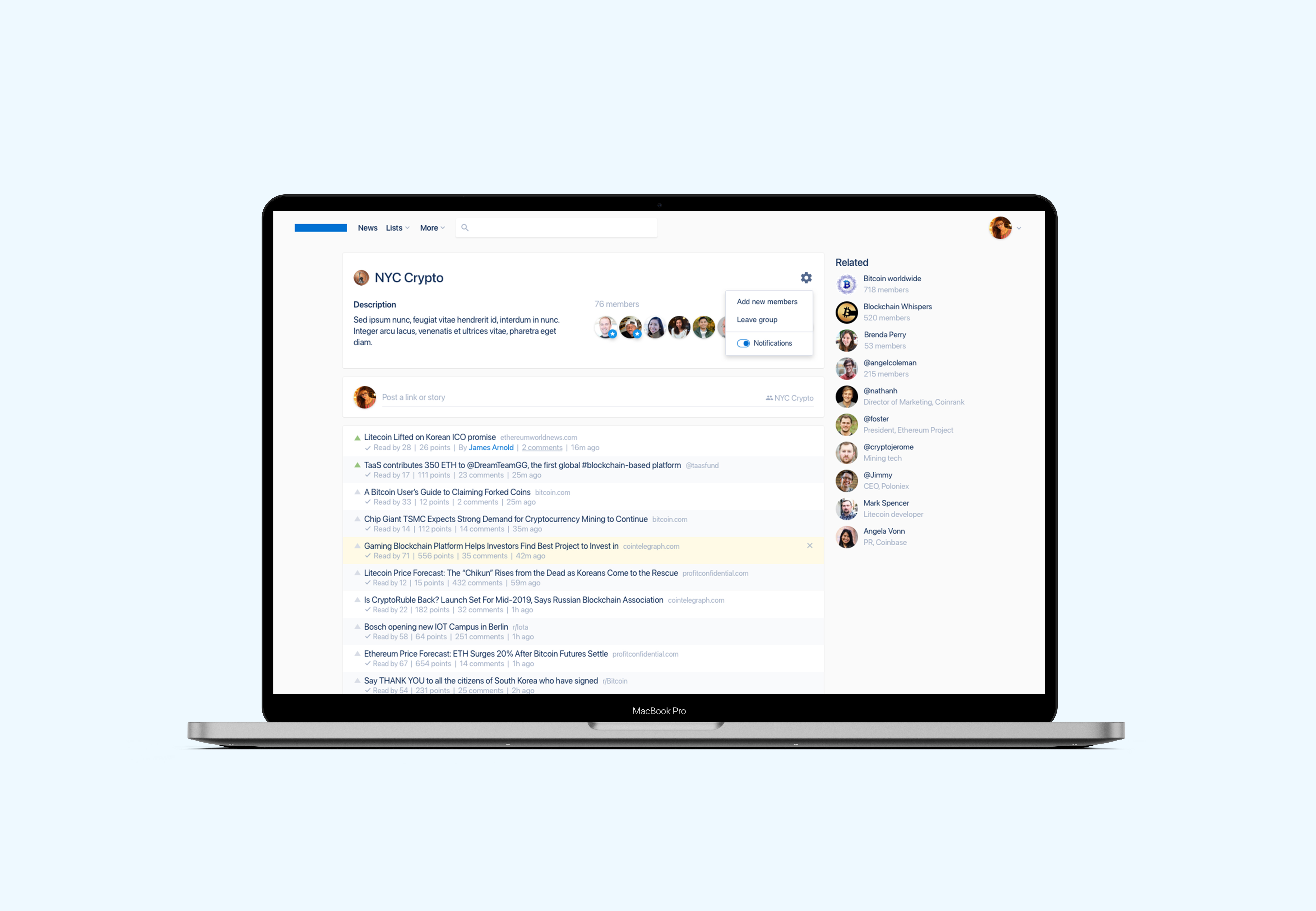
Crypto coin market caps app
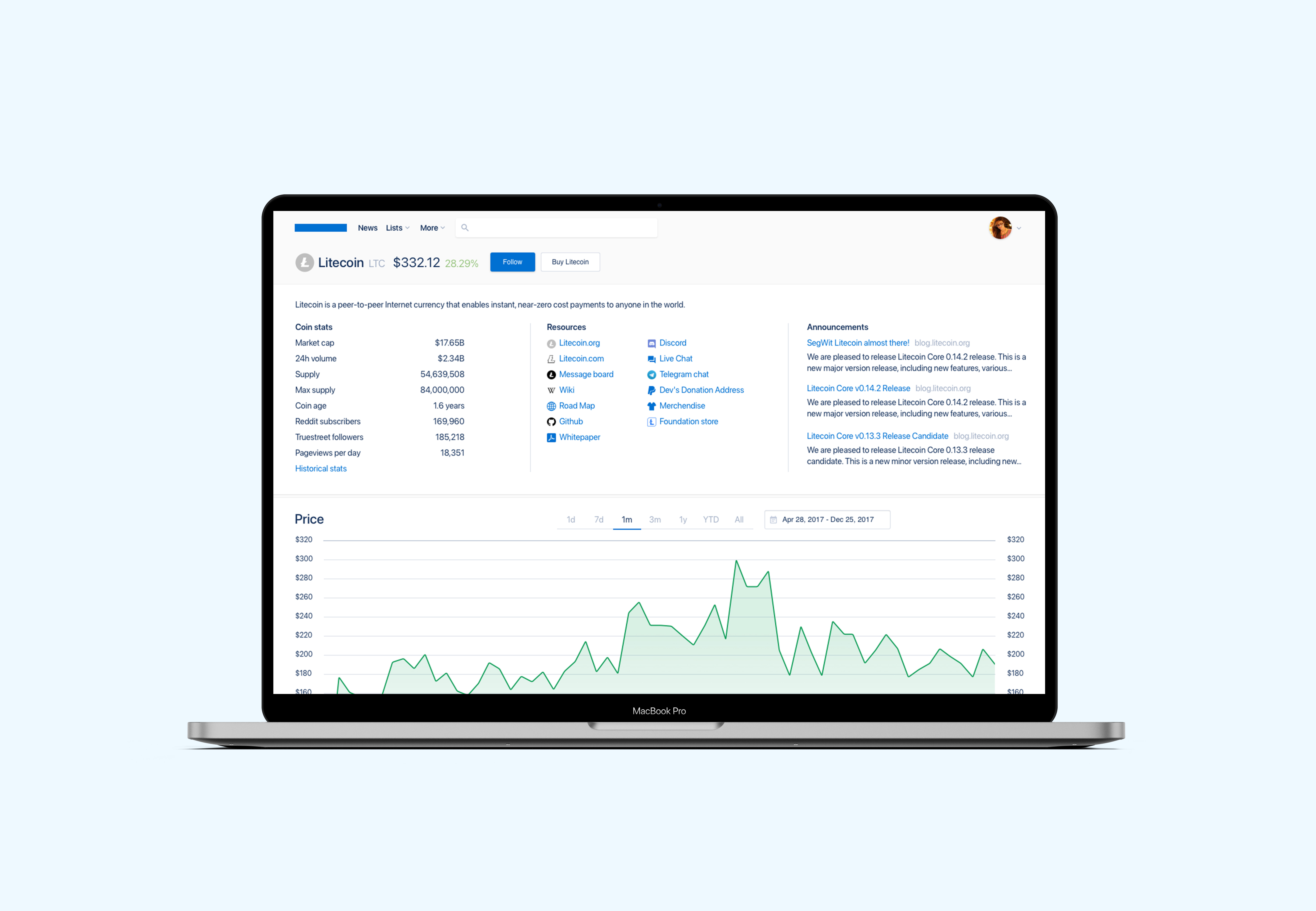
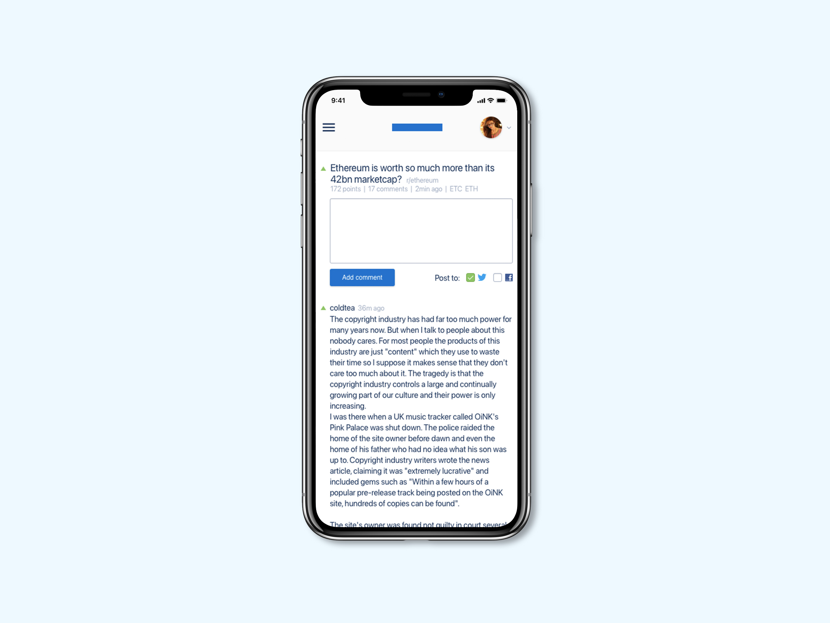
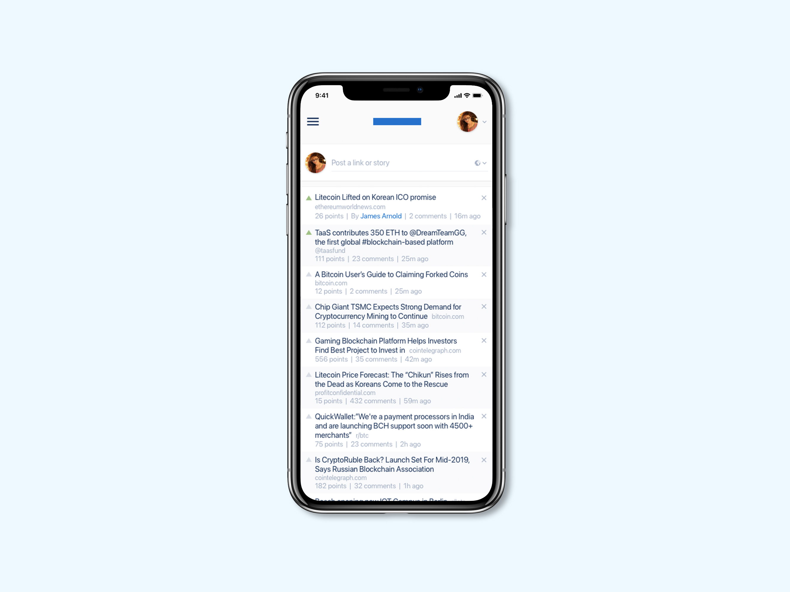
Community driven corner for crypto fans and enthusiasts to find and curate the most important and the most trusted news and stories for cryptocurrencies.
Designs included all screens for the app features, including different states and edge cases, as well as a mobile versions.
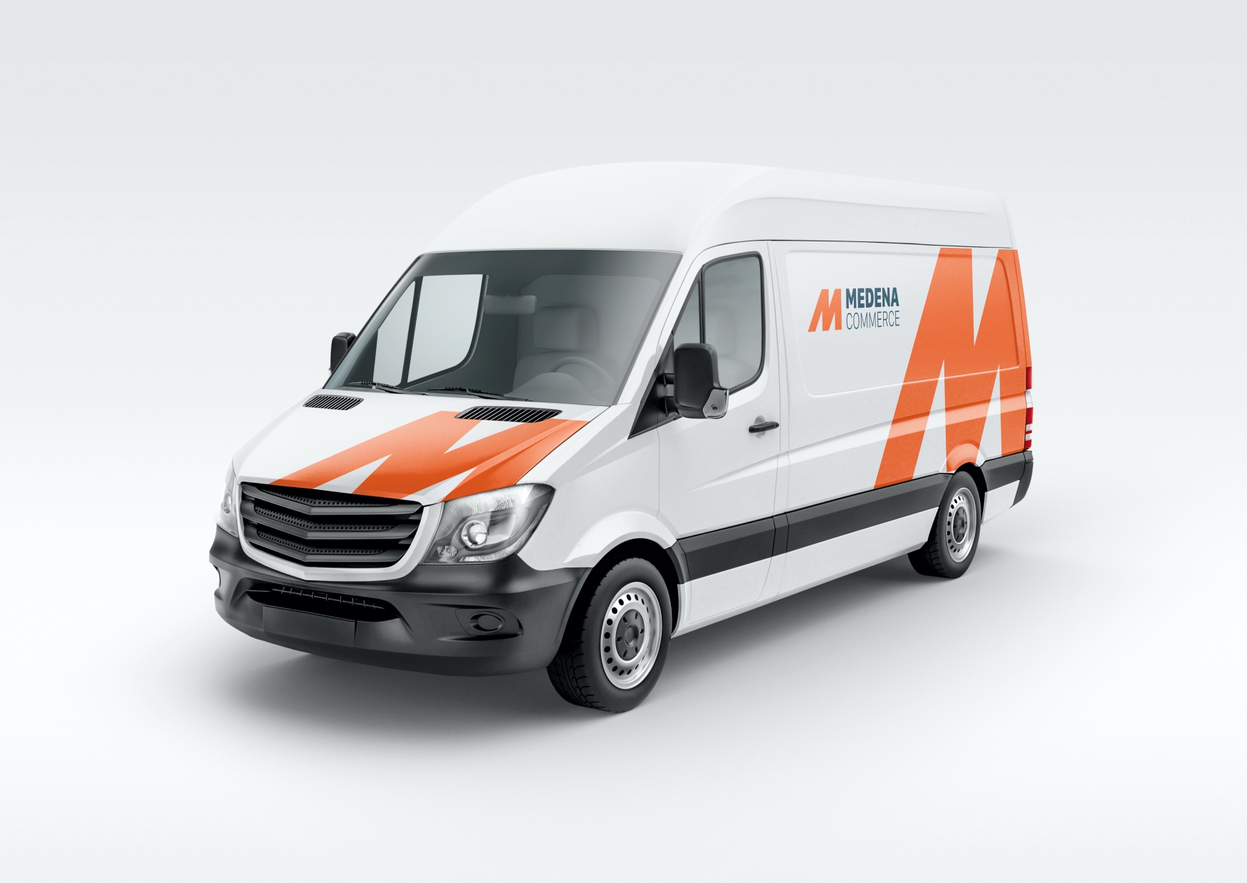
Medena visual identity
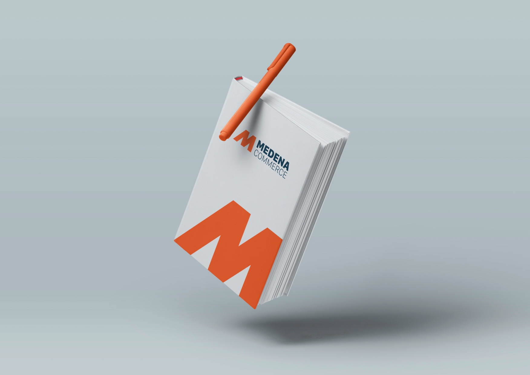
Established in the year 1993, with trade as it’s main business activity, Medena Commerce started their first production facility in 1998, initiating the production of metal parts.
Visual identity prebuilt to be simple in its practical application but at the same time recognisable by its structure and sharp lines that represent precision manufacturing



Crimp-net logo